photoblogography - Just some stuff about photography

Dumbing down

adieu, et merci pour tous les poissons

in General Rants , Friday, January 30, 2015

I’ve been a faithful reader of Réponses Photo for many, many years, and unlike pretty much all other photography monthlies, it has managed to keep my interest my including a very substantial proportion of cultural and explorative themes alongside the usual gear reviews. It also features regular and very strong portfolios of both unknown and famous photographers, often far from safe, comfortable choices, along with incisively edited interviews. The photo book reviews section is extensive and excellent. Of course, there is an element of the usual monthly photo magazine stuff, and indeed gear (especially the traditional November gear special), but in a remarkable move, a redesign about a year ago shunted all this to the back pages, and move the “arty stuff” to centre stage.

Even the featured reader photography is of a very high standard. Indeed, they rejected a portfolio I sent, so it must be! And in recent years it has gone even further, with the “Hors Series” set of special themed issues, each and everyone a remarkable piece of work, especially given the levels of 90% of the competition.  The driving force behind this marvel is the editorial team of Sylvie Hughes and Jean-Christophe Bechet. Or rather was, because it appears that in late November, the suits from the Mondadori publishing empire (principle shareholder: S. Berlusconi), which bought the title a few years back, summarily fired them.

I had noticed that the December issue was a bit lightweight, but I only skimmed it, being far too busy with other things. Then, the January issue had a sunset on the cover. This should have set alarm bells ringing, but even then it only slowly dawned on me that the editorial byline had changed, and there was no trace of Bechet or Hughes’ trademark style to be found.

Couve RP274

The alarming December issue with the very uncharacteristic “shoot winter light” theme and the downright informercial iPad section

Google searches led me to piece together the information, as there was no announcement. The francophone photoblogosphere is full of pretty angry people. Mondadori apparently want to raise circulation by cutting out all of the character and uniqueness of the magazine, the (relative) edginess and risk-taking, and lowering it to the standards of the rest of the How-To-Shoot-Sunsets-And_Kittens press. This, despite the fact that apparently RP’s circulation figures, while dropping, were performing considerably above market average across the whole print press industry.

The next issue apparently will lead on “How To Photograph Children”. Bugger all use to me, I haven’t got any. As far as I know. While in the past, in these parts at least, issues frequently sold out after a few weeks, I suspect that a very high proportion from now on will be going to the shredder.

This leaves me with one remaining worthwhile newstand-distributed magazine from the three languages I can read well enough: Italy’s Il Fotografo. Let’s hope that Silvio doesn’t get his slimy hands on that.

Cop 24 268

Last man standing ?

There has been no sign so far of what Sylvie Hughes and Jean-Christophe Bechet might, or indeed could, do next, but they certainly have an audience waiting for them. I for one send them my commiserations, thanks for all the great photography they’ve introduced me to, merci très sincèrement, and best wishes for the future.

Posted in General Rants on Friday, January 30, 2015 at 08:33 PM • PermalinkComments ()

On Landscape Photography

no, but seriously…

in General Rants , Tuesday, January 27, 2015

A couple of days ago, Ugo Cei published a “A curmudgeonly look at the current state of landscape photography” rant on landscape photography which has stirred up quite some debate.

As I read, “There is this prevalent style in landscape photography that aims to capture the viewer with dramatic light, strong composition and bright, saturated colors” I found myself nodding wildly in agreement, but on reflection, I’m not sure that firing at such an obvious target is fruitful. And to be brutally frank, Ugo’s own work, beautiful as it is, doesn’t seem to be so many notches away from that which he decries.

Yes, much popular landscape photography on 500px is formulaic, garish, fluff, craving attention, pandering to a lowest common denominator threshold derived from endless identical tutorials. It’s much the same on 1x, wildly so on WhyTake, and also on Flickr, even if there some dilution is evident from the sheer volume. But so what. Commentary on the post is largely split between people defending their right to be superficial, and others agreeing but without much in the way of realistic alternatives. For example, “going back to film” is a popular panacea, but film - specifically, Velvia - is actually what got us here in the first place. The opposite trend of the exaggerated “Portra 400” heavily unsaturated look, usually featuring anonymous, bland subject matter, is equally as affected as the saturation sliders to 11 wave. Black & white is a valid alternative, but equally open to wild contrast exaggeration. The dark, scratchy gothic look is also a popular counter-trend, but again, often superficial. The problem is not the presentation, but rather the content.

There seems to be a great desire from a subset of landscape photographers to produce “meaningful work”. I’d include myself in that group. Unfortunately, at the same time, they seem to crave popular acclaim, and that’s likely to be a problem (and yes, that’s me, too). The key point about social media is that the “social” part often outweighs the “media” part. Getting likes on 500px et al is not going to be hampered by showing great photos, but playing the social networking game is far more important. I honestly do not know of any inspiring landscape photographers who are stars on photo sharing sites.

It certainly isn’t impossible for landscape photography to be meaningful and artistic. Some high profile examples include Ed Burtinsky, and Salgado, obviously, but there are plenty of others out there. Some favourites of mine include Stuart Klipper, Dav Thomas, and Tiina Itkonen. I don’t think any of these are big (if at all) on 500px.

Coming back to the tricky topic of meaningfulness in landscape photography, the debate has helped to crystallise my own views a little. First of all, I would propose that any photograph which provokes some response beyond the superficial holds meaning. I do not think that landscape photography, or indeed much photography at all, generally holds explicit meaning. Why should it? We have several senses, why do we need to translate a visual, visceral response into textual description? The meaning in landscape photography is general intangible, and we should be comfortable with that. As landscape photographers, we have compositional tricks of the trade to deploy to make our photos more visually interesting. And of course these are flogged to death in magazine tutorials, how-to books, and “fine art photographer” websites. They’re all well and good, but going out specifically to find leading lines, Ye Olde Foregrounde Intereste, or s-curves is going to result in bland eye candy, although it might get you noticed on 500px. It’s the wrong way round: these techniques can be used to enhance an interesting subject, but they’re not terribly interesting of themselves.

So then, what makes a photograph interesting? Well, there are several key reference works on that topic, for example by Stephen Shore, John Szarkowski, or George Barr. But these are generic - useful, enlightening, classic maybe, but not infallible sets of instructions. I believe that individually we have to find our own parameters. About a year after I started posting on Flickr, I started indulging in a little conceit which was to give my photos one word titles. These titles were often oblique and obscure, but there was a method behind them. After a while, I started to realise that for some photos the titles came quickly, and for others it was a struggle, or nothing came at all. For some, the title turned out to have several layers of meaning, some direct, some indirect. And so I imposed the rule on myself that until a photo “named itself”, I could not post it. The photos with the strongest titles were not necessarily technically stronger, nor did they get huge acclaim on Flickr, but they were the most satisfying to me. I’ve notice other people using different ways to express meaning by association, for example by adding fragments of poetry. I’d like to think that if a photograph speaks to me in this way, it may speak to others, eventually. Of course I could just be delusional.

It’s actually very, very hard in my experience to produce meaningful landscape work which excludes human elements. So it’s a shame that so many landscape photographers seek to do just that, and yes, mea culpa. We’re shooting ourselves in both feet, as well diving deep into denial, in trying to separate ourselves from nature.

The following two photos attempt to illustrate what I’m getting at. The positive example (the second) was much harder to select.

Sandflat sunset

This says very little to me other than “ooh, nice sunset”. When I published it on Flickr it was before my “title” phase and the best I could come up with was a bland, descriptive “Breiðamerkursandur sunset”.

Xpan verzasca0412 12

This, on the other, means quite a lot to me, although there’s no context here. The title “siccità” was obvious. To me, anyway.

A lot of photos I see online give homage to the hackneyed “capture the light” theme. And often that is all they do, albeit often very, very well from a technical perspective. But they don’t capture the place, and don’t hold attention beyond a quick social blast. Getting away from the addiction to instant fleeting praise may be the first step on the road to a true sense of accomplishment, but it’s a long road to take. And whatever I may have said or implied here, being dismissive about other people’s take on the wide, wide world of photography is not a step in a rewarding direction.


Posted in General Rants on Tuesday, January 27, 2015 at 08:44 PM • PermalinkComments (6)

snowblown

off piste

in Photography , Monday, January 26, 2015

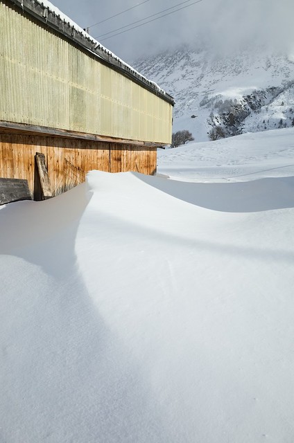
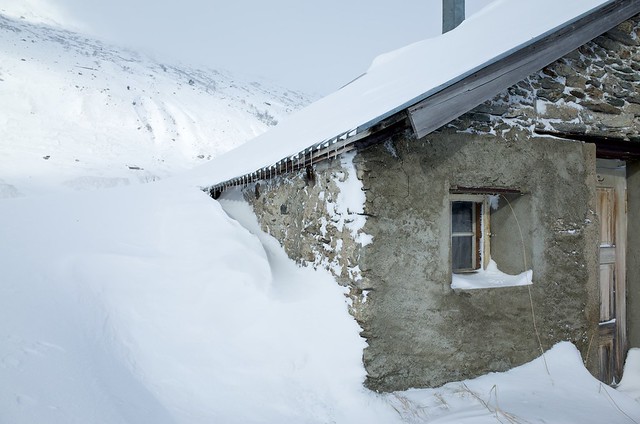
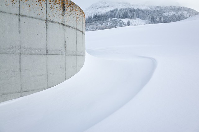
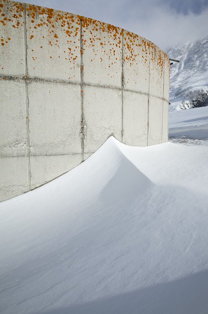
Last weekend, we went off for a weekend’s skiing in Andermatt, about an hour away. Due to combinations of fog, wind and headaches, we didn’t exactly overdose on the slopes, but a walk up the valley, initially in a snowstorm, but later in the afternoon with the sun breaking through, turned into a totally impromptu photo session.

The best camera, as they say, is the one you have with you, and in my case the Ricoh GR I had slipped into my pocket is quite possibly the best I have from a purely image quality point of view. Possibly even beats the Sigmas. But sadly, lacking an accurate eye-level viewfinder, in this kind of light and conditions, even with the very bright screen, composition often boils down to guesswork.

Anyway, I’m quite pleased with this little haul. Unexpected, and pretty satisfying.

drm_2015_01_25_R0000461
drm_2015_01_25_R0000415
drm_2015_01_25_R0000426
drm_2015_01_25_R0000422
drm_2015_01_25_R0000453
drm_2015_01_25_R0000459
Posted in Photography on Monday, January 26, 2015 at 09:15 PM • PermalinkComments ()

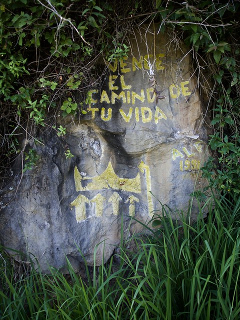
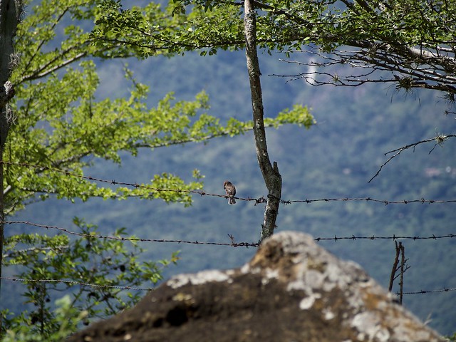
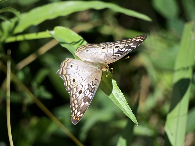
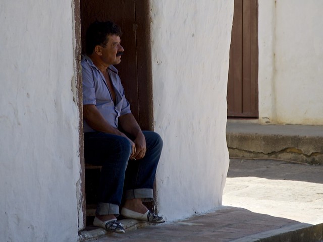
Colombia: Camino Reale

what I did on my holidays Part 94

in Photography , Thursday, January 22, 2015

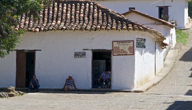
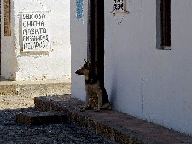
Bored with cameras now, time for some more holiday snaps. This batch-ette comes from a stroll along the slightly restored Camino Reale from Barichara to Guane. The chorus to this song was the perfect mental soundtrack ... actually the verses are too, in a slightly unsettling way, given the all too recent past.

Anyways, I’m getting sidetracked again. Here are the pictures. I know, it’s not gear, but it’s the best I can do.

drm_2014_11_23_PB230836
drm_2014_11_23_PB230853
drm_2014_11_23_PB230868
drm_2014_11_23_PB230884
drm_2014_11_23_PB230894
drm_2014_11_23_PB230889
drm_2014_11_23_PB230886
drm_2014_11_23_PB230891

Oh yeah, gear.  All this lot are down to the electronickal magickality of the Olympus E-P5 and two kit zooms. Nothing to see here, move along please.


Posted in Photography on Thursday, January 22, 2015 at 08:49 PM • PermalinkComments ()

Camera Of The Week #1

may contain traces of sarcasm

in GAS , Wednesday, January 21, 2015

Well, following my recent despairing musings, I’ve taken words of advice to heart, and decided that the best way to gain some redress from my creative slump is to BUY CAMERAS! Yay! So, rather than embark on some dull as ditchwater Photo-A-Day endeavour like everybody else, I’m going to be totally original and buy and rave about a new camera every week! Nobody has ever thought of that! (er, are you quite sure about that ? - author’s alter ego). By the time I’ve worked out what button to press to active Sweet Puppy Darling Cheesecake Party Light Selfie Mode (no, really, Panasonic *do* have that, I saw it on DPReview), I’ll be using the video mode (whatever the hell that is) to show the unboxing of the next one! And my blog will instantly become as cool as 35MMC! (author’s little voice - in your dreams, and after some extreme outsourced graphic design makeover, matey)

So, drum rolls and whatever, here’s the first in a long, long series (promise), a brand new (almost), totally up to date FULL FRAME DSLR (Dented-SLR): the truly stunning Olympus OM4Ti.

OM4Ti

The OM4Ti with a Zuiko 85mm f2 lens I had knocking around…

I’ve wanted one of these since, like, forever (I’ve seen cool people use “like, forever” on Facebook, so whatever). But it used to cost about $2000, which was a little on the ascendant side, given that it doesn’t even have Exposure Priority. Or indeed video. Then again since I only ever use Aperture Priority, that’s not a problem. And it cost CHF 89.-, which is slightly more US$ than this time last week (and let’s not even mention €), but still rather a lot less than $2K.

And OMG is it gorgeous. I can’t stop fondling it. The view through the finder makes me babble incoherently (nothing new there), and feathers would kill for its lightness of touch. It makes my Digital Wonderbox E-P5 look a little tragic, really. The handling is just perfect, the multispot mode that I remember Canon copying on the T90, and which I used a lot until it gave me a hernia, is excellent, although overkill for negative film, and the Hilight / Shadow buttons are fantastic for when you can’t remember how exposure compensation works. So, I ran two rolls of slightly expired Ektar 100 through it - I hate Ektar 100, actually, but it’s all I had to hand - and rushed off to the only 1-Hour photo lab left this side of the Alps… and it was bloody closed.  So no slightly delayed chimping for me.

…two days later…

Well, getting two rolls of Ektar processed and scanned automatically to CD on a Fuji Frontier 1000 cost me about half the cost of the camera, which gives one pause for thought, but the results are promising. Apart from the shots where I forgot that image stabilisation was invented about 20 years later, and allowing that it is, after all, Ektar, they look pretty good to me. When I get time I’ll do my own scans. I have two Zuiko lenses, a rather crotchety 50mm f/1.4, and a very smooth 85mm f/2.0. Both work far better on the OM4Ti than on digital bodies.

So, these are all basic vanilla lab scans, no tweaking.

drm_om4_02a
drm_om4_05a
drm_om4_04a
drm_om4_16a
drm_om4_12
drm_om4_30
drm_om4_17
drm_om4_33
drm_om4_36

Film’s not dead. It’s just resting.

Right, that’s enough of that camera. Bored. Attention span exceeded. Next, please!


Posted in GAS on Wednesday, January 21, 2015 at 09:53 PM • PermalinkComments (2)
Page 1 of 2 pages  1 2 >