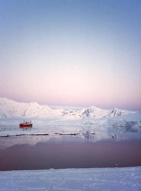
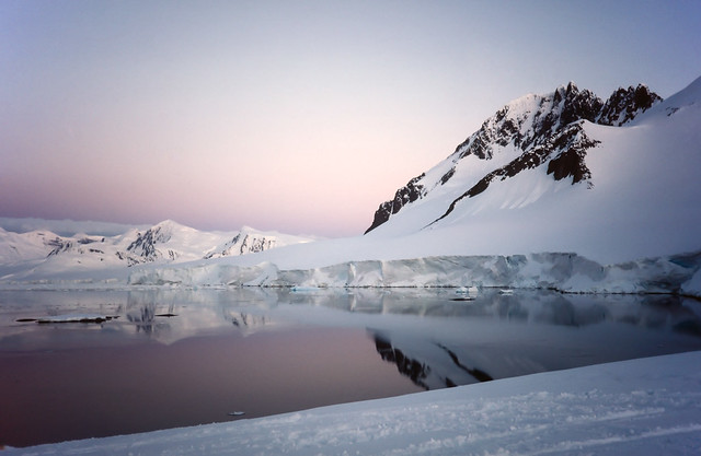
In a bit of a fit of retail therapy, the other day I decided to buy a license for Alienskin Exposure 2. This is an application with its roots very firmly in film emulation, but which in recent years has expanded into a full blown digital RAW file processor and - to some limited extent - organiser.
In the past
I've written a bit about trying out various film emulation methods, and being generally unconvinced. Since I used film extensively, and still do to some extent, I do have a reasonable idea of what I would expect such software to deliver, and I also the real thing to compare against.
I'm not really interested any more in trying to emulate film, as such. If I want a Portra look, I'll use Portra. But what does interested me is being able to apply a preset, or whatever you want to call it, to a given batch of photos, thereby giving them a coherent feel, while at the same time being able to speed up the process of all this adjustment stuff and get to the actually interesting part (for me, anyway) of editing and publishing. I tend to get so overwhelmed with the adjustment part, in the limited time I have, that it seems I'll never get to the actual point of it all. I also horrify myself with the sheer quantity of photos I take, even when I'm under the impression that I'm a model of self-restraint.
This "preset" approach I find is more adapted to my urban photography than landscape, or whatever you want to call it. Sometime last year I took advantage of a special offer and bought a VCSO film preset package for Lightroom, just to explore it a bit. Clearly it didn't grab me much, as by now I'd practically forgotten about it. However earlier this week, I started working on a smallish set of photos recently taken in Buenos Aires, and decided to try applying the VCSO Portra 400 presets.
I quite liked what I was seeing, although the results did seem a little contrasty to me, and VCSO's idea of what the ultimate hipster cliché 2-stop overexposed Portra 400 looks like doesn't correspond at all to what I see on film.
I had tried out Exposure a while ago, but at that point felt it didn't offer me anything. But anyway, needing an excuse to spend money to make me fell better, I tried it again. And I'm glad I did.
The interesting thing is, when I first put two versions side by side in Lightroom, one processed through VCSO, the other in Exposure 2 and imported, I immediately thought I'd wasted my money. The VCSO version was much more like Portra to my eyes. Then... I realised I had mistaken which was which. So the "good" version was from Exposure 2. Of course this is 150% subjective, and there's no real logic to it. But I repeated the experiment several times, and confirmed my opinion. However, the VCSO versions most definitely have more of that "pop" that people apparently want. But if I wanted "pop" I'd used Ektar, not Portra.

I'm actually not going to say which is which here. But you can probably guess.
So I'm pretty happy with Exposure 2, but working out how to use it is a bit tricky. It can work standalone, including a file/folder based browser (where it recognises Lightroom star ratings, which is handy), or it can work as a plugin. The problem with working as a plugin is that it receives a TIFF file generated by Lightroom with basic processing baked in (e.g. Adobe standard profiles). That isn't an ideal place to start from, which I imagine is one of the drivers behind expanding the reach of Exposure in the first place.
The standalone Exposure 2 is actually quite impressive. It doesn't seem to have received much praise or attention, but from a toolset point of view it combines a lot of the better aspects of both Lightroom and Capture One, and adds a twist of its own. The layer methodology, for example is better than either of its two august competitors. Exposure 2 has a lot of tools more specific to customising film emulation, inherited from the older plug-in only versions, and Alien Skin's from Bokeh application seems to be integrated (although that's not something I'm all that interested in). Apparently it also has automatic lens correction. But it doesn't have any chromatic aberration removal that I can see, or any perspective correction. Or, indeed, anything approach a user manual.

Another example. Again, you decide.
I'm quite comfortable with Lightroom these days. I appreciate the integration with things like Lr Mobile, and Adobe Spark, both of which allow me to make better use of my commute time. Lightroom, unfortunately, is an awful organiser /editor, but it is less awful than anything else on the market. There's no point any more lamenting Aperture, PhaseOne seem totally clueless on what to do with MediaPro, so Lightroom will have to do. And since organising and editing is a core part of my creative process, Lightroom is as well.
So, the compromise is to use Exposure 2 standalone to generate alternative versions, and import them into Lightroom for any final tweaking and management. It would be nice if Alien Skin could add the kind of "slingshot" feature in Iridient Developer, which when receiving a TIFF from Lightroom, instead looks for and loads the associated RAW, and then when saving overwrites the TIFF, leaving Lightroom none the wiser to the sleight of hand.
I'm also a bit puzzled why Exposure 2 does not include modern Portra 400 emulation, but just 400NC and 400VC. 400NC is close enough, but still, I would expect currently available films to be emulated.
Otherwise, I'll repeat what I said earlier - Alienskin Exposure 2 is actually a pretty good piece of software, and not only for film emulation. I'm surprised it doesn't get more coverage.


