photoblogography - Just some stuff about photography

Antarctica - In slow time

Stuart Klipper, again

in Antarctica , Thursday, December 05, 2013

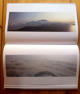
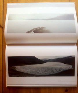
A while back I made a bit of a mistake. I wrote about Stuart Klipper, and in particular his book, “The Antarctic: From the Circle to the Pole”, here, and I was pretty enthusiastic about it. The problem is I didn’t realise quite how rare it is, and a few days after my post, coincidentally or not, Amazon and all other vendors (for example the excellent Longitude Books) were out of stock.  Bugger.  I did manage to get Amazon.de to take an order, but every now and again they send me a stream of undecipherable Germanic e-commerce babble which I assume means they’d love to take my money but they can’t. 

So I was pretty surprised not to mention happy to discover Amazon UK suggesting that I buy it new from a 3rd party vendor for just £7.22. And it’s just arrived.

IMG_1220

Over the past few days I’d been enjoying Joseph Holko’s Antarctic images, and feeling a little intimidated by them.  They’re dramatic, full of contrast and vivid flashes of colour, and sharp enough to cut through steel. They grab attention. I despair of ever being able to get anywhere near this standard.  But although I don’t in way want to dismiss them, I’m not sure I ever actually remember Antarctica looking like that.  Antarctica looks the way Stuart Klipper photographs it. It’s mysterious, unattainable, incomprehensible in it’s alien vastness. It’s really not the world of highly saturated dramatic icebergs and penguins that we’re getting increasingly subjected to. Stuart Klipper lets Antarctic speak to us, rather than impose his vision on it, and it makes a huge difference. He doesn’t go the uninvolved, dispassionate lengths of the more conceptualist art landscape crowd, there’s still a considerable emotional attachment involved, but you get the impression of a photographer who has taken his time to take a long look before pressing the shutter release.

Of course, Holko will sell, and Klipper probably doesn’t much. And Holko is a photographer, while Klipper has at least one foot in the “artist” camp. These are just observations, Joseph Holko is a fantastic photographer, and I’m just using his work to contrast with Stuart Klipper’s, I’m not being judgemental. But although I certainly don’t claim any artistic merit for myself, I do feel that my own photography is somewhat validated by Klipper’s. Sure, I’ve tried to go for the in-vogue ultra-impact approach myself, but I’m not comfortable with it and I think it shows. Which is probably why in my heart of hearts I prefer my XPan work. Not specifically because of the format, but because it’s on slide film, and there’s very limit scope in pushing that beyond what-you’ve-got-is-what-you-get.

Anyway, I’ve got a book to read tonight.

IMG_1221
IMG_1222
IMG_1222


Posted in Antarctica | Book Reviews on Thursday, December 05, 2013 at 04:57 PM • PermalinkComments (1)

Review: Image Interpretation Techniques

a new eBook from Bruce Percy

in Book Reviews , Thursday, August 29, 2013

The internet has brought about a huge change in book publishing. In the “old days”, getting a book published meant getting a publisher, an editor, a designer, a printer, a distributor and probably a lawyer or two. All this presented a high bar to entry, and although self-publishing, at a range of levels, could work, generally you had to jump through the hoops, and this provided a reasonable quality filter. Nowadays all you need is a desktop publishing application and a web service.

One area which has bloomed in this new world are photography “how to” eBooks. There are countless examples on offer, on topics ranging from the ultra-specialist to getting started guides, and quality ranging from absolute crap to excellent. And with wide ranges of pricing to match.

There are various ways to evaluate eBook quality, including design, layout, writing, photography and content. They don’t always come together - I have examples of eBooks which look gorgeous, but where the content is a severe let-down, basic to the point of laughable. I’ve also had to hack through jungles of mangled prose delivered with all the grace of a 3rd rate corporate PowerPoint presentation, to get to a kernel of valuable information. I haven’t come across many photography eBooks which tick all of these quality criteria, but of those that do, several come from the (digital) pen of Bruce Percy.

His latest eBook, “The Digital Darkroom: Image Interpretation Techniques” doesn’t really break any new ground - in fact the topic has been done to death by the likes of Michael Freeman, John Paul Caponigro, Alain Briot, David duChemin and a host of others - but it just does it better, by avoiding mystification and waffle, and bringing a very welcome clarity of expression to the table.

The topic is essentially an extension of ideas about image composition, discussing how you can use digital darkroom tools to help to lead the eye and to enhance the composition you made in the field. There is no discussion of technology here, just the ways in which generic software tools can be used. This in stark contrast to another eBook I purchased not so long ago, on Dodging and Burning, which I expect to cover similar ground, but was actually a sumptuously designed never ending rundown of various things you can do in Lightroom. I don’t even use bloody Lightroom. While I expected it to be an enjoyable read, I didn’t necessarily expect to learn that much from Bruce’s book, thinking that I already know this stuff, and that anyway it will be applicable principally to Bruce’s very distinctive style. I found out I was quite wrong, on both counts.

The book starts off by discussing visual paths through an image, and how the eye can get attracted - or distracted - by some sometimes quite innocuous areas. Where often people will tend to boost things, like saturation or contrast, Bruce shows that locally reducing such parameters can be more effective in achieving a good balance. It also helps that his example photos are pretty good from the outset, in that it the subtle enhancements he makes are all the more impressive in their effect. A set of case studies demonstrates various techniques, and includes the application to portraiture as well as landscape. I have to say the book immediately made me take a closer look at the photos I’ve recently been editing, and inspired to add some touches I otherwise would not have thought of. I have my own approach to enhancing areas of images, and actually it uses a tool which Bruce doesn’t cover - but that’s all for the better, as seeing things from his perspective can only add value to mine.

Getting back to design, typography and layout, it is clear that Bruce Percy, unlike far too many photographers, not only cares about such things, but is skilled at them. It makes a big difference - so many pundits on photographic style preach from the most horrifically designed eyesores of websites.
On a final point, the vast majority of eBooks I find are of the “read once, delete” variety. This one is quite the opposite, being both a rewarding read, and a reference I’ll come back to many times.

There’s a lot packed into the 37 pages, and although the presentation is clear and easy to follow, it isn’t necessarily suitable for complete beginners. Oh, and one more thing: at £9.99,“The Digital Darkroom: Image Interpretation Techniques” is pretty expensive for an eBook. But there are those that know the cost of everything and the value of nothing. Unless you fit in that category, I thoroughly recommend this eBook, and indeed the others you can find on Bruce’s web site.

Posted in Book Reviews on Thursday, August 29, 2013 at 11:11 PM • PermalinkComments ()

SEVEN by David duChemin

great expectations, but…

in Book Reviews , Friday, August 09, 2013

It’s just as well that nobody ever reads this stuff, because I have feeling this could be one of the most unpopular posts I’ve ever written, comparable to the time I dared to be critical of the great Andy Rouse.

David duChemin styles himself as a World & Humanitarian Photographer. Apart from this, he has authored a series of vision-oriented semi how-to books on photography, which, if you’re prepared to roll with his world view, are interesting. He seems like a very genuine, likeable, enthusiastic person, and he’s built up a great brand and a loyal following. Me, being a cynic, I find it quite hard to avoid a certain sense of nausea when he goes overboard with the (non-denominational) preaching and the hey-what-a-wonderful-world, but I guess that’s my loss.  He’s also built up an impressive eBook publishing venture, Craft & Vision, providing a platform for his own pamphlet-length books on various topics, and also those of various other authors. They’re inexpensive, and worth a punt. I’ve read most of them. Some I enjoyed, others less so, but duChemin’s own series of collections of essays are definitely worth your time and money. Finally, he also launched the Photograph eMagazine last year, which I reviewed, and subscribe to.

Along the way he’s been prone to downplay the importance of gear, which is fine, but also to some extent technique, which sometimes is ok, but sometimes not.  For example, saying that a photo shot at f/22 and ISO 800, which would have been much better at f/8, is like so because he got too involved in the shot to notice … well ok, I do that too. And then usually I realise that the photo just has to be binned, however good it might have been.

Which brings us to his magnum opus to date, his first monograph, “SEVEN; Seven Continents + Seven Years: A Photographic Journey”.

He states “I wanted to create something beautiful, inside and out. Something that was a delight to touch and hold. I wanted something that would inspire and show you the world the way I see it, in these fleeting glimpses of beauty, hope, and wonder”. It’s a lofty ambition, which raises great expectations.

Seven cover

Physically the book is quite nice, but not exceptional. The dark brown linen hardcover binding doesn’t really fit with the content, in my opinion.  But what immediately strikes me is that the layout & typography are a bit clunky.  This is strange, because actually the quality of the layout and presentation of many Craft & Vision eBooks exceeds the contents, and his web site is very elegant. But online, electronic layout practice does not simply translate to print, and I think this is the problem.  I can’t help but compare with Bruce Percy’s books - there are some parallels between Percy & duChemin, but it is clear that Bruce is a talented, meticulous designer as well as a fabulous photographer, and his book designs are exquisite. SEVEN suffers from far too big typefaces, and a serious lack of white space to let the text content breathe. The image layout is basically “default”.  Photos are overwhelmingly centre page, with little thought of dynamics. Tellingly, the digital version is MUCH easier on the eye, and the photography looks and works better.

Ok, so what about the photography ? Well, I’m not enjoying this at all, but honestly, for what my opinions worth, left to sink or swim on their own merits, rather than supporting essays or blog posts or how-to books, for the most part they do a good imitation of the Titanic.

Individually there are some good, or even great photos. Some examples are Plate 56, a great street candid, Plate 136 (which is included on the product page), one of the few landscapes I like. But really, I’m just trying to find some positives.

Seven 59

photograph © David duChemin

Seven 160

photograph © David duChemin

But there’s just too much chaff, and a lot of it really doesn’t do him any favours. A candid photo of an orange juice vendor in India inexplicably focuses on a pile of oranges rather than the vendor. Four shots of a whaling boat hulk on Deception Island - which world+dog has photographed - when one would do - easily. Many shots just seem to be strangely devoid of content or dynamic.  Far too much backlighting which just doesn’t work. The shots from Iceland using a tilt/shift lens hand-held were maybe entertaing on the blog, but here, especially in context, they’re a bit ridiculous. The best stuff is a set of commissioned posed portraits of villages in Loiyangalani, Kenya, which is very competent commercial photography, but really looks like an outtake from a Benetton shoot.

Seven 69

Nice oranges, but, really…? photograph © David duChemin

But the biggest problem is that there is no coherence to this book. As a monograph, one would expect some kind of continuity or visual narrative, but it just jumps all over the place.  From black & white candids to wide screen landscapes, from the inevitable photos of colourful, wrinkly, gap-toothed Asiatic ancients and cute kids, back to some more black & white candids, jumping to the weird Iceland stuff, to some even weirder stuff from Venice, to a set from an Antarctic trip where clearly the weather wasn’t playing along. It’s not giving much of a sense of a style or vision.  The total opposite of Bruce Percy’s “Iceland - A Journal of Nocturnes”.

SEVEN is very ambitious, but ends up drowned by a wildly over-reaching concept of showing the whole world, and therefore having to include work of quite considerably varying quality just to “tick” each continent. The New Zealand photos are particularly disposable. Perhaps a much stronger approach would have been to structure it as a set of self-contained mini-portfolios from a selection of global destinations. Basically, it needed a strong editor, and a layout artist.

One of the reasons I buy photography books, especially from less well-known photographers, is because I like to support their work.  I’ll continue to buy Craft & Vision eBooks, and I don’t regret the not inconsiderable cost of SEVEN. I would normally say this, or indeed expect to say it, but I have to say for all the locations in the book which I have also visited, I’ve either got better shots, or similar shots (near identical in the case of Milford Sound) which I’d never even think of publishing. I expect books like SEVEN to contain photography far better than I could achieve. It’s a bit of a shock when they don’t.


Postscript

Despite the fact that nobody will read this, I’ve hesitated a lot before publishing it. I’ve searched for other reviews of the book, and found just one, which frankly doesn’t say very much… one can infer anything from it. So why publish such a negative review, especially when I really, really wanted to love this book? Who am I to say such things? I think it’s a reaction to the massive dumbing down of photography everywhere, the “great capture, please visit my page LOL” theme that runs through the community these days. SEVEN unfortunately to me seems to ride on that sort of empty praise, and sometimes line have to be drawn. It should, and could have been so much better. And yeah, I know, my stuff sucks and I have no right to criticise genius etc etc. I know. Save your breath. It’s not the point.

Posted in Book Reviews on Friday, August 09, 2013 at 10:13 PM • PermalinkComments ()

Iceland Within

Impressions of Bruce Percy’s new book

in Book Reviews , Monday, November 12, 2012

I didn’t think I really needed any more Iceland photography books. I’ve got quite a lot, in all shapes and sizes. Some are excellent, some so-so, a couple are outstanding and one or two are crap. But altogether they add up to a lot. Or indeed too many.

lots of iceland books

Rather too much of a good thing?

So, when I first heard that Bruce Percy’s second book was to be about Iceland, I was perhaps a little underwhelmed. But eventually, for various reasons, I decided to order it, and it arrived a few days ago. Now, this is absolutely not a review. Bruce has stated that he doesn’t like reading reviews, and I’m not much good at writing them. But this book, “Iceland - a Journal of Nocturnes” makes me want to write about it. It’s a bit like that feeling you got as a teenager when you discovered a new band, that you wanted to keep to yourself, but tell everybody about at the same time. This book is like that. First of all, it’s not just a book of photos. It’s a work of art in its own right. Beautifully presented, with every detail obviously obsessed over, it’s the sort of thing you’d expect to find wrapped around a David Sylvian CD. The typography alone is worth the price of entry. An astonishing number of photographers show absolutely zero design skills, or taste. Bruce Percy is not among that number.

The photography is masterful and close to unique. I’ll admit I’d got a bit jaded with Bruce’s long-exposure style, finding it all a little repetitive. But that was from looking at small JPGs on the web. Here, in print, all together and given space to breathe these photos come alive. Many people, starting with Michael Kenna of course, have done the low-light long-exposure thing. But Bruce adds his own character, and in particular an extremely delicate sensibility for colour to the mix, and avoids the heavy-handedness and sterility which so many Kenna copyists suffer from.

Iceland is a magnet for photographers, and these days is heavily over-exposed. As a source of dramatic, contrasty, saturated landscapes it’s pretty much endless. Point, shoot wind up the contrast to drama+11 in Photoshop, post it on Flickr and wait for the “great capture” comments to come flooding in. Well you won’t find any such great captures here. There is plenty of drama, and indeed contrast, but it is subtle, controlled, and feels part of the scene rather than plastered on top. Perhaps because Bruce works exclusively with colour slide film, a restricted and unforgiving medium which offers little scope for Photoshopping, the natural ambience doesn’t get suffocated, and a realistic luminosity pervades.

The cornerstone of this book, though, is a few hundred meters of black sand beach, where the outlet from the Jökulsarlon flows into the Atlantic. Although many thousands of photographers have visited this area, Bruce has captured - and seemingly been captured by - it’s soul. My reading is that this beach is in some way his muse. In a collection of photographs totally devoid of any sign of life or human intervention, these lonely scattered ice fragments are recomposed into living sculptures. I was very prepared to just shrug my shoulders and think “same old”, but I was very wrong. In fact I find the rest of the photos, to one degree or another, rather incidental in this context, and I keep coming back to the beach.


What I see here is not a book of landscape photographs, but a book which obliquely reveals something of the photographer. That’s pretty common in other areas, such as street or reportage, but not in landscape, where we tend to go for the pretty picture and the quick win. This book shows how a collection of work can be much stronger than a set of random images. Iceland is the stage, not the subject.

I didn’t need another book about Iceland. But I did need this.

Posted in Book Reviews | Photography on Monday, November 12, 2012 at 08:08 PM • PermalinkComments ()

Um, actually, let me rephrase that

mmmumbleokmumbleokI’m Sorrymumble

in Book Reviews , Thursday, November 08, 2012

Well, once again I’m feeling a touch guilty about a rant posted here. This time it’s my broadside against Photographer’s i which is the culprit. Today I received a remarkably polite and graceful email from the unfortunate target of my ire, Adam Juniper explaining what has been going on on their side.

I understand, really, I do. It require a serious suspension of belief to think that such an ambitious undertaking as Photographer’s i could survive for long, especially with the punishing schedule they set for themselves. I know all too well about funding falling short of ambition and business plans which maybe with hindsight were not such a good idea. But the collapse was dramatic, and in my opinion it could have been handled far, far better.

In this day and age there is far more mileage to be made by being open and forthcoming about business problems than trying to plaster over the cracks. It seems abundantly clear to me, at least, that Issue 4 is principally a disaster recovery exercise. Let’s hope it is a stopgap which provides a path to a sustainable future. But if, for example, there were some clear statements on what is going on on the Photographer’s i website, and on their Facebook page, it would make the whole thing easier to accept. If, as Adam told me, it was always the intention for Michael Freeman to step away, then perhaps Freeman might have at least written a “hand over” editorial. The perception still remains a little different.

I couldn’t really decide what to do about my previous post. I guess I went in a little a lot too heavy, especially with the “fraudulent” stuff, and the ad hominen attacks - although hopefully regular readers, if I have any, will realise that a lot of this stuff is down to my strange concept of humour. Eventually I decided not to rewrite history, but instead to add this half-baked semi-retraction to make me feel better, along with a few addenda.

The crux of the matter remains the conclusion to my initial review. Can I actually recommend Photographer’s i in its new incarnation ? Honestly, well, right now, I can’t. Leaving aside my disappointment, the fact is that personally I’m no longer interested in the vast majority of “how to” articles, even well-written ones, which these certainly are. Instinct has always prevailed over analysis for me, which contributed to my downfall as a scientist. But what may be boring to me might well be just what somebody else was looking for. So my recommendation - one way or the other - is totally subjective.

I’m interested in photography as an art form, in what drives photographers, what impels and compels them, and how they see the world. There’s a lot of that in the first three issues of Photographer’s i, but sadly it seems that few people are willing to pay even a tiny amount of money for this - while paying insane sums for this week’s new Canikon. For the sake of the people who’s livelihoods depend on it, I hope that the reincarnation of Photographer’s i can engage with more of this mainstream audience.

Posted in Book Reviews | General Rants on Thursday, November 08, 2012 at 07:52 PM • PermalinkComments ()
Page 6 of 11 pages ‹ First  < 4 5 6 7 8 >  Last ›