photoblogography - Just some stuff about photography

The Art of Adventure - 40 Photographic Examples

A review of Bruce Percy’s first book

in Book Reviews , Tuesday, January 03, 2012

According to my email archive I “met” Bruce Percy online about 4 years ago, although it seems longer. I’d discovered his website some time before, and eventually got in touch, and we’ve had a low key conversation ever since. Over that time, Bruce’s progress has been meteoric. If ever there’s someone who has followed a dream with grim determination, it’s him. On the other hand, my own photographic progress curve has at the very best been flat…

Anyway, this isn’t about me, it’s about Bruce Percy’s first physical book, entitled “The Art of Adventure - 40 Photographic Examples”, a very clear, and explicit reference to Ansell Adams’ “Examples - The making of 40 photographs”. A bit of a cheek, you might think ? Or perhaps more a question of setting the bar very high.


The quality of the book as an object is striking. Despite his protestations to the contrary on his blog, Bruce clearly has a perfectionist streak, or at the very least a very fine attention to detail. The layout, the typefaces, the print quality, the feel and heft of the book strongly belie the fact that it is his first “real” publication.

So what about the content ? Well, there’s a surprise awaiting the casual browser, because alongside his very characteristic landscapes featured on the dust cover, a equal amount of space is given to his travel photography and especially portraiture. While Bruce admits to Michael Kenna - who wrote the preface - as a key influence, there’s more than a touch of Steve McCurry in there too. Pretty heady stuff. Funnily enough, Adams’ book also surprises with its wide range of content, moving far beyond his famous landscapes, and including portraiture.

Following the Adams model, each photo is accompanied by descriptive text which discusses motivation and thoughts on the shot, along with brief technical details. It’s far less wordy than Adams’ book, and in a way this might be the book’s weakness.

Adams’ book is clearly very didactic on nature. The photos serve to illustrate the text. It’s a textbook, in fact. In Bruce’s book, on the other hand, I’m tempted to say that the text distracts attention and detracts from the photos.  In presentation, the book is a monograph, but once you get inside it, it gets a bit confusing. In fact it ends up feeling like a extended mix of one of the author’s eBooks.

In the spirit of Constructive Criticism, personally I don’t think this part of the project works that well. It would have been better to give the photos the space to breathe that they so much deserve, and perhaps bookended them with a set of essays. Because in fact Bruce is also an excellent and engaging writer (not to mention a gifted musician, dammit) and one could say that the photos in turn distract attention from the text. There are of course plenty of photography books that use a similar photo / text mixed layout - but they tend to be “how to” books to one extent or the other, not principally art. And this feels like it should be an art book.

So what about the art then ? Well, Bruce Percy has carved out a very distinctive landscape photography style. A lazy characterisation would be to describe it as sort of Michael Kenna in colour, but actually that’s much too easy an analogy. Kenna is clearly an influence and in some cases a starting point, but Bruce is quite obviously his own man and no copyist. His style is quite removed from the general UK Landscape community. It can verge on abstract, but always retains detail, depth and strong composition. It’s often very much about movement and silence. It’s very, very dark blue violet. It’s very romantic. It’s a touch nordic. And I would imagine it polarises opinion. Although his photos are almost always exceptionally beautiful, they’re never gratuitously pretty, and I doubt he’ll get far in the picture postcard market. Sometimes he pushes his style to extremes, and he’s clearly got a streak of bloody-mindedness about him, because the photo he chose as the front cover is one of his most extreme. I have to confess I’m sometimes in two minds about actually liking his style, but I have no doubt that I admire it.

His portraits are perhaps more conventional, but only to the extent that Steve McCurry, or John Isaac, are conventional. They speak of a strong empathy and sense of communication with the subjects, which given that the average landscape photographer is a withdrawn sociopath is all the more remarkable.

But you know what ? You need to get a copy for yourself. “The Art of Adventure - 40 Photographic Examples” isn’t perfect, but there can’t be many more impressive first publications out there.

Posted in Book Reviews on Tuesday, January 03, 2012 at 10:19 PM • PermalinkComments (3)

Iceland, by Josef Hoflehner

A book review

in Book Reviews , Friday, August 12, 2011

For the third and final in my recent mini series of Iceland photo book reviews, I’m looking at one that seems to have achieved some kind of contemporary classic status: “Iceland”, by Josef Hoflehner.

Iceland cover

One thing really needs to be adressed up front. Anybody who decides to specialise in square format, monochrome, long exposure landscape shots is going to get compared with Michael Kenna, and that’s a scary prospect. So let’s leave that aside, for now.

I’d been dithering about buying this book for ages. Looking at Josef Hoflehner’s website though, I was never that blown away by the photos. But it seemed that my collection really would be incomplete without it, so finally I ordered it direct from the author. One thing I really have to comment on is that the packaging was amazing. So much bubble wrap that it would probably have survived a drop from several hundred feet. But unfortunately this caught the beady eyes of the Swiss Customs, who charged me the 2.6% import duty they normally waive - and a handling charge over half the cost of the book. Oh well. Anyway, after half an hour or so of unwrapping, I got the book open, and was immediately blown away by the print quality. It really is gorgeous, and makes the photos spring to life. So good you feel like you should wear cotton gloves to read it.

So, excellent first impressions. Josef Hoflehner’s style is clearly minimalist. There are a number of photos of poles sticking out of the sea, with or without bird perching on top. Seascapes tend to dominate, these being something of a primary material for long exposures. The locations will, by and large, be pretty familiar to anybody who has spent a few days or so in Iceland. And this is where things start to go a bit wrong, for me. It’s that I necessarily need to see new locations, but if I’m going to see the same locations that the world+dog snaps, then I’d like to see a personal interpretation, something that’s going to catch my attention. And, sorry, but using the Michael Kenna preset, in a fairly heavy handed way, doesn’t qualify.

I’m aware that this sounds very harsh. I’m also aware that Hoflehner is highly regarded by people who know what they’re talking about - after all, he was the IPA’s Nature Photographer of the Year 2007. But I find this collection strangely unengaging. It’s pretty telling that I’ve got 3 or 4 photos which are almost identical to his, apart from the 4:3 frame and the colour. And I know just how obvious they were. The “rocks in the sea”, and the telegraph poles in the sea (within urban Reykjavik, by the way), just don’t do much for me, in particular in the context of a book which is supposed to be about Iceland. Of course, it is entirely possible to put a very different twist on “about Iceland”. It doesn’t have to be pretty landscapes. It doesn’t have to be landscapes at all. In fact a book of photos of overweight people with badly fitting clothes stuffing hot dogs could easily be “about Iceland”. But for that to work, you’ve got to be consistent. And long exposures of rocks in the sea which could be anywhere in the world, and if anything resonate with a more Far Eastern visual ethos, don’t fit in comfortably.

It’s ironic that in the narrative that serves as an introduction, he describes a very different vision, albeit in the somewhat clichéd let’s-get-romantically-stuck-in-a-snowstorm pseudo-explorer style which seems to appeal to the Germanic contingent. But I searched in vain for any real photographic counterpoint to that tale.

There are some good photographs in this collection - there are even a couple of great ones (one of which is on the cover). But there’s also a lot of repetition, some dodgy compositions, and a fair of amount of humdrum which cranking up the contrast to 11 doesn’t rescue.  Josef Hoflehner is clearly a very good photographer, but I don’t think that “Iceland” is his best work.

Well, that’s my opinion. For what it’s worth.  You can make up your own mind by buying “Iceland” direct from the photographer, or from Beyond Words.

Posted in Book Reviews on Friday, August 12, 2011 at 04:11 PM • PermalinkComments ()

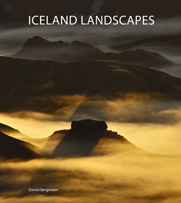
Iceland Landscapes by Daníel Bergmann

Book Review

in Book Reviews , Wednesday, July 27, 2011

“The North begins and ends with Iceland” - Marco Paoluzzo

There are a lot of photography books on Iceland and Icelandic landscapes in particular. They’re split, pretty much, into several categories: books by Icelandic photographers that are never seen outside of Iceland, but are ubiquitous in their homeland. “Lost in Iceland” by Sigurgeir Sigurjonsson is a good example. Then we have books by foreign photographers, which are never seen in Iceland, but in some cases are quite ubiquitous outside of the country. Interestingly black & white Icelandic landscape photography books, are, as far as I know, a uniquely foreign category.

And then we have Iceland Landscapes by Daníel Bergmann.

Db IL cover

Daníel is without a shadow of a doubt Icelandic, but thanks to time he spent outside of the country, he’s had something of the experience of discovering Iceland as a foreigner, and this gives him something of a mixed perspective. He is able to see the country at a remove, while at the same time knowing it extremely well, with the result that he’s able to bring something new to a rather over-crowded field.

Iceland Landscapes is, I think, his 5th published book, but it is the first that really focuses on the landscape. It’s beautifully printed and presented, and includes a foreword by British photographer David Ward. This is very appropriate, because Daníel’s approach is well in tune with Ward’s “Landscape Within” ethos, as well as his discrete but strong spiritual undertone.

One thing that stands out for me is his response to and treatment of light. He prefers the subtle approach, and often goes for quite muted light, and avoids the sometimes ghastly “Velvia tones” so characteristic of a sector of the landscape community, as well as the heavy-handed contrast treatments so beloved by the Flickr crowd.

In general he tends to avoid the more over-photographed locations in Iceland. In particular I’m think of the coastal area to the west of Vik, which has really been done to death - although he has included a couple of beautiful scenes from there. But the most successful shots tend to be from well off the beaten track, perhaps not so much because they’re unknown, but perhaps more because they communicate a stronger connection to the land.

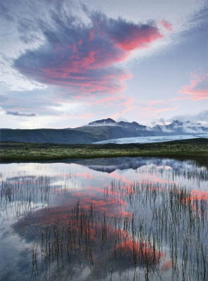
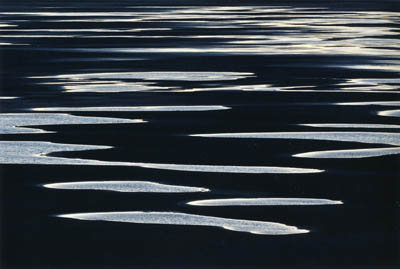
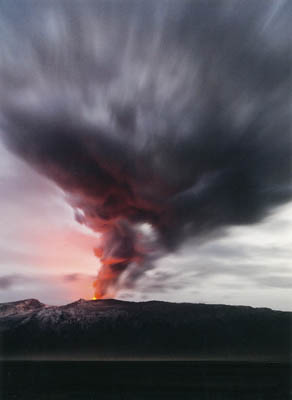
There are many outstanding photos, but here’s a small selection of my current favourites (which I hope doesn’t break “Fair Use” copyright rules!).

Db skaftafell

Skaftafell © Daníel Bergmann


Db leirur 400

Leirur © Daníel Bergmann


eyjafjallajökull

Eyjafjallajökull © Daníel Bergmann

“Iceland Landscapes” is at completely the other end the spectrum to “Terra Borealis” by Marco Paoluzzo, which I reviewed last week. But they’ve one special thing in common: they avoid the hard sell, the dramatic-but-cheap shot, but instead slowly draw you in to the worlds they create.

I think it’s obvious that I highly recommend “Iceland Landscapes”. You can get your own copy directly from Daníel Bergmann, or apparently it’s available in Icelandic bookstores and tourist shops.

The North, as well as a lot of other things, does indeed begin and end in Iceland. For me it’s been too long…

Disclaimer: In fairness I should mention that I’m happy to count Daníel Bergmann as a good friend who I’ve spent too little time with. But I’d be as positive about this collection of photographs even if my worst enemy had published it.

Posted in Book Reviews on Wednesday, July 27, 2011 at 10:17 PM • PermalinkComments ()

Terra Borealis, by Marco Paoluzzo

a book review

in Book Reviews , Thursday, July 21, 2011

A couple of years back, I reviewed Marco Paoluzzo’s book about the Faroe Islands, Føroyar. This followed on from his other “Arctic series” books, Iceland and North/Nord. Finally, he has put together his magnum opus, Terra Borealis, with photography from Iceland, Greenland, the Faroes, Svalbard and Norway.

Terraborealis1

Hvitserkur, Iceland: the cover photo of Terra Borealis. Photo © Marco Paoluzzo.

Terra Borealis has been out for about 6 months (and Marco was kind enough to send me a PDF proof over a year ago), so I’ve been a bit slow to write about it. Meanwhile it has been getting good reviews in various publications, and is currently being promoted on the site of the well recommended photo book retailer, Beyond Words. So this is old news.

Marco Paoluzzo is far from the typical landscape photographer - in fact I doubt he’d describe himself as that at all - even if landscapes figure large in his work. He has much more of a reportage view of the world, and is equally fascinated by the human presence in the landscape, or indeed shaping the landscape, as the place itself. He doesn’t photograph people very much, at least not in the Arctic, but he doesn’t shy away from the worst excesses of environmental damage, for example at Barentsburg, Svalbard. In this he reminds me a little of Edward Burtynsky, but less formal. He also shows a fascination with how man has managed to survive and prosper even in these harsh climates, not only in the more obvious Inuit communities, but also severe concrete constructions like those found in Kirkenes.

However, landscape, or perhaps better, “place”, figures very strongly. Since he uses only black and white, and generally avoids the heavy contrast, long exposure style of others such as Josef Hoflehner, this is almost a “decisive moment” approach. It’s certainly very individual, and may not appeal to the general landscape audience. It’s also in stark contrast (ha!) to the highly colorful Iceland “standard” style piled high in Keflavik airport - or indeed found all over Flickr. And it’s all the more refreshing for that.  Terra Borealis is a book that requires, and rewards, a certain degree of engagement and time.

Personally it has a style which resonates with me, even if I’m no black & white photographer. There are strong undercurrents of wonder mixed with ironic humour, and more than a degree of quiet romanticism. Paoluzzo’s photography doesn’t grab you by the throat, it just invites you to contemplate for a while.

My personal favourite is from the back of the dustjacket. It’s a shot taken from a ship cruising up the west coast of Svalbard, and typically, Marco has framed the wild, empty landscape using the ship’s structure, and as you look, you become aware of the coffee cup tucked away in a corner, and just become part of the scene.

Terraborealis2

Svalbard, observed. Photo © Marco Paoluzzo.

I don’t know where he can go from here with his Arctic series. Russia maybe ? But as you can see from his web site, he has plenty more tales to tell.

If you’ve got a bit of the Arctic in your soul, you need this book.


Posted in Book Reviews on Thursday, July 21, 2011 at 06:41 PM • PermalinkComments (5)

George Barr: Why Photographs Work

A review and a bit of a rant about film

in Book Reviews , Wednesday, May 25, 2011

I’ve recently finished reading George Barr’s book, “Why Photographs Work”. It features 52 photographs selected by the author, along with an essay on what makes that particular photo tick, in the author’s opinion, as well as an explanation from the photographer, and biographical and technical details. It’s a good format, and the book is well laid laid out and printed, and enjoyable to read. Good value for money, and highly recommended (and you don’t just need to take my word for it).

Gbarr1

The book emphasizes photographs over photographers, and this is sometimes evident in the selection of the photos. The cross-section of photographers represented is wide, from well-known to so far unknown artists discovered through recommendation and web browsing. The choice of works from photographers I’m familiar with - Michael Kenna, David Ward, Charlie Waite, Joe Cornish, for example - is far from obvious, and not necessarily representative of their general oeuvre. The point is not to introduce the photographer, as such, and this approach adds to the general attractiveness of the book. The range covers pretty much all of the thematic areas of photography, with maybe a slight bias towards landscape.

You can find a sample of the book here.

And now for a bit of digression…

One thing that really stands out for me though is the number of photos taken with film: some 37 out of 52. This can be explained to an extent by the fact that a good proportion either pre-date digital, or come from the in between period of the first part of the last decade, but then again as far as I know the date of the photo was not a criteria. Within these 37, the overwhelming majority are taken with large or medium format cameras, with very little 35mm in evidence. So, is the reason for their selection the fact that George Barr responds to a particular look characteristic of larger film formats? Or is it something about film, and film cameras and processes which appeals to the photographers he likes? Or is it evidence that film is far from dead? Certainly there seems to be a discernible growth in interest in film photography these days: the latest issue of Amateur Photographer is just one piece of evidence.

Maybe it’s down to economics. Maybe there is no way on Earth that most large format photographers could afford an equivalent switch to digital. Or perhaps some aspects of digital discourage creativity, leading to a lack of inspirational photography produced on these devices? For example, what happens to the mysteries and delights in the balance of light and shadow when you have the enormous dynamic range of the latest Phase One back? You get some very impressive technical feats of recording extreme scenes, but at the cost of substituting reproduction for interpretation. It is in danger of becoming aesthetically uninteresting.

Then again, in these days of digital processing, it is very difficult for me at least to look at a photo on the web or printed in a book and say that it is film or digital. And frankly I think most people who say they can tell are talking rubbish. The clues do exist, but they’re subtle, and require a trained eye and a lot of patience.

So perhaps it comes down to process. Perhaps, fundamentally, film is more fun and more rewarding.


Posted in Book Reviews on Wednesday, May 25, 2011 at 11:07 PM • PermalinkComments (8)
Page 8 of 11 pages ‹ First  < 6 7 8 9 10 >  Last ›