photoblogography - Just some stuff about photography

Capture One for iPad

drop the laptop?

in Post-processing , Tuesday, February 28, 2023

I very much like the idea of CaptureOne on iPad. I participated in the Beta program, but at its conclusion, I could not see any immediate scenario where it would be of use to me. However, recently I decided to see how it could work for me in a real world scenario. I’ve just returned from a 10 day trip to Iceland, for which I did not take a laptop, just my iPad Air. I installed CaptureOne, which the idea that it could perform the following tasks:

- image ingestion
- quick quality check
- rough, indicative edits
- export to sharing services (Apple Photos, WhatsApp)
- image backup to SSD

I used three cameras, Olympus OM-1 (mainly), Ricoh GRIII, and Ricoh GRIIIx.

Overall this was successful. However, for now I will be pausing my subscription. There is no single reason for this, just a combination of things, as I will explain.

Starting with ingestion, when it works, it works absolutely fine. When connecting a camera via USB-C, I could either select the camera as a source, or go via the file system. Selecting the camera was better.  One very nice feature involved the OM-1: here I used the two card slots in parallel mode, recording to both at the same time. While Files saw both SD cards independently, so duplicating every file, Capture One presented single copies for import. The import screen also arranged files grouped by day, which allowed me to very quickly select and import the day’s work. Also, files already imported are recognised, and the app asks if I want to reimport or not. There was a glitch though: when plugging in the camera, I could only make it appear in Capture One’s browser by quitting (swipe up) and restarting the application. Even then sometimes it did not appear, and even when it did, it would appear for a moment then vanish. I had to perfect a technique where I would connect everything, restart Capture One, then as quickly as possible select the import source.  Once selected the connection never dropped.  I have no idea if this is an iOS or Capture One issue.  Also, I had a card reader with me, and I could not get Capture One to recognise this as a source, although it worked on initial testing before the trip.

After ingestion, Capture One presents the files under “Latest Import”. This makes it easy to select them, filter for raw files only, and move them to a dedicated Collection.

So, generally ingestion works very well, but the connection issues were frustrating and lost me considerable time.

Coming to quality checking, this is generally satisfactory. I can easily browse and select images, zoom in and out, view a histogram, all I need to do. Exposure warnings would be nice. However one issue I repeatedly encountered was that I could not fully move around an image when zoomed in, only a part of it. This was irritating. Still, I could very quickly verify critical issues such as focus, exposure and composition.

Capture One for iPad provides a basic set of image manipulation tools on a single layer only. Tool panels inherited from the desktop version included Exposure, HDR, Details (sharpness etc), basic Colour, and a few rather random things like Clarity and Dehaze. It’s limited but it’s enough for a quick sanity check, and to prepare initial versions for sharing. The Basic Characteristics panel is missing, which, given its name, I would have thought would have been a rather, er, basic feature, and of course there are no layers. The Curve and Levels tools are absent. There is a clumsy workaround if you own a desktop version of Capture One: you can create a style settings unavailable on iPad, and import it. Since the underlying engine does appear to be complete, this works.  So for example I created a couple of styles with generic Luma curves, which allowed me to get a rough idea of how my standard approach to editing on desktop would work.

So, rough, indicative edits, yes, but I’d throw everything away and start again on desktop, so the one-way cloud sync is currently useless to me.  Even if it was not, over 10 days I exceeded the 1000 image limit.

There was one strange glitch when editing images: after selecting an image, going to full screen, and then back to tools view, a strange sort-of-floating-but-fixed tool panel appeared, with a single button (apparently a shutter butter simulation) and a little cog wheel, I assume for settings. I assume, again, that this has something to do with tethering, but neither button was responsive, and the panel could not be dismissed, and blocked part of the film strip. It could only be dismissed by restarting the app, and it soon reappeared soon after. Quite irritating but I got used to ignoring it. Capture one might consider hiring a test engineer…
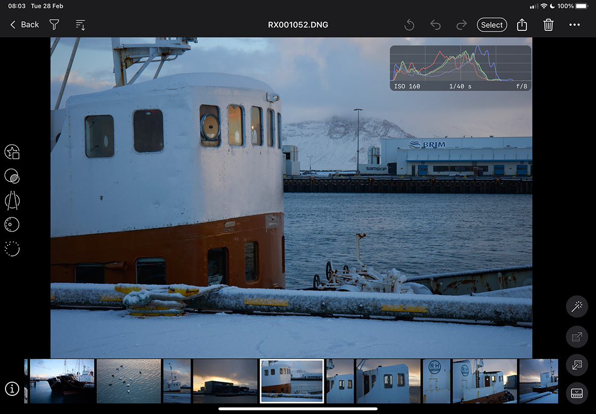
before appearance of the strange panel…
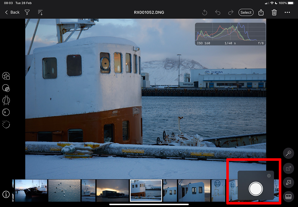
... and after appearance of the strange panel

Moving on to exporting, here it was again a case of “when it works, it works well”, but otherwise, very frustrating. The problem here is not in design, which is very intuitive, but in execution: I could never get more than 4 images to export at once. Sometimes only 3 worked. So before I realised this, I would select, say, 20, share to Apple Photos, and only 4 would turn up.  Not necessarily the first 4 in the selection, either.  There was no indication of any failure from Capture One. So I had to resort to 4 at a time, and since the initial preparation for export is quite lengthy, this was again time consuming and frustrating. Is this an iOS issue or Capture One, or a combination of both? I don’t know and frankly I don’t care. It should just work, and if there is a failure, I should be informed.

Finally, image backup. This works just fine. Possibly going via the Share function is not 100% intuitive, but having done that, I select “originals” as filetype, Files as destination, navigate to the external SSD, and execute. In this case there is no issue with the number of files, unlike sharing to Photos.

Overall, and despite the glitches, Capture One for iPad is a pleasure to use. Personally I really like the UI. I guess in order to fit in well with general iPad / iOS design principles, the app feels a little more modal than the desktop version, so there is a more explicit switch between “catalog mode” and “edit mode”, but this is fine.

But as a travelling landscape / nature photographer, I get the feeling that my “user scenario” was not high up on the list of product management priorities. I’m not actually all that bothered about editing in the field (but if I was, Capture One for iPad currently would fall short). I can’t properly edit on the move on an iPad, or even on a laptop, for that matter. Editing for real happens in my home office controlled environment. What I would really like to be able to do in the field is keywording and metadata editing. Capture One doesn’t offer that at all, but it isn’t alone in completely neglecting that aspect.

I could also happily use Capture One for iPad at home, away from my desktop, for tasks like keywording and triage, but then I would need proper two-way sync and less restrictive sync limits.

Capture One for iPad worked ok for me in Iceland, and liberated me from having to cart a laptop around, but having returned home, I really have no further use for it for now. So it makes no sense to continue the subscription. The cost is not unreasonable for something I would use regularly, but if I have no use for it, it is a waste of money. And it all adds up. I do strongly believe that it should anyway be included in a subscription, if not bundled with a perpetual license.


Posted in Post-processing on Tuesday, February 28, 2023 at 11:01 AM • PermalinkComments ()

True Colours

roses are blue, violets are green

in Post-processing , Friday, April 23, 2021

Colour is a funny thing.  Online forums and photo geek sites are full of self-appointed experts droning on about “color science” and generally talking total rubbish. For a start colour perception is both physically and culturally subjective. Our eyes are all slightly different, and our brains process signals in slightly different ways. The naming of colours is subjective in various ways. What I call dark orange somebody else might call red. And the colour I see with my eyes is often different to the colour I see on my camera or computer screen. And let’s not even get into prints.

So, buying a Hasselblad X1DII because it captures “more accurate colour” was possibly not the best idea I’ve ever had. Of course, Hasselblad has its vaunted “Hasselblad Natural Colour Solution”, which “was developed for serious users who demand the utmost colour accuracy”. But accurate in which sense? Maybe to a reference colour chart, which is all well and good, but it doesn’t help me much if I’m partially colour blind (I don’t believe I am, but who knows?)

Generally I don’t have too much issue with colour accuracy. In fact I’m more concerned with colour gradation. But there is one area which has always intrigued me, which is how cameras see flower colour.

Way back I had big issues trying to photograph poppies with my Olympus E-1, reported in one of my earlier posts on this site. Over time I’ve noticed that colours that to me visually are in the pink to magenta range come out blue. Some shades of yellow, such as wild primula, come out almost white.

So, I thought I’d do a little test on my thriving wisteria. To my eyes, the flowers are shades of lilac and purple, with some white and yellow tints. But on screen, in photographs they tend to come out more blue. So, I thought I’d see what the Hasselblad Natural Colour Solution would make of this. I lined the X1DII up on a firm tripod, then switching it for the 3 other cameras I use, the Olympus OM-D E-M1 Mk3, the Ricoh GR II, and the Sigma dp0. I used the 45mm f/3.5 lens on the X1DII, and the 17mm f/1.2 on the Olympus, these both closely approximating 35mm in reference terms. The GR has a fixed lens approximating 28mm, and the Sigma’s lens approximates 21mm.  I’m only really interested in colour here.  So, I loaded all 4 into CaptureOne, with minimal processing (the Sigma and Hasselblad images were converted to 16 bit TIFF via their respective proprietary applications. For the Ricoh and Sigma I tweaked zoom levels to get a rough match.

Wisteria test

Top row: Ricoh, Sigma. Bottom row: Olympus, Hasselblad

Well, the results are a bit disturbing. Of course you can’t really see a lot here, but from my subjective standpoint the best of the bunch at rendering the flower colours is actually the Olympus. The Hasselblad is close, but particularly in lighter areas in shifts towards blue (see on the left, and top right). The Ricoh is not bad, but a little under-saturated. The Sigma is in a world of its own, although if you look a detail rather than colour, it makes things a little awkward for the Hasselblad.

Maybe my eye/brain combination has some trouble distinguishing certain shades of blue? I don’t know, but on this unscientific and very specific sample, the Hasselblad Natural Colour Solution doesn’t score a home run.

Posted in Post-processing on Friday, April 23, 2021 at 05:33 PM • PermalinkComments ()

Losing faith in Lightroom

flip / flop / flip / flop etc

in Post-processing , Wednesday, December 16, 2020

At various intervals over the years I’ve questioned if I’m using the best approach to managing and processing my digital image files. As covered ad infinitum in previous posts, my tool of choice was Apple Aperture, but that rug was pulled from under my feet by the bling-flingers in Cupertino.  I eventually settled on Lightroom, with some misgivings, and have grown to accept it as the best compromise. It even has some unique features which I really like, in particular the “lights out” display mode, which is excellent for evaluating processing results, as well as for triaging photos without distractions. On the other hand, the UI is ugly, and the processing engine is based on the will of senior Adobe engineers to make everything look like it was produced by a badly calibrated 1 Hour (film) processing lab, with saturation turned up to 100. I spent a lot of my time in Lightroom fighting against under the hood saturation and contrast changes.  But, it was the best compromise.

Then came Lightroom Classic v10: from the beginning, this was not good. There were very noticeable performance slowdowns and UI glitches which made it very irritating to use. See all 9 pages (so far) of this thread, started on October 22nd. Adobe, with all their vast resources, eventually pushed out a version 10.1, which not only failed to solve the initial problems, but introduced a new “feature”, namely allowing Lightroom to quickly, completely and reliably freeze the Mac it is running on, requiring a power off reset to restore things - almost unheard of in the Mac world.  And to make things worse, they were warned about this beforehand, and therefore released this version in full knowledge that it contains this disastrous flaw.  It seems this flaw is linked to GPU processing: now, it may be true that testing for various hardware combinations is a big task (although for less so than for the much more varied Windows world), but other much, much smaller companies seem to have managed just fine (CaptureOne, DxO, Exposure for example).

I suppose Adobe will eventually fix this - although to be honest I’m not 100% confident - and there does remain the workaround of reverting to v9.4 (while sacrificing 2 months of editing and processing), or sticking with the sluggish performance of v10.0.  But as a subscriber I’ve had enough of this. Adobe are showing themselves to be an untrustworthy partner, and their support staff are condescending and arrogant.

For the most recent photo diary I published, The White Arcades, I had almost finished processing the photos in Lightroom, as usual fighting against the application’s obsession with making everything look garish.  But given the above, I decided to dust off CaptureOne, and, what the hell, try to import my entire Lightroom catalog of over 80’000 photos. Well, it worked pretty well. It took a few hours, and some files would not import (some DNGs, and of course Hasselblad Raw), but otherwise fine. I then reworked the photos I’d chosen for The White Arcades. Thanks to a combination of CaptureOne’s linear profile and luminosity curve, I actually managed to quickly get the look I wanted. Some of the more sophisticated display options in Lightroom are not in CaptureOne, and yes, the DAM functionality is not quite as good, and no, CaptureOne doesn’t have Adobes’s excellent stitching tool. But it is smooth and reactive, it has a non-modal UI, and it doesn’t crash my Mac. I’ll have to use Phocus for Hasselblad files, but’s not such a bad thing.

Long term I’d prefer not to be trapped in Adobe’s subscription dungeon, but while it was giving me a good set of tools I was ok with it.  Now Adobe has lost my trust.  Eventually completely cancelling my subscription is not something I’d do as an act of revenge - they wouldn’t even notice - but just one of self interest.

Posted in Post-processing on Wednesday, December 16, 2020 at 01:26 PM • PermalinkComments ()

6000 sow’s ears

...and not a silk purse in sight

in Post-processing , Monday, October 05, 2020

I enjoy taking photos. Seeing the world through a viewfinder, and cutting out pieces of it to copy and keep gives me a sense of accomplishment. Maybe it even makes me happy (my default state being “miserable old git”).

The rest of it… I don’t know. The long, long process of trawling through memory card contents, discovering that expected gems are out of focus junk, and the possibly good stuff I can’t even remember taking, the endless work of turning a Raw file into an actual finished photo, the doubts about my aesthetic choices, about my software choices, about comparing my flaccid shots with others’ effortless contest-winning masterpieces, this is not so much fun.

I actually prefer editing and working up film photography - with film, especially slide film, it is what it is, the choices were made when the shutter was pressed, and I find scanning film to be somehow more of a tangible activity than importing a memory card.

This pressures me to try to reduce the amount of photos I take in the field, but in some situations, not taking the shot isn’t really an easy option. A case in point, and the point of this post, is my most recent trip to Antarctica. Ok, it was actually 2 weeks in-situ, which is a long time, and the conditions were largely pretty good. The opportunities were endless, and to my horror I came back with about 6300 shots. Ouch.

If I have any wish to share anything of this harvest, even if it just to post a few galleries here, clearly I need to narrow things down. Quite a lot. This already presents a problem, because often the real quality of a photo cannot be told from a quick look at the default representation of the Raw file in Lightroom (in the old days, I could use Aperture’s much more elegant handling of Raw-JPEG pairs for a first pass - Lightroom doesn’t provide any help there).  But anyway, I managed select 1376 potential candidates without doing any kind of adjustment.  I then settled into the long process of examining and adjusting each and every one of these, finally, after months, ending up with 573 second round candidates.

From these I should now make a final selection, and start to do productive things like post subsets online. I might even make a book.  But for now I am so sick of ice and penguins…

Drm 20200128 P1286011

Me, after dredging through over 6000 self-indulgent snaps

There’s got to be a better way.

Posted in Post-processing on Monday, October 05, 2020 at 04:20 PM • PermalinkComments ()

Software

displacement activity I

in Post-processing , Tuesday, December 11, 2018

I’ve recently been going through some kind of phase where I’m reassessing a lot of my work. Initially this was on an aesthetic level, but somewhat inevitably technical considerations started to intervene. First of all, I have been trying to get a little more disciplined in my picture making. Although I like to think that I’m pretty much on top of the basics of using a camera, I have tended to be a little indisciplined in how I apply this knowledge. This then leads to, for example, photos with too much, or too little depth of field, because I was too lazy to think about optimising aperture. It all came about when I started to make prints of some of the recent series of woodland photos I’ve been making. In turn this led me to making a number of “test” prints (to be perfectly honest, I probably don’t make any other kind). And so I noticed that the colour in these prints was actually a bit weird, and so _then_ I just had to re-profile the paper, which more or less fixed the issue, but used up all my supplies. And left me wondering how my previous carefully created profile had “gone bad”. And off we go again.

Untangle II

“Untangle I” - the photo that led me to re-evaluate my printing

Or not - prompted by an article I saw recently, I wondered if maybe it might be a good idea to revisit ImagePrint by Colorbyte Software. I used to use ImagePrint with my Epson 2100 printer, but when this died, and some 8 years ago I splurged on an A2 Epson 3800, I would have had to upgrade my ImagePrint license, and I couldn’t afford it. So I bought a Pantone ColorMunki Photo kit instead, which allowed me to profile any printer paper I wanted. Of course this was not the only option: many paper manufacturer profiles are actually more than close enough, and if they’re not, various service providers can create custom profiles for a given paper and specific printer. But of course I wanted to do it all my own way, and now I think about it, I’ve gone through at least 3 printer profiling setups over the last 15 years or so, none cheap.  And in fact even with dedicated software and hardware, colour science, which this is an application of, is seriously hard and time consuming, apart from being a money drain.

ImagePrint on the other hand does absolutely everything for you. It includes a custom print driver which brings a number of tangible benefits, from more accurate colour to saving paper, and a huge library of expert print colour profiles tuned not only to printer/paper combinations, but also to different lighting conditions. The basic point of ImagePrint is that it offers 100% reliable, plug & play highest quality printing. So you can just forget about all the technical complexities and just enjoy the creative part. This to me is quite enough to justify the fairly high price, but on top of that there are myriad additional features which offer significant advantages in various printing scenarios.  So I renewed my license for the latest version, “ImagePrint Black”, and ever since I’ve been printing a lot more, with no test prints required.

That solved my output problems. Next up was the input. I had been working on a set of photos recently for my 2018 calendar, and revisiting these I noticed that one of them was not quite right. This was a photo of an iceberg, which look fairly spectacular, but after I printed it (see above) I realised it was all a bit too, well, blue. So once again a trip down the rabbit hole of Raw conversion software beckoned. I decided to download a trial of the latest version of Capture One, v11 (now they’re on v12), and opened a few iceberg photos. One of them, not the one that had initially sent me into a spin, really shocked me: Capture One appeared to be showing textures completely missing in the Lightroom interpretation, and better fine detail as well. I cross-checked in Exposure X3, and in Iridient Developer, and the variation across these gave me the clue I needed to narrow the gap - it was simply a case of reducing the exposure, which in Lightroom seems to have a complex relationship with brightness. The much more involved Capture One default processing had, in this case, given better results.  As for the fine detail, well, there, at least with Olympus ORF files, the current iteration of Lightroom cannot match Capture One, or indeed the new Exposure X4. Both extract more real detail, although frankly only us pixel peepers would notice in almost all cases. But this comes with a price with Capture One, as any kind of noise reduction coupled with sharpening gives a horrible plasticky effect in recent ORF files. This is nothing new - I noticed it with v8 and it was just that made me decide to give up fighting and submit to Lightroom for once and for all.

Drm 20161203 PC030310 IridientEdit 3

“float” - the photo that used to be far too blue

However, Capture One has another major card up its sleeve, at least for me: the luminance curve. In Lightroom pretty much any change to contrast, by direct slider or by curve, has a major effect on saturation as well. Apparently this is by design, and it is stubbornly maintained, but personally I hate it. You can compensate by reducing saturation and/or vibrance, but first, this is imprecise, and second, why the hell should one need to? This naturally led me to the realisation that I should just be more disciplined with applying a previous strategy: do the Raw conversion in Iridient Developer, which is far less heavy handed, has not only a luminance curve, but also a chroma curve, and delivers the best detail and sharpness of all, then do the rest in Lightroom. Iridient even includes a Lightroom plug-in to facilitate all of this.

So, after this bit of re-evaluation, I have ended up with a software end to end process (I’m not going to call it a “workflow”, this is fun, not work) which drags the absolute best of my pitiful 16 Mpix sensor camera, and starts to approach the delicacy I’m always aiming for in colour and colour transitions.  Having got those variables out of the way, I can now concentrate on choosing the correct f-stop.

Posted in Post-processing on Tuesday, December 11, 2018 at 09:20 PM • PermalinkComments (1)
Page 1 of 2 pages  1 2 >