Sidetracked, again
quiet round here, innit?
in Site Admin , Sunday, October 02, 2016
Recently, for whatever reason, there has been a noticeable increase in the number of visitors here (UPDATE - this might have something to with it). This coincides with a major drop in my posting frequency, which is unfortunate. So I thought maybe I should explain.
Earlier this year, around April, I asked a person whose opinions I respect for some feedback on my website. The outcome wasn't the glowing praise I hoped for, and in particular the observation that "it's a bit stuck in time (2000 to be exact)" stung a bit.
So I decided to redesign it. And, of course, I bit off far more than I could chew. In theory it should take me two weeks or so to do a redesign, but in practice, I have about 6 hours a week from which I could take time to do it (and that 6 hours also includes photo editing, keeping my computer working, lounging in front of the TV, or generally collapsing on the couch after yet another fabulous 12 hours away at the "day" job). On top of that, the publishing software I use was urgently in need of upgrading to a newer version. Any upgrade of Expression Engine is a bloody nightmare, but this time practically every plug-in I use broke as well, so it took about 1 month elapsed time to sort that out.
I then realised that a long history of quick fixes and "improvements" to my existing code had made it unmaintainable. So that needed to be cleared up. One more month passed by.
Then I could start thinking about how to redesign the site. So, I tried looking at a few other sites for inspiration. Not much luck there - the vast majority of photographer's web sites are boring as hell, with exactly the same layouts, "clever" off-the-peg galleries with all the bells and whistles, which do all they can to ruin the viewing experience, and very, very little to encourage return visits. The quality of the photography is irrelevant at this point. I did look at a few website services, bot the only ones that passed even basic requirements for me were Squarespace and Koken, and both those have showstoppers. Woken is one I'm watching for the future, though.
I've also been told that there isn't enough focus here on my photography. Well, ok, good point. So I'm trying to address this in three ways: 1 - improve the accessibility and presentation of existing content, 2 - improve my curation, 3 - introduce a completely new channel for more ephemeral collections, called "Photo Diary". Oh, and put some emphasis on my very short list of publications. Unfortunately all of that is a lot of work.
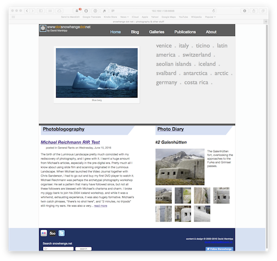
So, now, at the start of October, I have more or less completed the structure, and I'm working on the graphic design. Below is a snapshot of what the new front page looks like, right now. I've no idea if it will stay that way, or if it will ever come to light. So that's why I've been quiet recently.

Anyway, it's only photography. And barely that, really.
Earlier this year, around April, I asked a person whose opinions I respect for some feedback on my website. The outcome wasn't the glowing praise I hoped for, and in particular the observation that "it's a bit stuck in time (2000 to be exact)" stung a bit.
So I decided to redesign it. And, of course, I bit off far more than I could chew. In theory it should take me two weeks or so to do a redesign, but in practice, I have about 6 hours a week from which I could take time to do it (and that 6 hours also includes photo editing, keeping my computer working, lounging in front of the TV, or generally collapsing on the couch after yet another fabulous 12 hours away at the "day" job). On top of that, the publishing software I use was urgently in need of upgrading to a newer version. Any upgrade of Expression Engine is a bloody nightmare, but this time practically every plug-in I use broke as well, so it took about 1 month elapsed time to sort that out.
I then realised that a long history of quick fixes and "improvements" to my existing code had made it unmaintainable. So that needed to be cleared up. One more month passed by.
Then I could start thinking about how to redesign the site. So, I tried looking at a few other sites for inspiration. Not much luck there - the vast majority of photographer's web sites are boring as hell, with exactly the same layouts, "clever" off-the-peg galleries with all the bells and whistles, which do all they can to ruin the viewing experience, and very, very little to encourage return visits. The quality of the photography is irrelevant at this point. I did look at a few website services, bot the only ones that passed even basic requirements for me were Squarespace and Koken, and both those have showstoppers. Woken is one I'm watching for the future, though.
I've also been told that there isn't enough focus here on my photography. Well, ok, good point. So I'm trying to address this in three ways: 1 - improve the accessibility and presentation of existing content, 2 - improve my curation, 3 - introduce a completely new channel for more ephemeral collections, called "Photo Diary". Oh, and put some emphasis on my very short list of publications. Unfortunately all of that is a lot of work.
So, now, at the start of October, I have more or less completed the structure, and I'm working on the graphic design. Below is a snapshot of what the new front page looks like, right now. I've no idea if it will stay that way, or if it will ever come to light. So that's why I've been quiet recently.

Anyway, it's only photography. And barely that, really.
