photoblogography - Just some stuff about photography

Toscana Variations 2

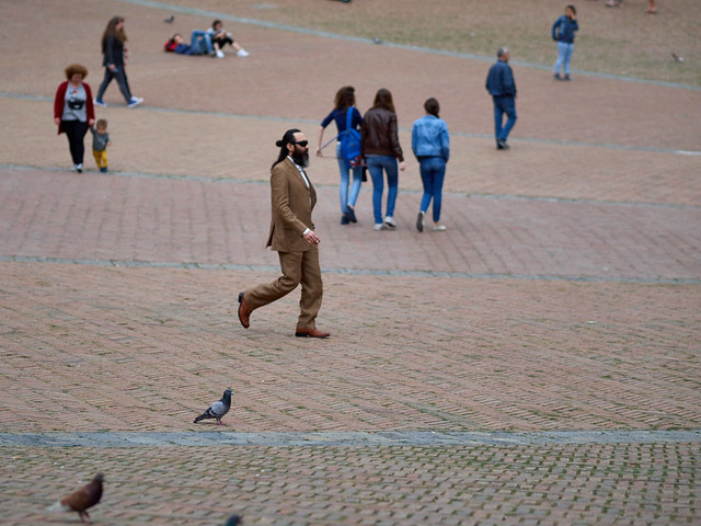
the people phase

in Photography , Friday, May 22, 2015

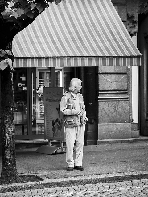
Just a few stolen shots wandering around the streets of Siena and Asciano. I’m surely no Cartier-Bresson. Although maybe if I convert to black & white, add a black frame, and start banging on about the gorgeously poetic lusciousness of Fuji cameras then maybe I’d get closer. But that sounds like far too much hard work.

drm_2015_05_17_P5172413
drm_2015_05_16_P5162301
drm_2015_05_16_P5162337
drm_2015_05_16_P5162330
drm_2015_05_16_P5162322
drm_2015_05_17_P5172414

Olympus E-P5, 17mm and 75mm lenses.

Posted in Photography on Friday, May 22, 2015 at 07:03 PM • PermalinkComments (2)

Toscana Variations

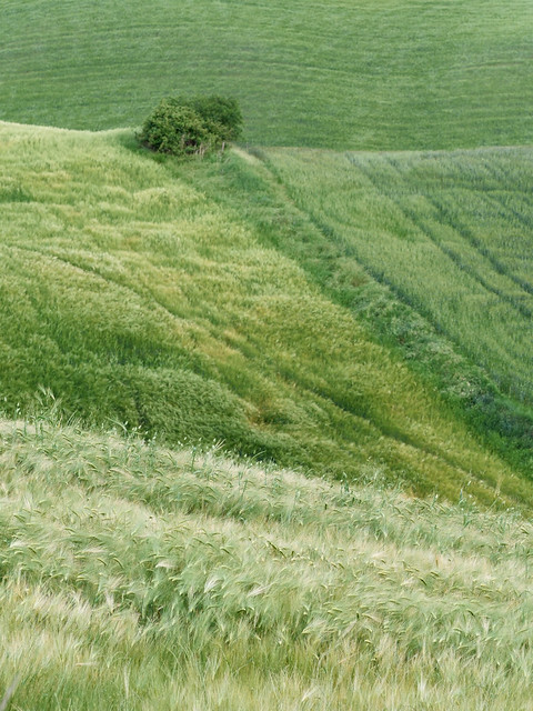
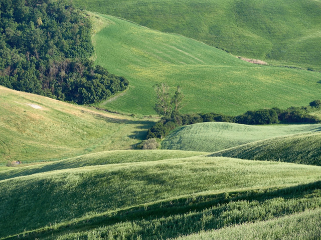
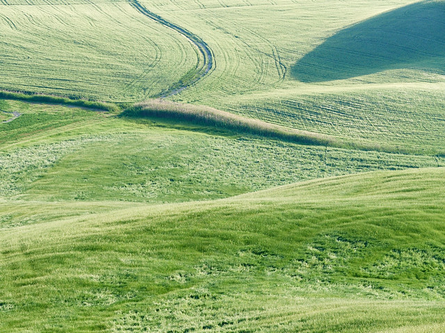
the green phase

in Photography , Wednesday, May 20, 2015

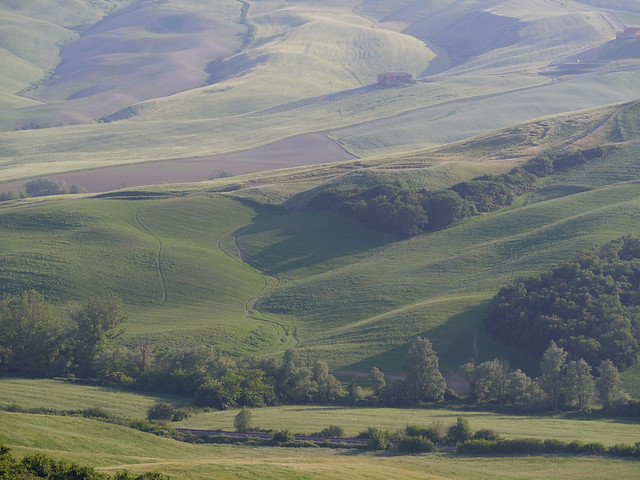
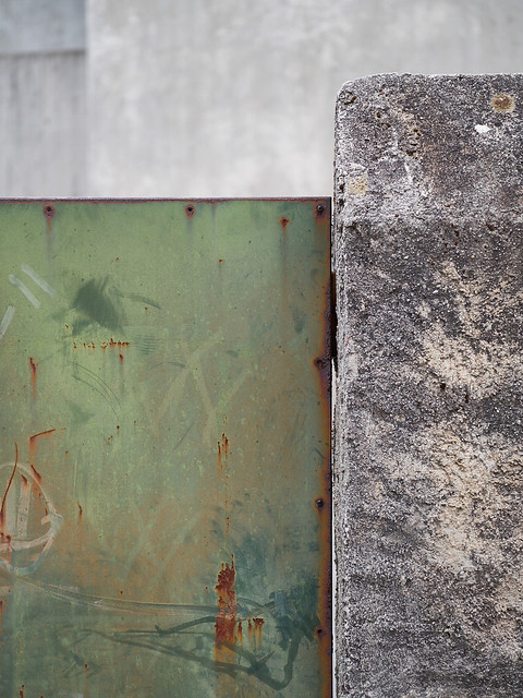
Following this year’s annual indulgence at our home from home, Casa Bolsinina in Tuscany, my archive of Tuscan photography has grown still further. Having finally managed to put together something a little bit substantial, in the shape of my Blurb book “Primavere Toscane”, I didn’t feel much pressure at all to photograph this year, and spent more time cycling. Well, that and eating and drinking. But one cannot live by food and exercise alone, so some photography had to be done. I had a vague idea of trying to forsake the big picture(s) for detail and abstractionism this time. As a vague idea, it produced vaguely interesting results, but only to the extent of demonstrating that simple isn’t easy.

Anyway, here’s a first set. Maybe there’ll be more. Maybe not.

drm_2015_05_16_P5162360
drm_2015_05_15_P5152214
drm_2015_05_17_P5172426
drm_2015_05_17_P5172434
drm_2015_05_17_P5172435
drm_2015_05_17_P5172423

All taken using an Olympus E-P5 and 75mm f1.8 lens.

Posted in Photography on Wednesday, May 20, 2015 at 10:59 PM • PermalinkComments ()

Random Walk

point & shoot

in Photography in Ticino , Friday, May 08, 2015

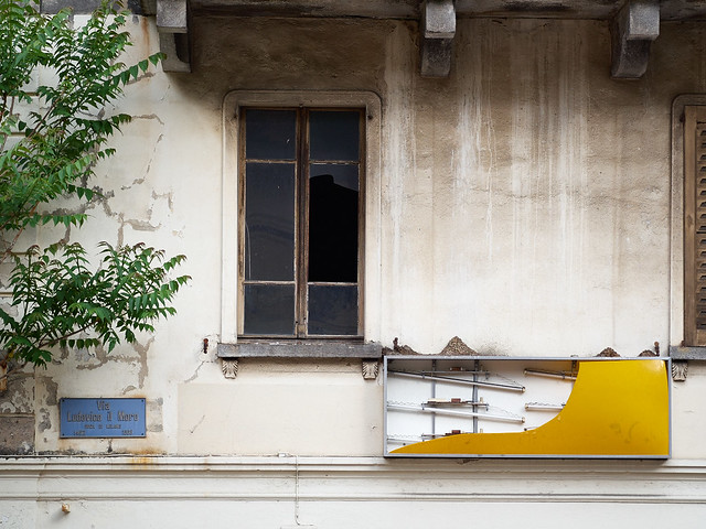
Just a quick burst of random photography walking to work through Bellinzona, Ticino, one random morning in May. No plan, no preconceived idea, and very little time. Just point, and shoot. It’s probably something I do two or three times a week, and forget about. But for some reason this little set said “publish me”. So here it is.

drm_2015_05_05_P5052161
drm_2015_05_05_P5052163
drm_2015_05_05_P5052156
drm_2015_05_05_P5052154
drm_2015_05_05_P5052152
drm_2015_05_05_P5052157

And for those who like to know, all shot with an Olympus E-P5 with Sigma DN 60mm f2.8 lens.


Posted in Photography in Ticino on Friday, May 08, 2015 at 07:56 PM • PermalinkComments (1)

Primavere Toscane

publishing empire launches today!

in Book Reviews , Wednesday, May 06, 2015

I have an announcement to make: I’ve finally managed to complete a project, and have self-published my first book, on Blurb.

Blurb 001

Still in the plastic wrapper

To be honest, “Primavere Toscane” is a very personal project, and was partly a kind of dry run, in advance of several other ideas I have in mind. It is a slim volume, weighing in at a mere 40 pages. Here’s what I have to say about it:

For over a decade, every springtime has been marked for me by a short visit to an area of Tuscany, just south of the city of Siena. This book is a distillation of hundreds of photos taken over these years, in the same places, and the same time of year.

Hundreds, if not thousands of photo books celebrating Tuscany have been published. The landscape, the towns and cities, the people, the culture, the food, even are richly visual and deeply attractive to photographers. Many of these are strongly biased towards the misty, early morning light, to the classic vistas across the Val d’Orcia, and the golden light illuminating the farmhouses and rolling hills. Certainly I’ve been drawn to these too, and this book does contain a few examples of such scenes. But more and more I’ve been attracted to the stronger, even harsh full daylight, which we landscape photographers are told to avoid. The problem with the morning light, apart from the fact that early morning in Tuscany is usually painfully early in late springtime, is that it ends up showing a very romanticised view, representing only one aspect of the complex character of the region.

I’m certainly not going to claim to do any better at representing all facets of Tuscany, or even the small area within which these photographs are taken, but I do hope to show a personal interpretation rather than replicating the work of celebrated authors.

Blurb 002

I decided to go the full DIY route, creating the layout in InDesign, and preparing the photos myself. For creating the layout, I used JPG proxy images, and then created exact size CMYK versions, sharpened at the output size. It was a lot of work, but the results are good. I chose a hardback format, and heavier Proline paper. Two things came out of that: 40 pages is barely enough to fill out a hardback format, and the Proline paper is nice, but has a degree of print-through, which surprises me. Only a little,but still. For subsequent printing I think I’d select Proline coated. The selection of paper stock is a bit of a pain with Blurb, and they could make it easier. For example, I have a couple of Blurb books by other authors, but I have no way of telling which stock they are printed on. But generally, the Blurb experience is great, apart from one eye-watering detail: the prices. They’re just way too high.

Blurb 005

The photography in the book is a mixture of “normal” and panoramic frames, and was edited down from about 700 shots. It is roughly divided into thematic sections, but these are not labelled. I’ve set it so you can flick through the whole thing on the Blurb site, using their preview tool.

If you get a chance to have a look at the preview, I’d love to hear what you think. I may create a PDF version for download sometime, but that will require a completely revised layout. Blurb’s “auto PDF” generator produces truly abysmal results.

Blurb 006

Wow. I’m a (self) published author now!

Posted in Book Reviews on Wednesday, May 06, 2015 at 10:47 PM • PermalinkComments (5)

A Shift in Perspective

tiltless wonder

in GAS , Tuesday, March 24, 2015

I’ve always found tilt/shift lenses very desirable, or at least shift (or PC, for Perspective Control). I never found the tilt part all that useful, or indeed easy to control or understand. Back when I owned a Hasselblad ArcBody, I had plenty of opportunity to experiment and learn, but that is long gone. The availability of high quality PC lenses is one huge attraction, to me at least, towards the Canon/Nikon world, but I own neither. There are also some very expensive third party lenses from the likes of Schneider available for Canon/Nikon, but again, out of my league. And there are some cheap adapters, which by and large don’t work very well. But generally, these adapter solutions are the only options for my system, Micro Four Thirds - with, however, two exceptions.

Back in the 1980s, Olympus made two PC lenses for the OM system, a 24mm f3.5 and a 35mm f2.8. The 24mm is sought after, rare, and very, very expensive. The 35mm is less celebrated, a little easier to find, and much more affordable second hand. And I found one.

Although PC lenses tend to be used for architecture, in confined spaces, and therefore benefit from short focal lengths, 35mm is still quite useful. However, on a Micro Four Thirds camera, that corresponds to a 70mm equivalent field of view, which might seem less useful. This is mitigated by the fact that Canon make an 90mm TS lens, so it can’t be totally useless, and anyway, nothing was going to get in the way of a serious bit of retail therapy.

Olympus pc lens 001

The best known application of PC lenses is to “stop buildings falling over”. However, there are several other uses. One is creating sets of photographs to stitch into a high resolution composite. By shifting laterally and vertically you can gather a set of images without moving the camera, and with no nodal point or parallax issues to worry about. Another is giving more latitude for composition when using a tripod in an awkward space. For the photo below, the tripod was resting, just, on a jumble of boulders, adjacent to a torrential stream, with very little latitude for adjustment. The vertical and lateral shift allowed me the frame an image I otherwise could not easily (or safely) have captured. I do own a Gitzo Explorer tripod with a fully articulated central column, which is also useful for working in tight spaces, but that has some stability issues, and I still need to get behind the camera in it’s probably precarious position.
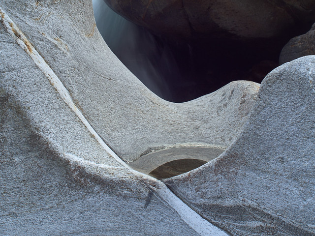
drm_2015_03_19_P3192011

The shift movement on the lens is achieved just by pushing. There’s no lock, no gearing mechanism. It all works by friction. Obviously on a tripod this could be a disaster, knocking the tripod out of place when giving the lens a hefty shove to shift it. But actually Olympus got the level of resistance just right. Enough to hold the position steady, and not so much that you have to push too hard. It helps to make it surprisingly compact and light for a PC lens.

In terms of optical quality, it’s pretty good. No vignetting at full shift, wide open, although on a Four Thirds sensor, only the centre of the lens is actually being “seen”. But even so, the results are impressive. It will be interesting to see what photos taken with it on my OM-4Ti look like. The lens is also beautifully built and just demands to be fondled. And what better retail therapy can there be?

Posted in GAS on Tuesday, March 24, 2015 at 09:41 PM • PermalinkComments (1)

Page 5 of 11 pages ‹ First  < 3 4 5 6 7 >  Last ›