photoblogography - Just some stuff about photography

Carry that weight

but not quite so much

in GAS , Sunday, November 06, 2016
A couple of years ago, I went off for a 5 week trip around Argentinian Patagonia and Tierra del Fuego, fitting in a 12-day cruise around the Antarctic Peninsula. Apart from the fact the the photos from that trip, in particular those from the Argentinian part, are still languishing neglected in my archives, one thing that keeps nagging at me is the ridiculous amount of gear I burdened myself with. I've whined quite a lot it here - here, and here, for example. I should have known better.

So, with a sort-of repeat experience coming up at the end of the month, have I learned my lesson ? Well, perhaps. I've worked out that even neglecting things like filters, batteries, film, and all the other paraphernalia, in December 2012 I set off with a backpack weighing over 10kg. And actually, I also had a Domke shoulder bag with a Ricoh GRD4, but I was relieved of this by a helpful Argentinian in Buenos Aires. This time, largely thanks to the Olympus Micro Four Thirds system, and swapping the Sigma Dp0 for the Hasselblad XPan set, I have a very similar set, but weighing under 7kg. It's still noticeable, but manageable. The difference between the Four Thirds and Micro Four Thirds sets is a significant contribution:
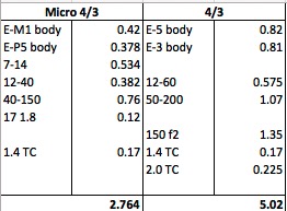
Camera weights


The range of focal lengths is a bit different. I left the 4/3 7-14 f/4 lens at home last time, because it was just impossible. But the m4/3 version is much lighter (and faster). What I am missing in my 2016 packing list is a long telephoto. In 2013 I took a non-mirrorless E-System kit with me, and the fabulous Zuiko Digital 150mm f2/0. Attaching this to a 2x convertor turned it into a 300m f/4, a pretty powerful tool. Coincidentally, Olympus now sells a very highly rated 300m f/4 for Micro Four Thirds. Forgetting the cost for a moment, this weighs in at 1.2kg, only 100g lighter than the old ZD 150. My Lightroom catalog tells me that in 2013, out of a total of 1108 photos taken in the Antarctic, only 89 were taken with this cumbersome and restrictive 150mm. However, those 89 include several of my favourites. But anyway the conclusive point is that there is no room in my backpack for a 300mm lens, so I'll just have to be more creative with what I've got. And anyway, I'm not really a dedicated wildlife photographer, so a 300mm prime lens really would be a little extravagant.

drm_20130123_6222.jpg

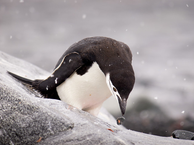
A pretty psychedelic penguin, rather an extreme shot taken with the Zuiko 150mm f/2 wide open


drm_20130124_7011.jpg

And a somewhat psychotic penguin. This time with the 150mm f/2 tele-converted to a 300mm f/2


Very recently Olympus introduced a new lens, a 12-100mm constant f/4 zoom, which would be really ideal for travel like this. The 12-40mm f2/8 is really excellent, but it is a little restricted in range, and a 12-100 would really help to avoid a lot of lens swapping, which in typically Antarctic Peninsula weather is really no bad thing. The new Olympus camera, the E-M1 Mk II, would also bring a lot of benefits. Unfortunately neither of these will apparently be available until 2 days before I return. Not being a Famous Photoblogger, there's no chance of getting my hands on them. Oh well, what I've got will work just fine.

Actually, weight is less of an issue this time, as the trip basically consists of a glorified taxi ride into (hopefully) the Weddell Sea, but still, it counts. One issue is of course ever stricter carry-on baggage restrictions, so that too needs to be taken into account, but there is also the point that too much gear can drastically interfere with photography.

Hopefully I won't end up whining so much this time.


Posted in GAS on Sunday, November 06, 2016 at 03:47 PM • PermalinkComments ()

White on white

backing off the sliders

in Antarctica , Wednesday, October 26, 2016
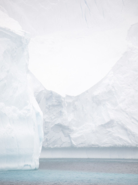
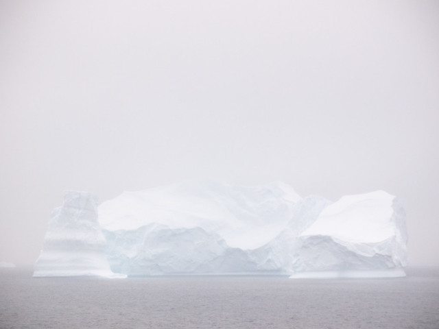
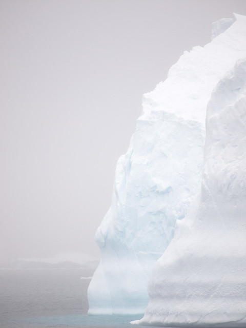
For some random reason I recently stumbled across a group of photos I took in Antarctica in 2013, and which I had more or less discarded. The photos are of icebergs, and I suppose I had tried to turn them into the sort of eye candy which is more or less obligatory these days, with ominous dark skies and intense saturated blues. Easy enough to do, but not really very satisfying. I have some shots which are naturally that way, and those, I let be. These, however, I finally realised, have a lot more potential to convey something of my idea of Antarctica. I've mentioned this before, probably too often, but I find a lot of common ground in the work of Stuart Klipper, who's Antarctica photography is a million miles away from the 500px aesthetic (I'm being polite, there).

So I tried to accentuate the soft light, the feeling of mystery, and the essential whiteness of it all. Something a bit like this:

drm_20130118_3651.jpg


drm_20130118_3632.jpg


drm_20130118_3640.jpg


Actually the reason was far from random. With practically zero planning, unexpectedly I am off to Antarctica again next month, and I needed to pick up where I left off.
Posted in Antarctica | Apple Aperture on Wednesday, October 26, 2016 at 06:28 PM • PermalinkComments (3)

Moss

snapshots set 1

in Photography , Tuesday, October 18, 2016
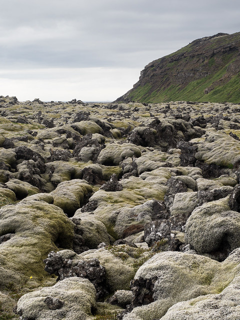
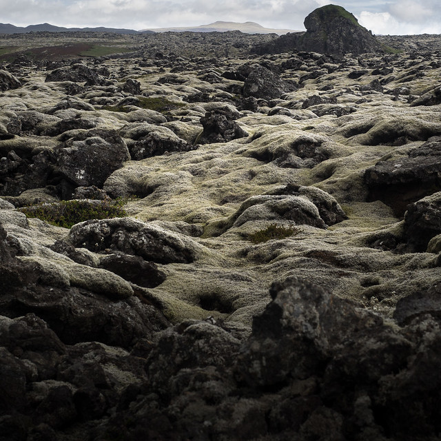
Vast extents of moss-covered lava are a pretty arresting sight in Iceland. The sheer scale can't help but conjure up thoughts go the frightening infernos that produced them. And no photographer with a pulse can fail to be tempted to try to capture something of the scene. In my experience it's pretty much impossible. But it doesn't stop me trying.

drm_E-M1_20160716_P7161864.jpg


drm_E-M1_20160716_P7161866.jpg


drm_E-M1_20160716_P7161862.jpg


Posted in Photography on Tuesday, October 18, 2016 at 09:32 PM • PermalinkComments ()

Sidetracked, again

quiet round here, innit?

in Site Admin , Sunday, October 02, 2016
Recently, for whatever reason, there has been a noticeable increase in the number of visitors here (UPDATE - this might have something to with it). This coincides with a major drop in my posting frequency, which is unfortunate. So I thought maybe I should explain.

Earlier this year, around April, I asked a person whose opinions I respect for some feedback on my website. The outcome wasn't the glowing praise I hoped for, and in particular the observation that "it's a bit stuck in time (2000 to be exact)" stung a bit.

So I decided to redesign it. And, of course, I bit off far more than I could chew. In theory it should take me two weeks or so to do a redesign, but in practice, I have about 6 hours a week from which I could take time to do it (and that 6 hours also includes photo editing, keeping my computer working, lounging in front of the TV, or generally collapsing on the couch after yet another fabulous 12 hours away at the "day" job). On top of that, the publishing software I use was urgently in need of upgrading to a newer version. Any upgrade of Expression Engine is a bloody nightmare, but this time practically every plug-in I use broke as well, so it took about 1 month elapsed time to sort that out.

I then realised that a long history of quick fixes and "improvements" to my existing code had made it unmaintainable. So that needed to be cleared up. One more month passed by.

Then I could start thinking about how to redesign the site. So, I tried looking at a few other sites for inspiration. Not much luck there - the vast majority of photographer's web sites are boring as hell, with exactly the same layouts, "clever" off-the-peg galleries with all the bells and whistles, which do all they can to ruin the viewing experience, and very, very little to encourage return visits. The quality of the photography is irrelevant at this point. I did look at a few website services, bot the only ones that passed even basic requirements for me were Squarespace and Koken, and both those have showstoppers. Woken is one I'm watching for the future, though.

I've also been told that there isn't enough focus here on my photography. Well, ok, good point. So I'm trying to address this in three ways: 1 - improve the accessibility and presentation of existing content, 2 - improve my curation, 3 - introduce a completely new channel for more ephemeral collections, called "Photo Diary". Oh, and put some emphasis on my very short list of publications. Unfortunately all of that is a lot of work.

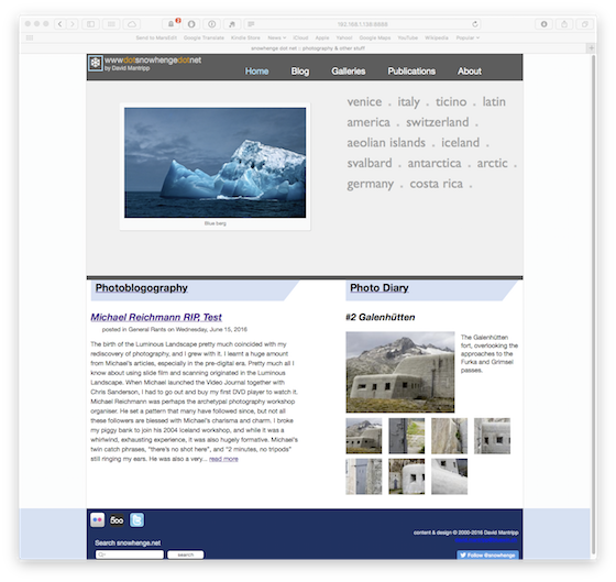
So, now, at the start of October, I have more or less completed the structure, and I'm working on the graphic design. Below is a snapshot of what the new front page looks like, right now. I've no idea if it will stay that way, or if it will ever come to light. So that's why I've been quiet recently.

Home new wip


Anyway, it's only photography. And barely that, really.
Posted in Site Admin on Sunday, October 02, 2016 at 10:51 PM • PermalinkComments ()

(I don’t need no) education ?

or maybe I do

in Post-processing , Wednesday, September 14, 2016
I've been quite prolific this year in photo-education consumerism. I've been fortunate to be able to participate in workshops with, and receive direct advice from, in Ragnar Axelsson (in Hamburg), Daniel Bergmann and David Ward (in Iceland), and Rafael Rojas (in Switzerland). All four are exceptional photographers, and really nice people, and all four have taken the time to give me feedback.

They've also shared with me techniques for post-processing files from camera in order to turn them into something meaningful. This part I find the most interesting, because it's an area in which if I'm honest I'm totally adrift. A lot of this education just goes straight into one ear and out of the other, but enough sticks around for me to get a feeling that some of it is totally contradictory. Two acclaimed, successful landscape photographers express pretty much exactly the same objectives, but give pretty much diametrically opposed ways to reach them. I'm not talking about "there's a million ways to do the same thing in Photoshop", but rather something like one person advocating increasing detail, and the other decreasing it, to achieve the same look. Which rather makes my brain explode.

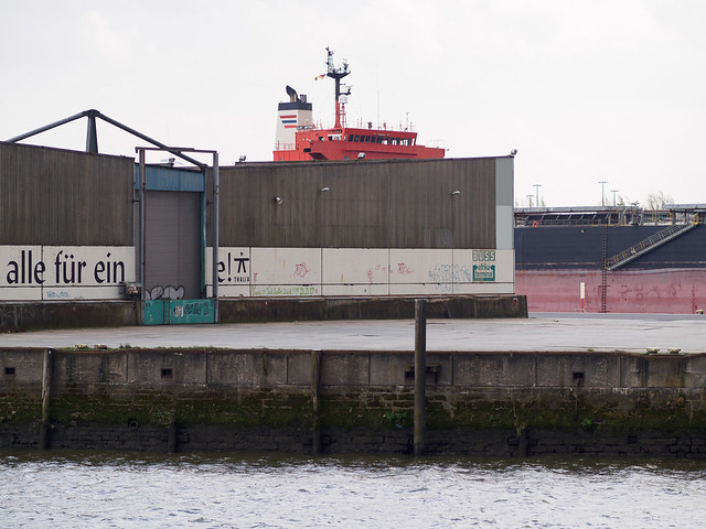
drm_E-P5_20160416_P4164216.jpg

Hamburg. Probably should be in monochrome and cropped a bit


I'm not sure if it's a result of this, or some basic lack of vision, or something else, but quite often when I'm reviewing recently imported images in Lightroom, if I'm honest I can't actually see anything I should change. They look fine to me. One of the above-mentioned experts may well take a photo of mine and apply layer upon layer of intricate changes, which, probably, improve the photo, and certainly make it look different. But then when I'm back home, sitting in front of the same photo, I don't even have a clue where to start. Should I take the David Ward approach, or the Rafael Rojas path ? Should I first consider framing, and cropping, as both Ragnar and Daniel appear to do? Should I immediately consider monochrome, like Rafael and Ragnar would propose, or should I flip it upside down to check the balance in the composition, as David does ?

Or should I just sit there staring at it for a bit, and then wander off to the web in search of new software or cameras to buy ?

drm__20160722_DP0Q0428.jpg

Iceland. Um. Looks better upside down. And, er, the white balance ?


After (large number) of years and (much larger number) of money spent, I should have a better idea, but I haven't. I had been drifting towards a sort of aesthetic borrowed from the film using, portrait/travelogue loose community, larger revolving around the look of Kodak Porta 400, and applying that to my vaguely defined landscape/architecture/travel genre. And before that, I had gradually evolved a process of enhancing images by manipulating texture using progressive, graduated micro-contrast ("clarity", or "detail"), which was quite natural to do in Apple Aperture (less so in Lightroom). But then, I've learned, recently, that touching the Clarity slider, at least to push in a positive direction, is A Bad Idea, and Contrast is my friend. Except that I learned 2 months ago that a giving Clarity a hefty upwards shove in sky areas can be very rewarding, and keep your hands off Contrast.

Of course, I probably got most of that wrong anyway.

drm_E-M1_20160903_P9033209.jpg

Well, I could spend hours on this if only I knew where to start!


So now what ? I basically haven't got a clue. Then again, I'm no worse off than when I started, and it was all quite good fun. Perhaps the style and methods I'd evolved myself were not so bad. Certainly, any four of the above could take any one of my images, and enhance it, arguably make it better. But then it would be theirs, not mine. It's a comforting though to fall back on, except of course when I'm back sitting in front oaf a recently shot photo, and I still have no idea what to do with it.
Posted in Post-processing on Wednesday, September 14, 2016 at 03:14 PM • PermalinkComments (2)

Page 9 of 47 pages ‹ First  < 7 8 9 10 11 >  Last ›