photoblogography - Just some stuff about photography

The Capture One Outrage

#captureOneGate?

in General Rants , Friday, December 16, 2022

The photointerwebs, or at least that part which is interested in Capture One, exploded in a orgy of demonstrative outrage last week, when a new pricing model was announced for Capture One software.

In a nutshell, the current offer is that you can buy a “perpetual” license, which will give you long term rights to use a particular release of the software, for as long as you meet the hardware / operating system requirement. In addition, any feature upgrades added up until the next major release you also get to use.  The to-be offer is much the same, only it removes the feature upgrades part, and can be bought at any time to cover the then-current product feature set.

It’s pretty clear why they made this move: some time ago, they introduced a subscription model running alongside the perpetual model.  A major touted benefit of the subscription model was that you get new features when they’re ready, not just at major release points (yearly in Capture One’s case). The problem here is that perpetual licenses also got that benefit, and the perpetual upgrade pricing was not very different to a subscription. So perpetual was more flexible, and on top of that did not lock you in perpetuity to a subscription. 

Since there are clear financial reasons for software companies to try to persuade their clients to move to a subscription model, this must have presented a serious commercial dilemma for Capture One.  And although their messaging was pretty flawed, actually I think they’ve come up with a fair compromise between offering choice to their customers and remaining a viable company, attractive to investors.

So Joe Photographer everywhere screamed he was going back to Adobe, which offers way better value for money (I’ll get on to that later), Joe of course forgetting how outraged he was when Adobe, faced with a similar dilemma, not only summarily dropped perpetual licences altogether, but also played a very nasty trick on customers a few months prior to going subscription only with their Creative Suite upgrade policy change. Then, they coerced people into upgrading, by drastically reducing the cutoff for upgrade eligibility from previous versions - only to kill off upgrades altogether a short time later.

But whatever - this is how commerce works. Neither Capture One nor Adobe are charities. They both need to pay their staff, keep the lights on, and keep the markets happy. Do I like the last part? Not much, no. Can I see an alternative? Nope.

So after several years of Adobe as The Great Satan, suddenly they’re all saints rolled into one.

But anyway, as Paul Reiffer put it, even skipping the false claim (well, false for now, I’m not that naive) that Capture One is forcing you into subscriptions, does any serious photographer really make core creative decisions based on whether or not there’s a subscription model involved?  I certainly don’t.

Adobe (and DxO, and Exposure, and Iridient) make great software. And a lot of people are very happy with Lightroom. Personally, I’m not. I dislike Lightroom for two reasons: one, it has an awful User Interface which makes it an absolute drag to use. But more important, for my tastes, it is an absolute battle to get any kind of attractive output from it. In Capture One my basic process is this: adjust exposure, balance shadows and highlights, adjust contrast with a Luma curve.  That takes about 30 seconds. With Lightroom it is nearly impossible to reproduce.  First of all to me Lightroom controls seem very unsubtle, and second they all interact with each other, following a Grown-Ups Know Best model apparently based what Thomas Knoll thought photos should look like.

Yes, the Adobe Photography Subscription, offers, on the face of it, a fantastic deal. But does it? Lightroom is not for me. Bridge is a clunky disaster area which seems to get worse with every update. Portfolio is ok but not much use to me. Lr Mobile is certainly very nice to have, but the UI is not pleasant. Photoshop? Well, of course, Rome remains Rome. But I think I can live with Affinity Photo for the few things Capture One can’t do.
So yes, an Adobe Photography Subscription is (much) cheaper than a Capture One subscription. Again, is that the basis for creative choice? Hey, a Kodak-branded Chinese Point & Shoot is WAAAY cheaper than a Nikon Z7!

But that’s just me. Don’t worry, I’ve got a long list of grievances against Capture One:

Obviously, the pricing is getting rather excessive. Generally speaking, a ceiling of $200-$300 per year for a core piece of somewhat specialised software is not that ridiculous. However, the problem comes more with what the upgrade or subscription charge brings you. In recent years this has not necessarily been very impressive. In particular for a lot of people Capture One 23 brings absolute zero added value, although for a particular customer segment I imagine it is pretty fantastic. Then again, that same segment probably was underwhelmed with Capture one 22. You can’t please all the people all the time. Actually the new pricing model does appear to be offering more flexibility on which features you want to pay for, but this is also wrapped up in a mysterious “loyalty scheme” which so far we know nothing about.

Capture One for iPad was, and remains, a massive disappointment. The core application looks fantastic, but it is rigidly locked to a workflow which places it as some kind of initial preprocessor for the desktop application. And development seems to have paused if not stopped.

Capture One refuses to support Hasselblad cameras. Well, I don’t know which party is to blame here, and it would certainly require full cooperation from Hasselblad to develop a solution comparable to Phocus, but still… time to get over past feuds?

Capture One’s catalog is far better than its many detractors claim. But it has vast scope for improvement, and while a few bones get thrown to customers who actually value catalog features now and then (versions in separate collections in Capture One 23 is nice, for example, but so far I can’t convince myself that it is $200 nice). The catalog needs to extend parent-child view to User Collections (at least we have it in Folders now), and really, really implement some model of Stacks, Ideally Aperture’s model, not Lightroom’s half-assed hack.  And yes, maybe get a competent data modeller to optimise the database?

But for me it all boils down to this: Capture One gives me results that I’m really very happy with, and is largely a pleasure to use. I’m happy to pay for that, unless the pricing or licensing gets completely insane, and honestly, we’re far away from that. The recent announcement is an adjustment dictated by market conditions, not some dastardly schemes designed to shovel vast amounts of cash to a predatory private equity firm, however attractive that narrative might be to drama queens on the interwebs.

Posted in General Rants on Friday, December 16, 2022 at 11:16 AM • PermalinkComments ()

Losing faith in Lightroom

flip / flop / flip / flop etc

in Post-processing , Wednesday, December 16, 2020

At various intervals over the years I’ve questioned if I’m using the best approach to managing and processing my digital image files. As covered ad infinitum in previous posts, my tool of choice was Apple Aperture, but that rug was pulled from under my feet by the bling-flingers in Cupertino.  I eventually settled on Lightroom, with some misgivings, and have grown to accept it as the best compromise. It even has some unique features which I really like, in particular the “lights out” display mode, which is excellent for evaluating processing results, as well as for triaging photos without distractions. On the other hand, the UI is ugly, and the processing engine is based on the will of senior Adobe engineers to make everything look like it was produced by a badly calibrated 1 Hour (film) processing lab, with saturation turned up to 100. I spent a lot of my time in Lightroom fighting against under the hood saturation and contrast changes.  But, it was the best compromise.

Then came Lightroom Classic v10: from the beginning, this was not good. There were very noticeable performance slowdowns and UI glitches which made it very irritating to use. See all 9 pages (so far) of this thread, started on October 22nd. Adobe, with all their vast resources, eventually pushed out a version 10.1, which not only failed to solve the initial problems, but introduced a new “feature”, namely allowing Lightroom to quickly, completely and reliably freeze the Mac it is running on, requiring a power off reset to restore things - almost unheard of in the Mac world.  And to make things worse, they were warned about this beforehand, and therefore released this version in full knowledge that it contains this disastrous flaw.  It seems this flaw is linked to GPU processing: now, it may be true that testing for various hardware combinations is a big task (although for less so than for the much more varied Windows world), but other much, much smaller companies seem to have managed just fine (CaptureOne, DxO, Exposure for example).

I suppose Adobe will eventually fix this - although to be honest I’m not 100% confident - and there does remain the workaround of reverting to v9.4 (while sacrificing 2 months of editing and processing), or sticking with the sluggish performance of v10.0.  But as a subscriber I’ve had enough of this. Adobe are showing themselves to be an untrustworthy partner, and their support staff are condescending and arrogant.

For the most recent photo diary I published, The White Arcades, I had almost finished processing the photos in Lightroom, as usual fighting against the application’s obsession with making everything look garish.  But given the above, I decided to dust off CaptureOne, and, what the hell, try to import my entire Lightroom catalog of over 80’000 photos. Well, it worked pretty well. It took a few hours, and some files would not import (some DNGs, and of course Hasselblad Raw), but otherwise fine. I then reworked the photos I’d chosen for The White Arcades. Thanks to a combination of CaptureOne’s linear profile and luminosity curve, I actually managed to quickly get the look I wanted. Some of the more sophisticated display options in Lightroom are not in CaptureOne, and yes, the DAM functionality is not quite as good, and no, CaptureOne doesn’t have Adobes’s excellent stitching tool. But it is smooth and reactive, it has a non-modal UI, and it doesn’t crash my Mac. I’ll have to use Phocus for Hasselblad files, but’s not such a bad thing.

Long term I’d prefer not to be trapped in Adobe’s subscription dungeon, but while it was giving me a good set of tools I was ok with it.  Now Adobe has lost my trust.  Eventually completely cancelling my subscription is not something I’d do as an act of revenge - they wouldn’t even notice - but just one of self interest.

Posted in Post-processing on Wednesday, December 16, 2020 at 01:26 PM • PermalinkComments ()

Software

displacement activity I

in Post-processing , Tuesday, December 11, 2018

I’ve recently been going through some kind of phase where I’m reassessing a lot of my work. Initially this was on an aesthetic level, but somewhat inevitably technical considerations started to intervene. First of all, I have been trying to get a little more disciplined in my picture making. Although I like to think that I’m pretty much on top of the basics of using a camera, I have tended to be a little indisciplined in how I apply this knowledge. This then leads to, for example, photos with too much, or too little depth of field, because I was too lazy to think about optimising aperture. It all came about when I started to make prints of some of the recent series of woodland photos I’ve been making. In turn this led me to making a number of “test” prints (to be perfectly honest, I probably don’t make any other kind). And so I noticed that the colour in these prints was actually a bit weird, and so _then_ I just had to re-profile the paper, which more or less fixed the issue, but used up all my supplies. And left me wondering how my previous carefully created profile had “gone bad”. And off we go again.

Untangle II

“Untangle I” - the photo that led me to re-evaluate my printing

Or not - prompted by an article I saw recently, I wondered if maybe it might be a good idea to revisit ImagePrint by Colorbyte Software. I used to use ImagePrint with my Epson 2100 printer, but when this died, and some 8 years ago I splurged on an A2 Epson 3800, I would have had to upgrade my ImagePrint license, and I couldn’t afford it. So I bought a Pantone ColorMunki Photo kit instead, which allowed me to profile any printer paper I wanted. Of course this was not the only option: many paper manufacturer profiles are actually more than close enough, and if they’re not, various service providers can create custom profiles for a given paper and specific printer. But of course I wanted to do it all my own way, and now I think about it, I’ve gone through at least 3 printer profiling setups over the last 15 years or so, none cheap.  And in fact even with dedicated software and hardware, colour science, which this is an application of, is seriously hard and time consuming, apart from being a money drain.

ImagePrint on the other hand does absolutely everything for you. It includes a custom print driver which brings a number of tangible benefits, from more accurate colour to saving paper, and a huge library of expert print colour profiles tuned not only to printer/paper combinations, but also to different lighting conditions. The basic point of ImagePrint is that it offers 100% reliable, plug & play highest quality printing. So you can just forget about all the technical complexities and just enjoy the creative part. This to me is quite enough to justify the fairly high price, but on top of that there are myriad additional features which offer significant advantages in various printing scenarios.  So I renewed my license for the latest version, “ImagePrint Black”, and ever since I’ve been printing a lot more, with no test prints required.

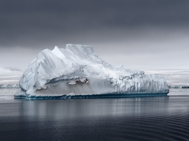
That solved my output problems. Next up was the input. I had been working on a set of photos recently for my 2018 calendar, and revisiting these I noticed that one of them was not quite right. This was a photo of an iceberg, which look fairly spectacular, but after I printed it (see above) I realised it was all a bit too, well, blue. So once again a trip down the rabbit hole of Raw conversion software beckoned. I decided to download a trial of the latest version of Capture One, v11 (now they’re on v12), and opened a few iceberg photos. One of them, not the one that had initially sent me into a spin, really shocked me: Capture One appeared to be showing textures completely missing in the Lightroom interpretation, and better fine detail as well. I cross-checked in Exposure X3, and in Iridient Developer, and the variation across these gave me the clue I needed to narrow the gap - it was simply a case of reducing the exposure, which in Lightroom seems to have a complex relationship with brightness. The much more involved Capture One default processing had, in this case, given better results.  As for the fine detail, well, there, at least with Olympus ORF files, the current iteration of Lightroom cannot match Capture One, or indeed the new Exposure X4. Both extract more real detail, although frankly only us pixel peepers would notice in almost all cases. But this comes with a price with Capture One, as any kind of noise reduction coupled with sharpening gives a horrible plasticky effect in recent ORF files. This is nothing new - I noticed it with v8 and it was just that made me decide to give up fighting and submit to Lightroom for once and for all.

Drm 20161203 PC030310 IridientEdit 3

“float” - the photo that used to be far too blue

However, Capture One has another major card up its sleeve, at least for me: the luminance curve. In Lightroom pretty much any change to contrast, by direct slider or by curve, has a major effect on saturation as well. Apparently this is by design, and it is stubbornly maintained, but personally I hate it. You can compensate by reducing saturation and/or vibrance, but first, this is imprecise, and second, why the hell should one need to? This naturally led me to the realisation that I should just be more disciplined with applying a previous strategy: do the Raw conversion in Iridient Developer, which is far less heavy handed, has not only a luminance curve, but also a chroma curve, and delivers the best detail and sharpness of all, then do the rest in Lightroom. Iridient even includes a Lightroom plug-in to facilitate all of this.

So, after this bit of re-evaluation, I have ended up with a software end to end process (I’m not going to call it a “workflow”, this is fun, not work) which drags the absolute best of my pitiful 16 Mpix sensor camera, and starts to approach the delicacy I’m always aiming for in colour and colour transitions.  Having got those variables out of the way, I can now concentrate on choosing the correct f-stop.

Posted in Post-processing on Tuesday, December 11, 2018 at 09:20 PM • PermalinkComments (1)

Sigma DP0 Firmware 2.0

old toy becomes new toy

in Sigma , Tuesday, May 02, 2017

The recent very welcome and generous firmware update (2.0.1) for Sigma’s DP Quattro cameras has added several new dimensions to working with the output. The update brings two major new features:

  • DNG Output
  • SFD (Super Fine Definition mode)

Of the two, DNG is probably the most significant: it means that it is no longer necessary to use Sigma Photo Pro to process raw images.  They can now be opened directly in various DNG compatible applications. I’ve tried Adobe Lightroom, Photoshop, Photo Mechanic, Alien Skin Exposure, Iridient Developer. They all work fine. This is a huge boost to workflow, and opens up Sigma Quattro cameras to all those put off by having to use Sigma Photo Pro (which, by the way, is actually nowhere as awful as the internet echo chamber would have you believe).

On top of this, you can now use software such as XRite ColorChecker to create customer camera profiles to use in compatible applications.

SFD is a bit more esoteric. SFD mode combines 7 standard frames automatically shot at different exposures to obtain a single file with extended shadow and highlight detail, and lower noise. Basically an auto-HDR, but thankfully without the kitsch. Unlike, say, Olympus in-camera HDR, here all individual frames are saved as RAW and can be selected, discarded, or individually edited in Sigma Photo Pro, if you wish to go too that level of detail (no DNG here).  I’d read some pretty negative opinions of SFD from Sigma SD Quattro owners, so I was curious but not all that excited.

So, yesterday evening I went out to grab a few shows to try all this stuff out. Please note this was just a “kick the tyres” sort of thing, in a context of taking photos that I might actually be interested in, not “testing”, taking a million shots of the pot plant, brick wall, or cat nearest to the couch.

DNG output

The addition of DNG output makes a huge potential difference to workflow enhancement. The question is, what, if anything, are we losing? There are a lot of drawbacks to using Sigma Foveon cameras, but there are also two big plusses, resolution, and colour character. Compromising on either of those arguably makes using the cameras pointless. So, using a frame which is not far off a torture test, with deep shadow and bright highlights, not to mention abundant, potentially troublesome green tones, let’s dive in.

I’ve taken two identical shots, one recorded to X3F file, and the other to DNG. I have processed the X3F file in Sigma Photo Pro (SPP) using “Auto” settings - I don’t usually use Auto, but here it seemed to make sense, as I assume something similar must happen internally in-camera to create RGB data for the DNG file. I’ve opened the DNG file in Lightroom, on default settings, but changed the camera profile to Standard to match SPP. Here are the full frames, compared in Lightroom Library module.

Sd0 dng compare 1

X3F on the left, DNG on the right

Ok, you’re not going to be able to tell much from these, but the idea is to get an overall feel. The colour in the DNG file seems a little muted compared to the X3F. We’ll look at that a bit later.

The top left corner of the shot is a bit troublesome - again, we’ll look at this when discussing the SFD mode, but let’s see how X3F and DNG compare.

Dp0 compare dng tl

Top left crop, DNG version

Dp0 compare x3f tl

Top left crop, X3F version

Well, there are some minor differences, but nothing I’d personally lose sleep over. What gets interesting is looking at the potential for colour calibration.  Using the XRite Colorchecker Passport, a made a quick Lightroom profile for the SD0.

Sd0 dng colour profile

Left, custom profile, right, Sigma standard

The difference there is quite clear. I’m not yet entirely sure I prefer the custom profile version, but I think it is probably more accurate. Personally I actually like the somewhat muted saturation that the Sigma standard profile gives, but well, it’s certainly opening up a whole new dimension. It will be interesting to compare a Sigma custom profiled shot of an identical scene shot with another camera.

Lightroom actually has all the built-in SPP colour modes as profiles under calibration. I assume these come in with the DNG. If Adobe had actually put some effort into actively supporting Sigma Quattro cameras, I think we’d have heard about it.

As I said above, I’m not all that unenthusiastic about SPP, but even so, there are a lot of good arguments for using DNG, and so far, I don’t see any significant drawbacks. The out of camera DNGs are huge - about 110Mb to the 60-ish Mb of a corresponding X3F, but apparently running them through Adobe DNG converter shrinks them with no adverse side effects. I haven’t tried it yet.

SFD Mode

A couple of shots here demonstrate the usefulness of SFD mode. Unfortunately I was in a bit of a hurry, and the location I was shooting from was a bit precarious, so I wasn’t very careful about details and the non-SFD version is shot a f/4.5, so the background is not sharp.  Note that this sort of shot, where there is moving water, is not supposed to work in SFD mode.  I found it to work fairly well. The significant thing here is the highlights, in the patches of bright water. The SFD mode has yielded a lot more highlight detail.

DP0Q0671 x3i 2 full

Full scene, SFD mode

Now, two close ups of the two modes.

Drm SIGMA dp0 Quattro DP0Q0669

Close up, standard mode (auto exposure)

DP0Q0671 x3i crop

Close up, SFD mode

Note, the white balance is different in SFD mode. It was actually much cooler, but I made a rough adjustment in Photoshop. The differences in sharpness are irrelevant, as mentioned above, they are down to to wide an aperture on the non-SFD shot. However, what is significant is the extra detail in the bright water patches in the SFD shot. In the non-SFD shot they are completely blown.  Also, note, from this example, the SFD rendering of blurred water is comparable to the non-SFD. However, at the edge of the full frame, there was some minor leaf movement, and there artefacts do show up. Sometimes they will be acceptable, sometimes not. Indeed, I took a different SFD shot with moving water, and in that case some of the patterns were a bit weird.  But it looks like it could be useful, in some situations.

Note, I didn’t encounter any of the processing time nightmares broadcast on the forums. On my computer, Sigma Photo Pro 6.5.3 took under 2 minutes to process an SFD set (.XFI file). That seems reasonable to me.

A second example was aimed more at shadow detail. The full frame is below (in this case I was more interested in shadow detail).

Drm SIGMA dp0 Quattro DP0Q0658

Looking in detail at the debris in shadow in the lower left:

Drm SIGMA dp0 Quattro DP0Q0658 crop

Close up, standard mode (auto exposure)

DP0Q0659 X3i crop

Close up, SFD mode

I would say that is pretty conclusive.

However, the highlights (sky patches, top left) are blown in both cases. The sky was completely overcast, so that is fine, however the loss of detail in the foliage isn’t so impressive. Here the SFD version does a better job, but neither is brilliant. An extreme case, maybe, but also just one of the Foveon sensor’s weak points.

Drm SIGMA dp0 Quattro DP0Q0658 tr2

Close up, top left, standard mode (auto exposure)

DP0Q0659 X3i tl

Close up, top left, SFD mode

I’m not sure how much I might end up using SFD mode. I would imagine it is more generally useful for static subjects in controlled, indoor conditions, but from this very brief trial, it does seem more useful for outdoors photography than I expected. Anyway, I’m certainly not going to complain.

Thanks very much to Sigma for this update - they don’t really get a lot of publicity, but I doubt there is a company today more dedicated to making great photography equipment at reasonable prices. And they just keep improving.


Posted in Sigma on Tuesday, May 02, 2017 at 08:39 PM • PermalinkComments ()

A matter of Exposure

and, indeed, a matter of opinion

in Product reviews , Saturday, February 18, 2017
In a bit of a fit of retail therapy, the other day I decided to buy a license for Alienskin Exposure 2. This is an application with its roots very firmly in film emulation, but which in recent years has expanded into a full blown digital RAW file processor and - to some limited extent - organiser. In the past I've written a bit about trying out various film emulation methods, and being generally unconvinced. Since I used film extensively, and still do to some extent, I do have a reasonable idea of what I would expect such software to deliver, and I also the real thing to compare against. I'm not really interested any more in trying to emulate film, as such. If I want a Portra look, I'll use Portra. But what does interested me is being able to apply a preset, or whatever you want to call it, to a given batch of photos, thereby giving them a coherent feel, while at the same time being able to speed up the process of all this adjustment stuff and get to the actually interesting part (for me, anyway) of editing and publishing. I tend to get so overwhelmed with the adjustment part, in the limited time I have, that it seems I'll never get to the actual point of it all. I also horrify myself with the sheer quantity of photos I take, even when I'm under the impression that I'm a model of self-restraint. This "preset" approach I find is more adapted to my urban photography than landscape, or whatever you want to call it. Sometime last year I took advantage of a special offer and bought a VCSO film preset package for Lightroom, just to explore it a bit. Clearly it didn't grab me much, as by now I'd practically forgotten about it. However earlier this week, I started working on a smallish set of photos recently taken in Buenos Aires, and decided to try applying the VCSO Portra 400 presets. I quite liked what I was seeing, although the results did seem a little contrasty to me, and VCSO's idea of what the ultimate hipster cliché 2-stop overexposed Portra 400 looks like doesn't correspond at all to what I see on film. I had tried out Exposure a while ago, but at that point felt it didn't offer me anything. But anyway, needing an excuse to spend money to make me fell better, I tried it again. And I'm glad I did. The interesting thing is, when I first put two versions side by side in Lightroom, one processed through VCSO, the other in Exposure 2 and imported, I immediately thought I'd wasted my money. The VCSO version was much more like Portra to my eyes. Then... I realised I had mistaken which was which. So the "good" version was from Exposure 2. Of course this is 150% subjective, and there's no real logic to it. But I repeated the experiment several times, and confirmed my opinion. However, the VCSO versions most definitely have more of that "pop" that people apparently want. But if I wanted "pop" I'd used Ektar, not Portra.
Exposure2vcso

I'm actually not going to say which is which here. But you can probably guess.

So I'm pretty happy with Exposure 2, but working out how to use it is a bit tricky. It can work standalone, including a file/folder based browser (where it recognises Lightroom star ratings, which is handy), or it can work as a plugin. The problem with working as a plugin is that it receives a TIFF file generated by Lightroom with basic processing baked in (e.g. Adobe standard profiles). That isn't an ideal place to start from, which I imagine is one of the drivers behind expanding the reach of Exposure in the first place. The standalone Exposure 2 is actually quite impressive. It doesn't seem to have received much praise or attention, but from a toolset point of view it combines a lot of the better aspects of both Lightroom and Capture One, and adds a twist of its own. The layer methodology, for example is better than either of its two august competitors. Exposure 2 has a lot of tools more specific to customising film emulation, inherited from the older plug-in only versions, and Alien Skin's from Bokeh application seems to be integrated (although that's not something I'm all that interested in). Apparently it also has automatic lens correction. But it doesn't have any chromatic aberration removal that I can see, or any perspective correction. Or, indeed, anything approach a user manual.
Exposure2vcso2

Another example. Again, you decide.

I'm quite comfortable with Lightroom these days. I appreciate the integration with things like Lr Mobile, and Adobe Spark, both of which allow me to make better use of my commute time. Lightroom, unfortunately, is an awful organiser /editor, but it is less awful than anything else on the market. There's no point any more lamenting Aperture, PhaseOne seem totally clueless on what to do with MediaPro, so Lightroom will have to do. And since organising and editing is a core part of my creative process, Lightroom is as well. So, the compromise is to use Exposure 2 standalone to generate alternative versions, and import them into Lightroom for any final tweaking and management. It would be nice if Alien Skin could add the kind of "slingshot" feature in Iridient Developer, which when receiving a TIFF from Lightroom, instead looks for and loads the associated RAW, and then when saving overwrites the TIFF, leaving Lightroom none the wiser to the sleight of hand. I'm also a bit puzzled why Exposure 2 does not include modern Portra 400 emulation, but just 400NC and 400VC. 400NC is close enough, but still, I would expect currently available films to be emulated. Otherwise, I'll repeat what I said earlier - Alienskin Exposure 2 is actually a pretty good piece of software, and not only for film emulation. I'm surprised it doesn't get more coverage.
Posted in Product reviews on Saturday, February 18, 2017 at 05:00 PM • PermalinkComments ()

Page 1 of 3 pages  1 2 3 >