photoblogography - Just some stuff about photography

Why I still miss Aperture

whine, fanboy, whine

in Apple Aperture , Friday, April 17, 2020

It seems weird to be writing about Apple Aperture in 2020, some 5 years since its nominal demise. It does still work on MacOS Mojave, although it seems to make the OS crash if it is left running for too long (several days). I still lament its passing, while acknowledging that the stable door has been open so long that this particular horse has not only bolted into the next hemisphere but has been rendered down for glue.

But there is one feature of Aperture which I still use, and which I’ve never seen before our since its murder by Time “Bean Counter” Cook, and that is the Light Table.

I realise that for the vast majority of camera owners, Light Table is at best puzzling, but more generally a target of scorn. It has little to do with demonstrating that cats photographed with THEIR Superpixelmuncher X100X ProX are better than those of the next DPReview forum rodent.  That’s because it is a feature for photographers, not camera owners. And it’s brilliant.

A Light Table can be added to a Project, and can be used to arrange, lay out and edit (in the true sense of the word) a set of photos contained in that project. And I’ll say it again, it’s brilliant. Under peer pressure to do something useful with my COVID-19 confinement, I’m embarking on a couple of long, long overdue publication projects. One of these is to create a book. The big challenges in book creation are the selection and ordering of photos in a way which is coherent and conducive to the aims of the project.  The other is layout. Aperture’s Light Table can pretty much solve the first, and can help to get started with the second.

IMG 6463

The view above shows Aperture displaying a Light Table, with the pool of photos shown below in a browser strip (when added to the Light Table they gain a red counter icon). On the right I have an iPad acting as a second screen - this shows the photo selected, either on the Light Table, or in the browser strip.  So, simultaneously I have a freeform selection and layout, a means to browse and select photos out of my initial edit, and a full screen view so I can check sharpness or whatever.  When I place or move photos on the Light Table, automatic alignment and placing guides appear, like in InDesign or something. I know of no other application which can do this. Whichever unsung hero came up with this concept, (s)he deserves a mega award.

And it doesn’t end there. You might say that the Light Table seems a little constrained. No problem, drag a photo or photos off of the area in any direction, and the light Table expands to accommodate them.  There may be a limit, but I’ve never encountered it. Of course, you can also have any number of Light Tables you want under a Project, so you could even dedicate one to each spread.  Then again, Aperture also had a superb Book tool, so really you’d just progress from a rough mockup using Light Table to Book.

And there’s more: using the sort-of gadgety (only it isn’t) Loupe, you can examine any part of any photo, at your chosen magnification, in-situ.  And, thanks to Aperture’s unparalleled integration, using the HUD panels, you can pretty much do anything to any photo, also in situ, be it add keywords, check metadata, or even fully edit (in the Photoshop sense) the photo (of course all this worked in Books too).

ApertureLoupe

The much-maligned but actually very slick Loupe

ApertureHUD

The Light Table with adjustment tools HUD

Ok, it took a few versions for Aperture to fully deliver on its lofty ambitions, but once its got there (let’s say v2.5) it was humming.  Everything fit together like a well engineered Swiss watch. Unfortunately, the Apple dumbing-down disease struck a glancing blow to v3, but it was only superficial.

So given all this, why did it ultimately fail? Well, setting aside the fact that such an application just did not fit into Apple’s consumer disposables vision, and indeed probably only ever got approval because of Steve Job’s antipathy towards Adobe, it did suffer in detailed comparison in some areas to the far less ambitious Adobe Lightroom. For example, the pixel peepers and forum rodents could point at minute and adjustable differences in initial rendering - usually of noise at 1’986’543’200 ISO, or sharpness of Your Cat’s whisker at 500% magnification. Also Apple was pretty sluggish at keeping up to date with new camera releases, which Adobe correctly saw as an absolute priority.

What sunk Aperture was essentially Apple corporate culture.  It was overcome by a brilliantly conceived and ruthlessly executed social marketing campaign by Adobe, playing on all of Apple’s corporate weaknesses (obsession with secrecy, no interaction with customers, etc).  Aperture was different to Lightroom, and in many ways.  But Adobe managed to ensure that the competition was judged by one facet only, the pixel-peeping level characteristics of its image adjustment toolset. And actually even here Aperture had some unique and very powerful features (the implementation of the curve tool, for example), but nothing was going to save it against the massed ranks of photo-influencers like Jeff Schewe, Scott Kelby, Michael Reichmann and legions of others.  Apple just could not bring themselves to put the spotlight on others. Or, of course, horror of horrors, release a Windows version. No, people had to buy Macs to use Aperture.

Had Aperture been developed by an independent company, free of the clutches of Jobs, Cook, et al, I’m pretty confident it would have flourished. It was aimed at a market segment which is still not served today - it’s a pity the marketers never realised that.

I’m still happily using the Light Table, and it integrates pretty well with a Lightroom-centered workflow. But I’m on the last version of MacOS where this is possible.

Posted in Apple Aperture on Friday, April 17, 2020 at 05:00 PM • PermalinkComments ()

The Third Bag

the search goes on

in Product reviews , Wednesday, June 15, 2016
So after the lengthy bag discussion, I decided to throw caution to the wind. The PRVKE just wasn't working for me. Honestly, I think it's just trying to solve far too many problems at once, and some of them don't even need solving. The essential problem is that it doesn't seem to have a primary role. I really don't think you can mash up a camera bag, hiking bag, travel bag, gym/school bag and biker backpack in one and end up with anything sensible. It really doesn't fit my needs as a camera bag. In terms of capacity, the "cube" really makes very poor use of the space available, and as other reviews have mentioned, it's all a bit flimsy and inflexible. As for the rest, well, I'll give it the benefit of the doubt, but I'm not that convinced about the roll top standing up to much in the way of moderate rain. Ok, so there's a rain cover, but still - my experience of roll tops is that they're the bags you put other stuff in to keep dry, rather than the other way around. So, nice try, WANDRD, but I'm afraid if the Perfect Bag TM was that easy to pull off, LowePro or Tamarac or Manfrotto or whoever, with years of experience, would have already done so. The psychology of Kickstarter funding is very interesting - since backers are general early adopters, and have both a monetary and emotional buy-in, I suspect this leads to very uncritical user reviews. Or maybe it's just me. But I still needed a bag. The F-Stop stuff looked tempting, but their obvious epic inability to manage production, and poor marketing and communication left me dubious. Anyway, you can't actually buy most of their stuff, it's all back-ordered for ever. So, what was left ? Well, in the end, thought convergence, some comment by Bernard on the previous entry, and a dose of common sense led me to Bag 3: the Mindshift Backlight 26L. Sadly the green version isn't available yet, and I've got a deadline.
Mindshift Backlight

The Backlight 26L. Actually it looks quite nice in grey.

I did swear I'd never buy anything from ThinkTank again, but I guess I'm let off here on a branding technicality. Anyway, the Backlight is a really nice little bag - a blend of ThinkTank build quality and LowePro wearability. The zips are just amazing - sorry WANDRD, but please take a look at how Mindshift do it - solid, chunky, smooth running zips that you can easily open and close with one hand - unlike your YKK stuff, which may be great for jeans, but honestly doesn't work too well on a backpack. Mindshift have taken a different approach to providing space for clothing etc - the division is vertical. Camera gear goes at the back, and is accessed from the back, and other stuff goes at the front. It's less voluminous that the PRVKE, and possibly marginally less secure, but it is a lot more practical, and clearly defines the Prime Mission as being a camera bag. It wouldn't work very well for overnight trekking - but honestly, neither would the PRVKE. I wouldn't much like to carry much over 10kg on my back with the PRVKE's weedy waist strap. So the Backlight easily swallows all this: Olympus E-M1, Zuiko 12-40 lens, Zuiko 50-200 lens (that would have to stay at home with the PRVKE), Sigma DP0 (very awkward shape) and Voigtländer Bessa III, along with filters, batteries, etc. And there's still space to spare. And it is easily flight carry-on size.
Mindshift Backlight

Come on in, plenty more room inside!

So what to do with the PRVKE? I'm not sure yet. It might still be useful as a "city" backpack, or indeed a travel backpack, but it's a little too large and bulky for that. Or it might end up on eBay. After all, it's had rave reviews, so it should be easy enough to find it a more suitable home.
Posted in Product reviews on Wednesday, June 15, 2016 at 10:16 AM • PermalinkComments (2)

A Tale of Two (new) Bags

hipper than thou?

in GAS , Wednesday, June 01, 2016

A quick Google search on the phrase “photographers can never have enough bags” astonishingly yields only 56 results. Astonishingly, because I’m sure I see at least one a week on my forays across a pretty limited part of the blogosphere.  However, slightly less constrained searches immediately give counts heading into several thousand, so that’s a bit reassuring.

While I certainly have enough bags, none of them ever turn out to be particularly satisfying. I have a need for two, possibly three bags. The first would be an everyday bag which can accommodate both work stuff and a smallish camera (Olympus PEN-size at most), but ideally could instead carry a full “street” kit.  The second would be a day hiking backpack, which can carry a workable “landscape” kit, as well as extra clothes, rain jacket, food, etc. Finally, a nice to have but rarely needed third would be a dedicated hiking backpack with full “kitchen sink” capacity.  I have no need for trolley bags, Pelican cases, etc.

Starting with the first category, I do own a Domke F803, which is actually great, and I use it a lot - or at least I used to. But it is too small to carry a laptop, so fails the “every day” criteria.  But as a small discrete camera satchel, it is unequalled in my opinion.  I’ve been through various non-camera messenger bags, but none have really worked or lasted long. And a few years ago I received a gift of the highly lauded ONA Brixton messenger bag: this, for me, is a disaster. Heavy, inflexible, uncomfortable, with front pockets so tight they’re practically useless. And the canvas has weathered horribly in rain, becoming stiff and shiny, unlike the Domke which weathers beautifully with age. Sorry, but ONA is hipster rubbish in my experience.

In category two I’ve never really found much to beat the modest Kata 467. Unfortunately, a nasty little thief in Bogota agreed with me, so I don’t have it any more. And Kata was bought out by Manfrotto, and their evolution of the 467 doesn’t excite me. I bought a LowePro Rover Pro 35L AW a few years back, but it’s just a mess of straps and weird pockets with this removable camera pod thingy which takes up far too much space. I’ve hardly ever used it.

In category three, I have a LowePro ProTrekker 300 AW which is fine, but a little heavy and cumbersome.  I tried replacing it with a ThinkTank Airport Commuter, but this was a total disaster: the removable waist strap (a feature looking for a requirement if ever there was one) removed itself in an Argentinian 737 overhead locker, and the removable tripod straps (there’s theme there) did the same thing a few weeks later. Never used it since. So, possibly I do have enough bags - but not the right ones.

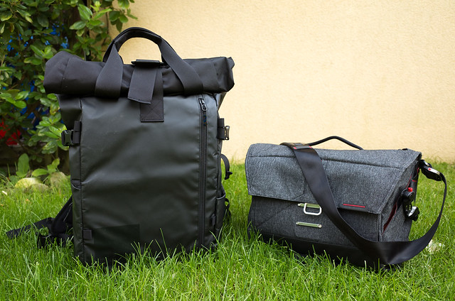
Which brings us to these two:

drm_GR II_20160601_R0000096.jpg

on my left, the $270 WANDRD PRVKE, on my right, the $219 Peak Design Everyday Messenger. Ouch. That’s $489!

This general dissatisfaction with bags, and the apparent inability of mainstream manufacturers to come up with anything really good has left an opportunity in the market. Also, LowePro, Manfrotto, Tamrac et al don’t really seem to have responded to the trend of camera downsizing. Their bags are always quoted as “fitting x DSLRs with x lenses” - sure, that would mean x CSCs with x lenses, but they’d be rattling around in a pointlessly large bag. I’m still not convinced that anyone really caters for this, specifically, but certain smaller manufacturers are trying to offer more focused design, along with less geeky styling, and hipster lifestyle trimmings. For example Peak Design, and WNDRD.

I bought Peak Design’s Everyday Messenger in February, and WNDRD’s PRVKE pack a few weeks back. My reactions so far are a little mixed.

I’ve been using the Peak Design Everyday Messenger almost everyday since I bought it. I take it to work everyday, with at minimum an iPad, sunglasses and a small camera, but sometimes also a 15” laptop, notebook, various accessories, etc. It’s been on various flights, I’ve used it in Hamburg and in Tuscany as a travel camera bag. I’ve carried by hand, over the shoulder, and while cycling.  I can sum my feelings for this bag up quite easily: it is by far the best messenger-style bag I’ve ever used, and I can’t see me ever wanting to change.  At $220 it isn’t cheap, but it’s worth it.  And you could throw in one of their excellent camera straps while you’re at it.

The Everyday Messenger was designed in collaboration with photographer Trey Ratcliffe.  His photography doesn’t do much for me personally, but he sure knows how to specify a bag. The bag has got a zillion features, but they’re ALL useful and well thought out. Very unusually for a messenger bag, it is also designed to carry a tripod, and my Gitzo Traveller fits just fine. Other great touches include the quick access zipper on the top, and the dedicated, separate iPad sleeve. It also survives torrential rain quite happily. 

On the downside, I will say that it is showing some faint signs of wear, in particular on the excellent, seatbelt material strap, but hopefully it will be long lasting. And there is just a touch of “hipster cool, obligatory beard stuff” about both the company and the bag, but not so much that it goes from background embarrassing to irritatingly contrived.  Which brings us to…

...the WANDRD (pronounced “Wandered”) PRVKE (pronounced “Provoke”) backpack. Well, the names are a bad start. It would be hard to come up with anything more irritatingly contrived, or indeed bloody stupid. It’s a pity their budget for vowels was so restricted, or possibly the beards filter them out? But anyway, the basic premise sounds good - “We are passionate photographers, travellers, commuters, creators, and explorers, and we needed a pack that could keep up with our adventurous lifestyle. But we also wanted it to look incredible, and the perfect combination of style and function wasn’t out there, so we decided to make it”. Honestly, I don’t need it to look incredible, I actually need it to look unremarkable. And in fact, the PRVKE is, in my opinion, more anonymous than the Everyday Messenger.  It certainly doesn’t scream “camera bag”. So that’s a plus point.

Anyway, having been searching for a long time, and with an approaching deadline, and with the only alternative i could see, the F-Stop Loka, looking to be permanent vapourware, I decided to risk the not inconsequential $270 and order it from the US.

My initial impression was not particularly good. For a start, for $270, I would like to have a slightly better user guide. Yes, there is a card providing a link to an online PDF, but that is a masterpiece of prioritising bleeding edge design over clarity. Pretty much all reviews mention that getting the bag setup is not easy.  The PRVKE has endless zips, pouches, netting, straps, extra straps, and so on. Some of these are clearly useful, the others not so obviously. Camera gear fits into a removable (oh dear) “camera cube”. Actually installing this cube is not straightforward, and in my opinion it doesn’t fit all that easily. And worse than that, saying that camera gear “fits” is perhaps pushing it. Rather, camera gear can be shoved in, especially when accessing the top part of the cube, which is partially concealed by the top edge of the opening in the pack itself. The cube can be configured to allow access from a side flap, but as others have noted, this needs to be used with care to stop expensive items falling out.  The dividers are not padded - an approach taken also by Peak Design for the Everyday Messenger, and by ThinkTank, and personally I think this is fine. But they provide insufficient configuration flexibility for the cube layout, and all in all, my impression is that for such a (relatively) large bag, the amount of camera gear you can fit in to the dedicated space is pretty small. You could get more into the considerably smaller, much cheaper (but waaaay less hip) Kata 467.

This is the essential problem I have with the PRVKE - I expect a $270 camera pack to have a little more thought put into the lead mission of carrying camera gear. There are some other niggles: it’s advertised as having “magnetic latching” handles on top. Well, the magnets are far too weak to do the job: the handles just don’t stay together. Compared with the Everyday Messenger’s brilliant magnet-assisted latch, this is a bit pathetic. The doubtless detachable waist strap is not to my liking. It is very similar to those in Think Tank bags, effectively a narrow belt which helps to stabilise the pack, but not to shift weight onto the hips.  Great, no doubt, for motorbikes, not so good for hikers. And in fact, in essence this pack does seem to be more designed to for bikers than anybody else. Which is fine, but possibly it should be more highlighted in the marketing. There is a rain hood provided, in a pouch at the base of the pack, which is very nice, but unfortunately it tends to fight for space with the camera cube.

I’m probably sounding very negative about the PRVKE. I am being quite hard on it, but I have 270 reasons to be so. I haven’t really put it through its paces yet, so we shall see if it grows on me.  But if I didn’t have all the endless complexities of Swiss customs to deal with, I’d probably take up WANDRD’s 30 day return offer.

In summary, both of these bags are high on (life)style, and skinny flat whites, and beards. Both where also Kickstarter funded, and both have plenty of rave 5 star reviews by people who don’t appear to have used them. But while Peak Design show that you can be hip and produce highly functional gear at the same time, I’m not convinced that WANDRD have worked out how to do that.  The PRVKE is nevertheless lined up for a trip to Iceland in July, so if I change my mind, I’ll be sure to let you know.


Posted in GAS on Wednesday, June 01, 2016 at 06:54 PM • PermalinkComments (7)

Some thoughts on Mylio

here, there & everywhere

in Product reviews , Tuesday, July 14, 2015

The following is a fairly lengthy commentary on Mylio, a product which has been vaguely on my radar for some time. It first emerged towards the end of 2014, and received a lot of glowing praise. Mylio promises to do this (amongst other things): allow you to access a catalogue of all your photos stored on any of your digital devices on all of these, with near instantaneous updates. It’s an ambitious objective which others have tried, and failed, to achieve, but at this level at least, Mylio absolutely hits it out of the park. So what is Mylio, anyway? To me this was initially a little difficult to grasp, but basically Mylio is a photo management application, with feature-parity applications for Mac, PC, iDevice & Android, together with a set of cloud services and storage which bind all these together, if (and this “if” is important) you want it to.

Mylio

Mylio Mac version, showing a folder view

So why would I need Mylio? Well, the idea of being able to access, and work with, a catalogue and sub-catalogues of my photography at any time and any place is highly appealing. It means, for example, that I can do things like tagging, rating, keyboarding and editing photos (in the sense of curation) while being stuck on a train, or in an airport. It means that I have access at any time to portfolios to show people. Mylio even offers the possibility of processing RAW images from many formats, with quite an extensive toolset.

I’ve been hoping and searching for such a tool for over a decade. Aperture coupled with PixelSync came close, until Apple first destroyed the ability for PixelSync to access Aperture’s library, and then killed Aperture itself. And of course never even attempted to provide a cross-device solution for Aperture. In fact in my opinion Aperture set, and still sets the benchmark for Digital Asset Management (DAM) in the digital photography age. The combination of it’s abstracted approach to file storage, which disassociates the concept of a photo with a single physical file, the much-copied but never equalled Stacks, the superbly implemented metadata tools, the quick browsing mode introduced in later versions, and extras such as the light table and book tools, were and still are way in front of the competition.

Mylio ipad

Mylio iPad version, showing the same folder

It is quite striking now just how many advanced and pro photographers - who we assumed all had to be using Lightroom - are now coming out of the woodwork looking for alternatives to Aperture. The Aperture pro user community was never very verbose, at least compared to Lightroom. There, Adobe marketing lavished money and flattery on building up an army of shills, all in turn pushing their tutorials, books and workshops. It is remarkable how large a market there seems to be for teaching people how to use what is supposed to be such an intuitive application. But it is also remarkable how many articles on Mylio by independent writers mention that they specifically need an alternative to Aperture.  So Mylio is well worth my attention, and setting Aperture as a benchmark seems fair.

As I’ve already said, on the cross-device side Mylio blows Aperture and everything else into the weeds. Setting up multiple devices and synching between them is ridiculously easy. Mylio gets around the issue of moving large amounts of data around by allowing you to set the type of synchronisation by device, at thumbnail, preview or full file level. Using full file synchronisation of course provides a seamless way to maintain backups. Optionally, you can also buy cloud storage and use this to back up valuable files. Mylio does not actually require you to use cloud storage, a point that many seem not to understand. It works at a multi-device peer to peer level, where the cloud is just another device. It also has intelligence, and options, built-in to sync by wifi only when available, and to use cellular data only if enabled. Finally it provides a method of creating a temporary ad-hoc wifi network between two devices for when there is no adequate internet connection available. I could go on for a while about the synchronisation aspects of Mylio, but suffice it to say it is all very, very impressive. Another impressive aspect is the speed of import and preview creation. Aperture was extremely fast at this, compared say to Lightroom or CaptureOne, but Mylio is just as rapid.

Mylio iphone

Mylio iPhone version, again, showing the same folder

For a customer who’s interest in photography is basically as a part of their social life, we could stop here, and just say “buy it”. It is far better than Apple’s offerings, and I assume also Google’s, and Adobe has nothing to touch it in this market. The strong, one-touch integration with Facebook and Flickr is a killer feature. But what about other customers, which for the sake of discussion I’ll call “advanced” ? Well, clearly different advanced customers have different needs, so generalisation is futile, but for me Mylio is not quite there yet.

So what is missing in Mylio ? The biggest stumbling block is the lack of any kind of “Stacks” or “Versions” feature.  A standard Use Case for me is to select a photo and open it in an external RAW processor, such as Iridient Developer, and then save a version back.  I would like my DAM application to keep track of these versions. Mylio cannot. In fact, Mylio, today, can only show one variant of any file with any extension at a time: if you have two files, Myphoto.tif and Myphoto.jpg, in the same folder, Mylio can only show one or the other. Not both. PhotoSupreme can show both, or indeed many, in the same folder - provided they have the same filename root. Aperture could not only show many, but they didn’t have to be in the same folder or even the same volume, or have the same name, because Aperture works by file reference from its database, not by relying on a physical organization. The fact that Mylio cannot do this does make me a little concerned about possible fundamental design weaknesses. However, it does, I believe, have a feature which can detect file duplicates using a hash signature, so possibly an extension of this technology could be used to implement a strong variants feature. Hey, Mylio, if you want me to write the functional specification, just get in touch 😊. Or better, as many frustrated CaptureOne users have written in the PhaseOne forums, “just copy Aperture, fercrissakes!”.

Silver Efex Pro 2

The fact that Mylio makes it as easy as a simple click to open a RAW file in any local application that can handle it - here, Nik SiverEFX Pro - makes it incredibly frustrating that it doesn’t follow up and manage the results.

This is really the only major stumbling block for me, but it’s a big one. A medium sized stumbling block is the currently quite primitive keywording system. For something which is aimed at being a near-permanent, long term and robust tool for managing photos - and “memories” - I’d like to see some attention given to a set of keyword and keywording management tools, and metadata management in general. It’s not a bad start at all for a 1st release, but it isn’t 1999 any more. Again, copy Aperture! A smaller complaint is that even in the “fluid” view, there is sometimes some truncation of preview images when the proportions tend towards the wider end. So for a gallery of XPan images this has some limitations.

I should emphasise that I have raised all these points with Mylio support, and have received rapid, detailed and attentive answers. Obviously they’re not going to implement everything every customer asks for, but they do say they’re taking suggestions onboard, and I believe them. Generally Mylio customer support gets very high praise.

The Mylio user interfaces are very smooth and well designed. Generally they are very intuitive, but there’s plenty of online help if you get stuck, there’s the aforementioned excellent customer support, and there’s also The Official Guide to Mylio available at a token price. Really not too much to say there except to compliment Mylio’s UI designers on a job well done. Performance is also good on all devices I’ve used it on (2008 Mac Pro, 2011 MacBook Air, iPad 2, iPhone 5), to the extent that basically you don’t notice it. Which is as it should be. Reviewing, rating and sorting photos in Mylio is a complete breeze.

Mylio also provides a complete set of image editing tools, including a RAW processing stack. I’ve played around with this a bit, and it seems to work well enough, but it isn’t something I would expect to use. Although I can understand the commercial argument behind providing this feature, frankly I think it is a little out of line with the overall Mylio vision. My understanding is that Mylio wants to help liberate us from locked-in, “silo” applications, not provide (yet) another alternative. There is no shortage of excellent, mature RAW processing tools, but on the other hand there are practically no DAM tools, consumer level or other, that aren’t stuck in a 20-year old paradigm. Having said this, the ability to check actual exposure latitude and sharpness when sorting and rating is certainly useful.

So how does a Mylio-based setup compare with other solutions? Well, since Aperture imploded, I’ve tried two things - actually three. I’ll start with the third, which was returning to the venerable, but still quite impressive MediaPro, now owned by PhaseOne. MediaPro has many strengths, and I’m very familiar and invested in it. But since it was first sold to Microsoft, and then to PhaseOne, it has received no significant feature development at all, and is quite literally stuck in the 1990s. It’s a great pity, but clearly it is nuts to hope that PhaseOne are ever going to do anything with it, so despite everything, and with great regret, I’ve largely given up on it. So my next move was to try to find an alternative which did not lead to a new locked-in solution (e.g Lightroom) or indeed to any kind of dependency on Adobe. I found this in IDImager PhotoSupreme, which I’ve written about previously. I still do quite respect PhotoSupreme, but finally I have to admit that it is slow, locks up or crashes when trying to deal with anything heavier than trivial import tasks, and has some quite weird UI design and workflow touches which lead to a near vertical learning curve. It’s got some really nice ideas, but it desperately needs a decent User Experience designer to work with the one-man band developer. Also, it doesn’t even attempt to provide multi-device support. A saving grace is that it does have a “Stacks” feature, and quite an innovative one at that, but it is filename based and is not enough to save the day, for me. So my next move was to see if I could live with CaptureOne 8, complete with it’s kludged-together, bastardised MediaPro catalog add-on. Well, I managed after some effort to import my complete Aperture library, and I have been working with CaptureOne for some months, but ultimately I’m finding that it isn’t the best RAW processor for my Olympus ORF files - it gives very smudgy fine detail - and personally I don’t really like the rather unsubtle default look which it applies, and which is hard to undo. I keep coming back to Iridient Developer. But ultimately, the ideal solution is flexibility of choice, and to use the right tool for the right job, just like we used to be able to choose which film to use. And Mylio promises a solution which easily enables just that.

There has been quite a lot of commentary about Mylio’s pricing on various fora and blogs, with two main themes: first, people are shocked that they’re expected to pay at all, and second that they’re “not gonna put 27 Tb of their photos in any damned cloud”. As far as the second argument is concerned, it’s a complete strawman. Mylio offers a cloud option, but does not require it. You can keep all your originals on your own computer, no problem, no fuss. As for pricing, well personally I’d call Mylio reassuringly expensive. If I’m going to commit basically a lifetime of photography to an application, I want the company behind that application to have a solid long term business model. And such a business model still requires a primary revenue stream. Sure, Google, Yahoo, Facebook will give you “free” cloud space. But if it’s free, you’re not the revenue source, i.e you’re not the customer. Somebody else is. So what are they buying ? If you’re comfortable with the answer to that question, fine. Personally, I’m not. If I decided to go ahead with Mylio, it will cost me $100 a year, for the second tier, which is slightly less than my web hosting. Seems ok to me.

A persistent, and valid criticism of the subscription model is that it pushes you into vendor lock-in. If you have invested a lot of time and effort into working with proprietary tools, then you’re exposed to the risk of losing your work, if the vendor goes to of business, or changes strategy, or you can no longer afford the pricing. Leaving aside the non-destructive RAW processing, Mylio works essentially with XMP sidecar files, so all your rating and keywording work is safe. And since it works with XMP files, any changes made show up in other XMP-conversant applications, and, generally, vice-versa.  I say “generally” because for example with Iridient Developer, star ratings set in Mylio show up fine (Iridient reads the XMP file), but in reverse direction it doesn’t work, as Iridient writes only to it’s own, proprietary idsf file. Which, really, is fine, as I’d want to use Mylio to rate and sort photos, and then send them as a batch to Iridient to process them.

And this, then, is where just now, it all breaks down. As I’ve already said, Mylio cannot recognise multiple derivatives, or variants, of the same photo, so when I save a TIFF back from Iridient, Mylio, having it’s “prefer RAW” option set, will ignore it - unless I change the filename root, thus destroying the only referencing I have. And even then, Mylio will interpret this as a new, completely separate photo.  It is a new file - but it is not a new photo. Until Mylio sorts this out, it will remain a highly promising, ever-so-close, but ultimately inadequate application for me. I’ll just have to hope that I’m not the only one who feels this way, and that there is sufficient business justification to expand the feature set.

So, in summary, I like Mylio a lot. It doesn’t (yet?) do quite what I want, but it might still do enough to be worth subscribing too. But it you are not burdened by the cumbersome needs of my personal workflow, you might already find that Mylio’s fulfilled promise of letting you access all your photos, on any device, everywhere, is quite enough reason to adopt it.

Posted in Product reviews on Tuesday, July 14, 2015 at 06:12 PM • PermalinkComments (2)

Sigma 60mm DN f2.8

a subjective (re)view

in GAS , Monday, May 19, 2014
Drm 2014 05 19 5198165

I rarely talk about gear these days, but for once I’ve got something to write about. A couple of days ago, on an impulse triggered by a post on Kirk Tuck’s blog, I indulged myself in a bit of retail therapy in the shape of a Sigma 60mm DN f2.8 lens for micro FourThirds. This was greatly helped by the unbelievably low price, in Switzerland at least, of CHF 170. Bearing in mind that this is about a third of the price of the Olympus equivalent (which to be fair is a macro) and something like one fifth of the cost of an Olympus 75mm f/1.8, and taking into account the fabulous optics on my Sigma Merrill, it was hard to resist.

drm_2014_05_18__EP35058

Olympus E-P3, ISO 200, f/2.8, 1/640

Apart from the 40-150 zoom, the longest lens I had for mFT was the Olympus 45 1.8, and I could certainly find some uses for a relatively fast, sharp 60mm. It could come in quite handy for stalking street photography,as well as landscape. So along with Kirk Tuck’s glowing praise, I had enough to convinced myself.

Like all of Sigma’s “Art” range for mFT, the 60mm comes in black and silver versions. I would have preferred the black, but it was back-ordered everywhere, and impulse buys demand instant gratification. So I went for the silver.

The package, especially for the price, should make Olympus hang their heads in shame. The lens comes in a robust box, complete with padded carry case, lens hood (hear that, Olympus?), and a cute Sigma Switzerland credit-card format warranty card giving not only 2 years guarantee but also a free yearly service and alignment check. For CHF 170. Ok, aesthetically the lens itself is going to be an acquired taste. It’s probably a little less challenging in black, but in silver the first visual impression is of a large tin can. Since it is also available for APS-sensored Sony NEX, it’s larger than it needs to be for mFT. The design is certainly, um, functional, but nevertheless solid, and with some really nice touches, for example the characters around the front of the barrel and left uncoloured, just etched into the black plastic, so as to avoid any chance of spurious reflection off a filter. The lens barrel itself, though, while very large for mFT, has a slippery finish and makes manual focussing harder than it needs to be.

drm_2014_05_18__EP35047

Olympus E-P3, ISO 200, f/2.8, 1/1000

When you pick up the lens you are rewarded with a muffled clunking sound. Being pre-warned about this, I wasn’t worried: the autofocus system apparently uses an electromagnet, and when there is no power to the lens, the assembly just moves around. A bit weird, but by design. And it doubles as audible check that the camera is switched on - give it a shake and if the lens goes “clunk!” the power is off! Once powered up, the autofocus seems good enough. I don’t measure this stuff, but subjectively it seems a touch slower than average. Oh, and the lens barrel scratches very, very easily. If keeping your gear pristine and ding-free is important to you, DO NOT buy this lens.

drm_2014_05_18__EP35071

Olympus E-P3, ISO 200, f/3.5, 1/500

I’ve been going through a bad period of photographer’s block recently (or possibly much, much longer but I’ve only just noticed), so the photography here is illustrative at best. But hopefully it gives some idea of how this lens works.

drm_2014_05_18__EP35052

It’s a portrait lens. So here’s my long-suffering portrait subject. Olympus E-P3, ISO 200, f/2.8, 1/1600

It does that bookey stuff too!!

drm_2014_05_18__EP35062

Olympus E-P3, ISO 200, f/2.8, 1/800

From what I can see, it performs very well. There’s no sign of vignetting, even wide open, and the edges seem as sharp as the centre, also from f/2.8 onwards. It’s a fun lens to use.

drm_2014_05_18__EP35075

Olympus E-P3, ISO 200, f/5.6, 1/800

And finally, a bit of pixel-peeping. Two 1:1 segments of the above photo:

drm_2014_05_18__EP35075_z1

The centre

drm_2014_05_18__EP35075_z2

The bottom right corner

And that’s quite enough gear reviewing for now. Far too much like hard work. In conclusion, I can hardly not recommend this lens. Even forgetting the quite unbelievable value for money, it delivers great results and is fun to use. It is a little on the large side on my Olympus E-P3, but less so than, for example, the Panasonic / Leica 25mm. A less slippery focussing ring would be nice, and as I said, if you’re allergic to scratches, steer clear.  But if you like great quality optics for not very much money at all, you can’t go wrong with this lens, or indeed pretty much anything from Sigma these days.

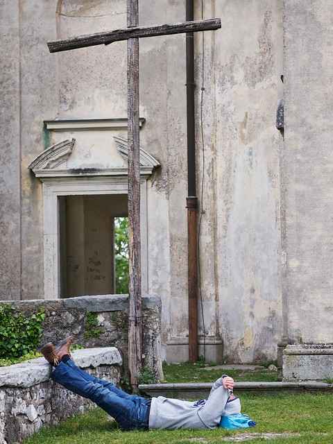
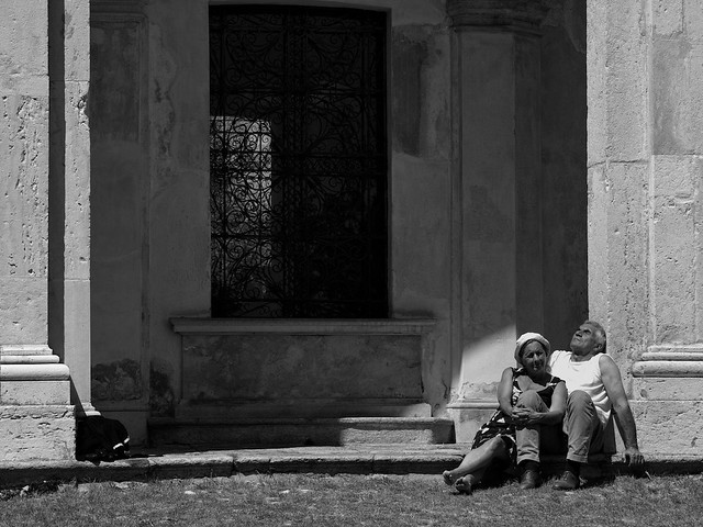
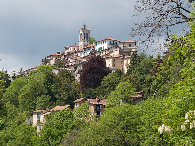
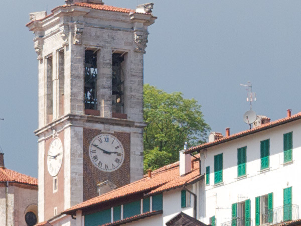
All photos taken at the UNESCO-listed Monte Sacro di Varese, Lombardia, Italy. A stunning and remarkably little known location, well worth a visit.

Posted in GAS on Monday, May 19, 2014 at 09:27 PM • PermalinkComments (2)

Page 1 of 2 pages  1 2 >