photoblogography - Just some stuff about photography

Architects may come…

...and architects may go

in Book Reviews , Monday, October 10, 2022

Last night I finally finished reading the epic “Venice, the city and its architecture”, by Richard Goy (Phaedon Press, 1999). Let’s say that again, epic. And heavy too, both physically and intellectually. Although not having any architectural knowledge at all, some of the terminology made it quite hard going for me, it is actually a very readable and quite fascinating book. I wish I had read it years ago.

I’ve tended to turn my nose up at the more monumental structures of Venice. I’ve only been inside St Mark’s once, and the same goes for Doge’s Palace, although in both cases that is in large part due to my aversion to queuing for anything (including ice creams). Not all that long ago there were still times of the year where Venice was not in the slightest bit crowded.

However having read this book cover to cover (which requires some dedication) has given me a significant new perspective. Understanding the human context under the skin of all these epic piles puts them in a very different light than that shed by the usual by-numbers guidebook commentary.

“Venice, the city and its architecture” was actually published over 20 years ago, and is not all that easy to find these days. I noticed a copy in the window of a bookshop in Venice earlier this year, but decided it was too heavy to carry around with me. I did try to get the shop to send it to me, but they adhere to standard Venetian passive agressivity and refuse to have anything to do with any concept invented later than the 18th century (then they’ll be whining they had to to shut down and sell to a Chinese tat vendor, but that’s 21st Century Venetians for you). Anyway. The type setting in the book is pretty weird. Very, very small paragraph text, with titles even smaller. This makes it uncomfortable to read, not principally because of the small type, but also because this leads to line lengths which are painful to scan. No pain, no gain I guess.  Also most photographs and illustrations are bafflingly small for such a large book. The editors did not do a good service to the author, which for a publisher with the reputation of Phaidon is really quite baffling. Still, I guess it was a miracle it was published at all, I doubt that it would be in today’s TL;DR era.

The book goes beyond a description of architecture, which is just as well, as I’m totally out of my depth when it comes to any discussion of pediments, orders and a whole bunch of terms which just as well be Martian to me. Particularly interesting is the extensive section on the Ghetto and the Jewish history of Venice. It also describes just how it was possible to build the city and especially these massive structures on a semi-submerged collection of desolate mud flats. The invisible foundations of Venice must be at least on a par with the pyramids or the Great Wall of China in terms of unimaginable scope and (manual) effort. It puts everything in a historical and political context, right until the 20th Century. And the author extends to a discussion of everyday vernacular buildings from the earliest days onwards, although this is one section I’d like to be a bit more detailed. For me the near endless cataloguing of churches did verge on tedious, but then again, the city’s ridiculous number of churches are fundamental to its social fabric.

Probably to get the full benefit of this book, you need to be better versed in the history of art, and perhaps certain basics of architecture, than I am, but nevertheless, if you, like me, are irretrievably hooked on the charms and mysteries of La Serenissima, then “Venice, the city and its architecture” is a must have. Next time I visit I’ll be looking at the city with an enhanced perspective.


Posted in Book Reviews on Monday, October 10, 2022 at 11:24 AM • PermalinkComments ()

Luca Campigotto’s Venice

a belated discovery

in Book Reviews , Wednesday, August 03, 2022

Venice is a recurring theme on this blog, and always will be. I’m hardly the first person to be fascinated by the place, but it can become a borderline obsession at times. It is of course a subject for photography, but for me it is much more than that. What fascinates me is the essential unreality of the place, and what it must mean to belong to and live in such an unlikely city. I can quite happily wander around the streets and canals without a camera, and even with a camera, by and large the photographs I come back with are not going to interest many people.

I also have a habit of acquiring vast numbers of books about Venice, photographic and other. Venice photobooks have a very strong tendency the feature the obvious: the Rialto bridge, the Grand Canal (and the Grand Canal from the Rialto bridge), the Piazza, San Giorgio Maggiore, the Doge’s Palace, the Bridge of Sighs. Toss in a few gondolas and carnival masks and you’re done. Not that the photography in these cases is necessarily bad, far from it. But it represents the monumental and symbolic Venice, and to me that’s really not so interesting.

Somehow in all these years I’ve managed to miss the work of Luca Campigotto. Luca is both a high level professional photographer and a native Venetian, and has published a series of photobooks on Venice (amongst other themes). I happened to discover one of these, “Venezia, Storie d’acqua” in probably the last remaining genuine bookshop in Venice, Libreria Studium. Based on what I wrote above, the cover of Storie d’aqua, featuring a shot of the Bridge of Sighs, gave me reason to pause, but after a few seconds of flicking through the pages I was sold - big time. There is certainly a significant number of photos the standard scenes in the book, but these sit alongside some almost unbearably atmospheric shots of truly vernacular Venice, a lot from my favourite area of Castello. Throughout the photography is of an extremely high standard, both in composition and execution. This is without a doubt, for me, the best Venice photobook I have seen to date.

But wait - there’s more. This is not Luca Campigotti’s only Venice photobook, and of the others, one is an absolute must. “L’Arsenale di Venezia” takes us inside the largely inaccessible, forbidden zone of the Venice Arsenal. Even today the Arsenale is a military zone, and can at best be glimpsed and not visited. So apart from the high standard of photography in “L’Arsenale di Venezia”, it also reveals facets of Venice which are completely inaccessible to most. What does get revealed is a landscape of largely industrial decay. The book was published in June 2000, and if I understand correctly, access was in part possible due to a temporary opening of some areas to house Biennale installations. The photographic medium would appear to be medium and/or large format film, and it shows in some high contrast shots, although not to any detrimental effect. “L’Arsenale di Venezia” is more specialised than “Venezia, Storie d’acqua”, but it is equally beautiful, absolutely fascinating and I strongly recommend it to fellow Venice obsessives.

The third book I have is also the oldest (the price on the dustjacket is in in Lire!). “Venetia Obscura” was published in 1995, and is a book of nighttime black and white photography. Actually both black and white and nighttime are two more of the standard tropes around Venice photography, but “Venetia Obscura” again, rises above these. The content of the book soon shows that “obscura” can be interpreted in more than one way, dark, certainly, but also obscure, shadowy, hidden. At the extremes the photography verges on the eerie, but always atmospheric, and never forced. It’s another beautiful collection, and again if some better known locations are thrown into the mix, these are counterbalanced by some much less travelled areas, in this case including the Lido and even Marghera.

It seems to me that Luca Campigotti pretty much owns Venetian photography. I’m not sure why he doesn’t have a higher profile, especially in the city itself. Maybe he does, and I’ve been too blind to see. The depth and breadth, but most essentially the soul in his work goes way beyond the surface scratching that most accomplish. A lot of photographers use Venice as a means to show their skill. Luca Campigotti instead puts his skill at the service of Venice. For me his photography acts as some kind of validation - while my own accomplishments are way inferior, at least somehow I feel the direction I’ve been trying to go in is justified.

Unfortunately these books are not that easy to find. While I bought “Venezia, Storie d’acqua” from Libreria Studium (who are yet to discover the Internet), the other two I obtained directly from Luca. If you’re interested, the best place to start is his website, www.lucacampigotto.com.

Posted in Book Reviews on Wednesday, August 03, 2022 at 04:19 PM • PermalinkComments ()

Timeless, by Rafael Rojas

Venice in monochrome

in Book Reviews , Tuesday, January 24, 2017

A quick survey of this website will reveal the author’s recurrent obsession with Venice. Indeed, if Venice had ice and penguins I’d never need to go anywhere else. Since another popular theme of mine is phonebooks PHOTObooks, damn it, Apple auto-correct - then there is an obvious intersection to explore. However, as I’ve noted in the past, this particular crossroads is less populated than one might expect. In fact to date I’ve yet to find a book of Venice photography that really grabs me, although I discuss on that last link, there are a couple that get close.

Well, now there’s a new candidate to consider: Timeless, by Rafael Rojas. Over the past 5 years or so Rafael has been steadily building a reputation as one of Europe’s leading and most inventive landscape photographers. It might therefore seem a little strange for his first published monograph to feature not wild, colourful open spaces, but instead restrained monochrome studies of Venice. And indeed, taking it another step away from the habitual by photographing exclusively on film. With a fully manual prehistoric Hasselblad. But I’m certainly not complaining.

The first thing that struck me about Timeless was the painstaking attention to detail and to providing a rich visual, subtle experience - and this was even before I bought the book: the dedicated website is a work of art in itself. The physical book fully backs up that impression. It arrives nestled in a black, silver printed slipcase, the book itself bound in vermillion hardcover. The whole presentation is somehow reminiscent of the spirit of La Fenice, an impression reinforced by the frontispiece. The print quality is just sumptuous, with deep, rich blacks and subtle tonalities. At the risk of repeating myself, the care and attention to detail that just leaps out of the pages is quite remarkable.

Rr timeless

photography copyright © Rafael Rojas

As far as I am concerned, any Venetian photobook loses points for the showing following subjects: gondolas, The Rialto, The Grand Canal from the bloody Rialto, gondolas, St Mark’s Square, carnival masks, actually pretty much anything to do with the carnival, and gondoliers. And San Giorgio Maggiore is right on the limit. Oh, and did I mention gondolas ? Naturally, I’ve personally photographed all of these hundreds of times. And naturally, most are to be found within the pages of Timeless. But, crucially, they are all treated in original and interesting ways. Moreover, Timeless visits the quiet backwaters of Venice, featuring places I immediately recognise without having any idea where they are, but could surely find. Laundry hanging out over a nocturnal Castello contrada, quiet details from areas so close to, yet so far from the swamped, stifling tourist hotspots.

The real star of Timeless, and indeed Venice itself, is stone. Stone in all its forms which has been used to create this absurd, impossible city, floating on a bed of mud and ancient wooden pilings. The photography revels in the endless combinations of texture of stone, the interplay with glancing natural and artificial light, with fog, with water, always reminding of the sheer unlikeliness and ingenuity of it all. Through the study of light and stone Timeless gets right to the heart of Venice. It’s a book to revisit and explore time and time again.

Obviously, I fully recommend this book. You should stop reading right now and get over here to order it. And yet…

And yet, Timeless is missing one important dimension for me. It’s obviously very subjective, but what else would it be: colour. For me, there is something absolutely unique about colour in Venice, especially winter light. It is incredibly hard to capture on film, needing an extremely delicate touch, and so I can understand the temptation of black and white. I don’t want to imply that black and white is some kind of surrender or second best choice - personally I’m completely inept at it, not that I’m much better at colour. But there still seems to be a certain strand of opinion that colour photography is for tourists. I’m certain Rafael Rojas does not share that view, and I understand that Timeless has certain set parameters, within which it succeeds brilliantly, but I’d love to see him produce a colour photography companion.

[Disclosure - I should note that Rafael and I are friends, but I’m a full-price paying customer, and this review was neither requested nor influenced in any way]

Posted in Book Reviews on Tuesday, January 24, 2017 at 08:47 PM • PermalinkComments (2)

Cameras or Photography?

it’s one or the other

in General Rants , Saturday, March 05, 2016

Cameras get in the way of photography. That sounds like a fairly ridiculous statement, but I think it is difficult to argue against. I’d like to think I’m interested in photography, but of the far too many hours I spend browsing the web, I spend far more reading about cameras than I do about photography and photographers. But what is very noticeable is that the more engaging photographers just don’t talk about cameras at all (and usually have dull websites, but that’s another matter). Maybe they feel a stigma attached to such discussion, or maybe they’re just not interested. But anyway, when the discussion veers towards cameras, as it usually does, something is lost. Of course, ten seconds on this site shows quite clearly which camp I’m in. It’s not exactly a gear site - and after all, these do encompass quite a wide spectrum - but it hardly ignores cameras or other paraphernalia of photography-as-hobby. So I’m in no position to judge, even if I were judging, which I’m not - just observing. But coming back to the original statement, I do find that the more I think about cameras, the less interested I am in photography, and the less interesting my photography gets.  Fortunately I have by and large stayed with the same principal brand and gear over a very long period, and I’ve never been afflicted by the more extreme cases of the malady which involve switching brand every 6 months. But nevertheless, if there is one thing that separates photography as art from photography as hobby, it’s the susceptibility to Gear Acquisition Syndrome.

The cycle of endless new, improved, must-have cameras has slowed down a bit, but it hasn’t stopped. It has changed tack a bit, and now we’re seeing design becoming much more prevalent in the marketing push, especially retro design sparking nostalgia for the alleged romance of the mechanical heyday of the film era.

So, what bought this on? Well, a new camera on the market, basically. Namely, the new Olympus Pen-F. It’s a nice looking piece of metal, and it is getting mainly rave reviews everywhere (although this review, from an actual Olympus employee, is strikingly lukewarm). Amongst Olympus owners, of which I’m one, there is a discernible of peer pressure to buy one. Well, yes, it’s a nice camera, but I’ve already got an Olympus Pen, an E-P5, and that took me long enough to decide to buy. The Pen-F, apart from the striking design, has 4 Megapixels more (not terribly significant), a fixed built-in EVF, and lots of new modes aimed at doing everything in camera, outputting JPEG, when for the last decade we’ve had it piled on us that we should be shooting Raw. What the Pen-F does not have, but what the E-P5 does, at least as an accessory, is a tilting EVF which allows you to hold the camera at chest level, and affords a different way of shooting and different perspectives.  For some this is uninteresting, for me it’s a big plus. Also the E-P5 EVF is the same as the one on the top of the range E-M1, and superior to that on the Pen-F.  Add into that an eye-wateringly high price, and well, for now at least I think I’ll pass.

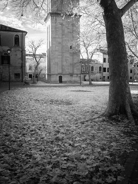
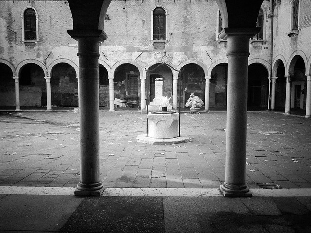
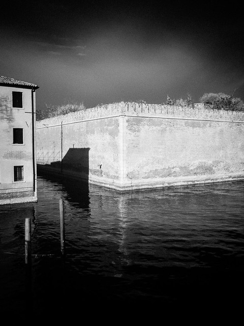
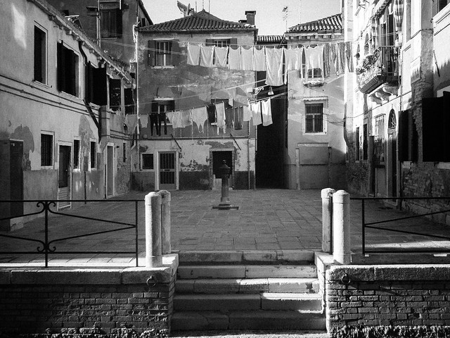
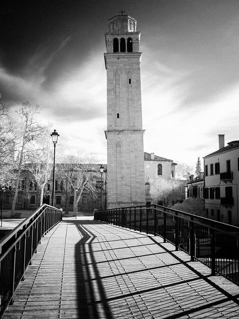
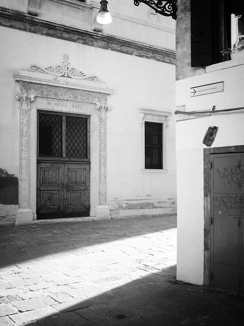
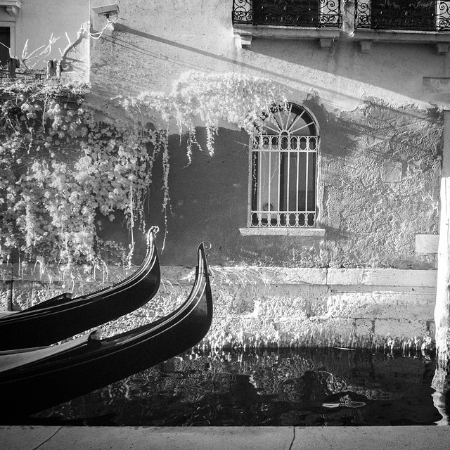
This leads on nicely to the previous “upgrade” cycle, when the E-P5 replaced the E-P3. There again I dragged my feet, as I was used to the E-P3, and Olympus had moved the controls around disturbing my reflexes. But there were a couple of compelling arguments that time, so eventually, I switched.  But I didn’t just abandon the E-P3. Instead I had it converted to infrared, which gives me a good excuse to water down this gear-obsessed post with some photography, a selection of infrared shots from Venice, taken back in December.

I can’t keep away from the gear, but it really is a relief to get back to photography.

drm_E-P320151216__EP30317.jpg
drm_E-P320151216__EP30318.jpg
drm_E-P320151216__EP30322.jpg
drm_E-P320151216__EP30329.jpg
drm_E-P320151216__EP30324.jpg
drm_E-P320151217__EP30345.jpg
drm_E-P320151216__EP30343.jpg
drm_E-P320151217__EP30358.jpg


Posted in General Rants on Saturday, March 05, 2016 at 07:20 PM • PermalinkComments (2)

A trip to San Pietro

yep, still more Venice

in Photography , Wednesday, January 13, 2016
drm_20151216_DP0Q0090.jpg

Despite many visits to Venice, the eastern, seaward end of the city has always eluded me. So on my last visit I was determined to make this my focal point. I have to admit from the glimpses I had in the past, I expect something more like the apartment blocks of the outer reaches of Cannaregio, or even Sacca Fisola. While there is an element of this, in fact I discovered that the area cut through by via Garibaldi has a quite distinctive character, subtly different to any other part of Venice. However the part that really caught my imagination is the little island of San Pietro, right at the northern tip.  A few hundred years ago I imagine San Pietro was not the quiet backwater it is today. The Basilica di San Pietro di Castello was in fact up until 1807 the city’s cathedral church, even though St Mark’s was already more dominant. But now it is very peaceful, and only dedicated tourists venture this far away from the fake Burano glass and carnival mask sellers.

Actually, I didn’t even go into the Basilica. Churches aren’t really my thing. I did open the door, but on seeing the inevitable ticket booth, I declined to go further. If the Catholic Church has decided that the primary purpose of ecclesiastical architecture is to make money, then it is hardly surprising that the only relevance it has today in much of the world is to tourists. I’m quite happy to make donations, but even an agnostic such as I am looks as much for a sense of the spiritual in a church as a collection of mouldy, dark old paintings by some vaguely famous Italian bloke. And that sense is stopped in its tracks by a ticket booth.

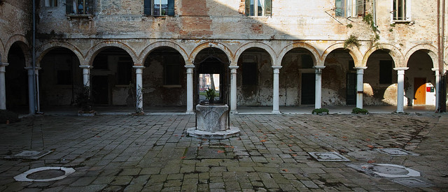
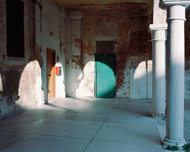
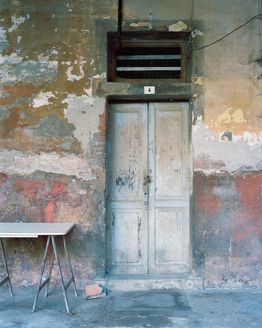
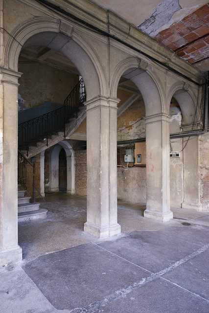
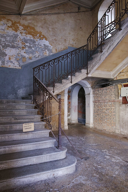
But anyway, it hardly mattered, because the visual treasure trove was immediately next door, in and around an old colonnaded courtyard backing on to the Basilica.  I can’t actually find a reference to this place, and I suspect it is in a fleeting state of transition between out of bounds Church property and a luxury development of charming residences with Genuine Venetian Fittings™. It was marked “private”, but I spent at least two hours wandering around, and the two or three people I saw there didn’t seem to mind. They obviously thought I was a bit weird, though.

Not that I would know anything about it - despite a brief dabble - but this seems the perfect location for a certain genre of portrait photography. Since I didn’t have one to hand, I’m afraid you’ll just have to imagine the models, in the set below.

drm_B667_Dec15_12_01.jpg
drm_B667_Dec15_12_08.jpg
drm_20151216_DP0Q0091.jpg
drm_20151216_DP0Q0098.jpg
drm_20151216_DP0Q0092.jpg
drm_20151216_DP0Q0095.jpg
drm_20151216_DP0Q0097.jpg


All photos from Sigma DP0, except the first and second after the text, which are Kodak Portra 400 / Voigtländer Bessa III


Posted in Photography on Wednesday, January 13, 2016 at 01:33 PM • PermalinkComments ()

Page 1 of 6 pages  1 2 3 >  Last ›