Website refresh
yesterday and today
Well this has taken a while. I started working on a redesign of this website around about May 2016. The basic idea has survived, and is pretty much what I’m releasing now, finally, nearly 2 years later. The basic concept was quite straightforward: I wanted to shift the focus a little more towards my photography, to reduce clutter, and to refresh the design a bit. The execution was anything but simple. First of all, I had to sort out the underlying technology, and apply various updates. That broke stuff, in all sorts of ways, mainly badly written code that wouldn’t work anymore. So I had to go through my rats nest of templates and scripts and clean them out. Actually this led to an interim update about a year ago, when I put the cleaned up version of the old design online. Of course there was no outward benefit to this.

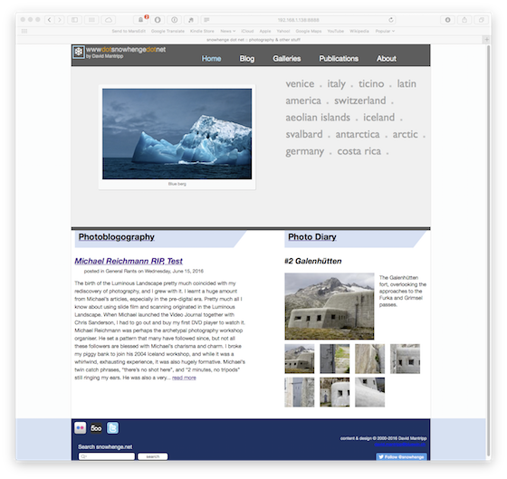
The home page earlier this week, and the home page today.
But then I could start working on shifting to the new design. I spent ages faffing around with stuff like web fonts, and even on a completely new concept using Koken. I had decided to completely rework the photo gallery part, and in particular revisit the contents from scratch. Just selecting and preparing the photos was an endless task. I had decided to add a new “Photo Diary” section, which is basically a blog with pictures and very few words, but of course I needed content for that too. And tellingly, the actual dates on the first two entries are really from Autumn 2016. I could maybe have stopped there, but no, I then decided to add this “Destinations” concept, which provides another way to discover and explore content. I’m quite pleased with that, in fact.
And so on and so forth. All this wasn’t helped by having very little time to work on this, usually just a few minutes here and there every week, which didn’t help with continuity, or remembering what I was meaning to do next. Finally I’ve arrived at a point where it seems complete and stable enough to throw it out there to sink or swim. There are still a few enhancements I’d like to add, mainly to do with the visibility of visitor feedback. I also need to make some further technical upgrades, but hopefully it will be relatively painless this time.
I don’t think I’ll be putting myself through this again. If I ever do another major upgrade, I’ll use some cookie cutter thing like Squarespace. Following this DIY approach has the benefit of allowing me to present everything exactly in the way I want it, albeit constrained by my abilities, rather than to fit in with some generic concept. And since I’m largely doing this for myself, that still makes sense, but only up until the point where it becomes unsustainable, and that point is quite near.
I’m sure there are bugs, glitches and gotchas all over the place, but I can’t procrastinate forever. Either it works well enough, or it will be time to call it quits. Hopefully the objective of providing a better platform for my photography has been met at least in part. Then it will have all been worth it.

