photoblogography - Just some stuff about photography

Random Walk

point & shoot

in Photography in Ticino , Friday, May 08, 2015

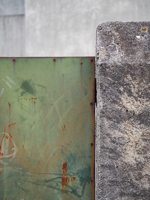
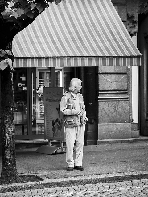
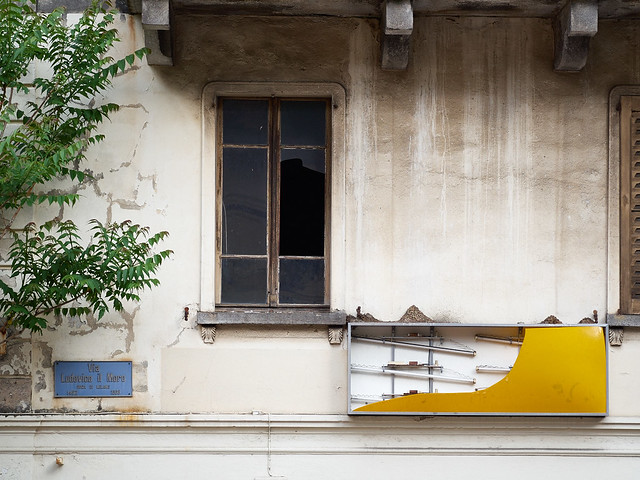
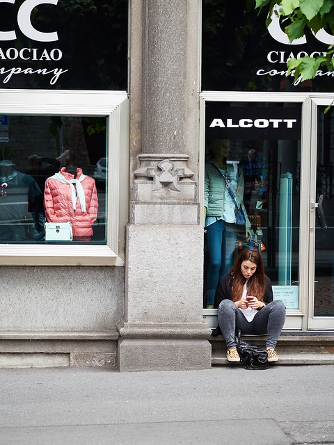
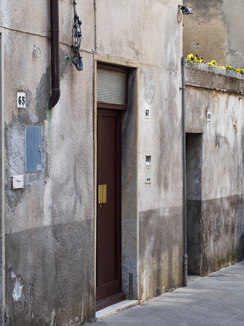
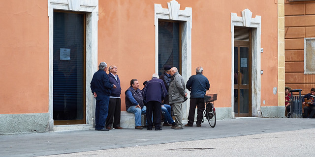
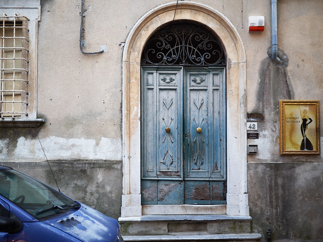
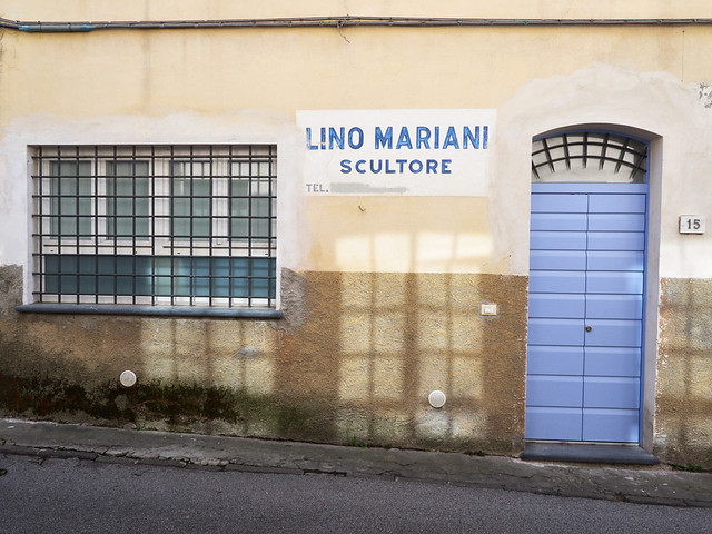
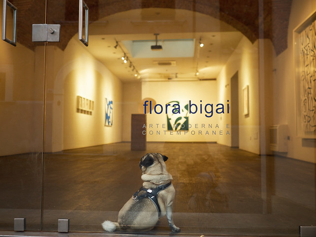
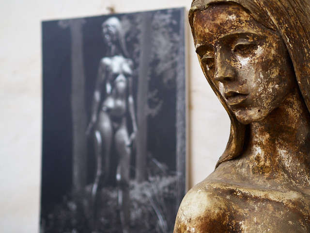
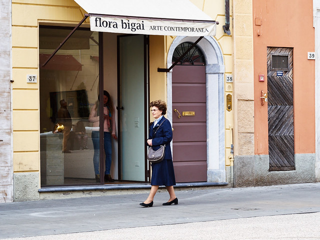
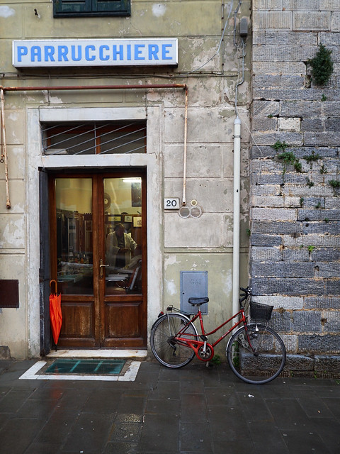
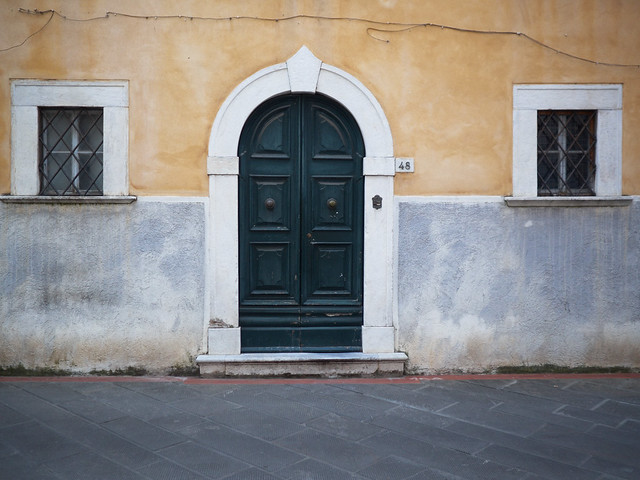
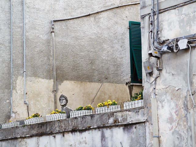
Just a quick burst of random photography walking to work through Bellinzona, Ticino, one random morning in May. No plan, no preconceived idea, and very little time. Just point, and shoot. It’s probably something I do two or three times a week, and forget about. But for some reason this little set said “publish me”. So here it is.

drm_2015_05_05_P5052161
drm_2015_05_05_P5052163
drm_2015_05_05_P5052156
drm_2015_05_05_P5052154
drm_2015_05_05_P5052152
drm_2015_05_05_P5052157

And for those who like to know, all shot with an Olympus E-P5 with Sigma DN 60mm f2.8 lens.


Posted in Photography in Ticino on Friday, May 08, 2015 at 07:56 PM • PermalinkComments (1)

Primavere Toscane

publishing empire launches today!

in Book Reviews , Wednesday, May 06, 2015

I have an announcement to make: I’ve finally managed to complete a project, and have self-published my first book, on Blurb.

Blurb 001

Still in the plastic wrapper

To be honest, “Primavere Toscane” is a very personal project, and was partly a kind of dry run, in advance of several other ideas I have in mind. It is a slim volume, weighing in at a mere 40 pages. Here’s what I have to say about it:

For over a decade, every springtime has been marked for me by a short visit to an area of Tuscany, just south of the city of Siena. This book is a distillation of hundreds of photos taken over these years, in the same places, and the same time of year.

Hundreds, if not thousands of photo books celebrating Tuscany have been published. The landscape, the towns and cities, the people, the culture, the food, even are richly visual and deeply attractive to photographers. Many of these are strongly biased towards the misty, early morning light, to the classic vistas across the Val d’Orcia, and the golden light illuminating the farmhouses and rolling hills. Certainly I’ve been drawn to these too, and this book does contain a few examples of such scenes. But more and more I’ve been attracted to the stronger, even harsh full daylight, which we landscape photographers are told to avoid. The problem with the morning light, apart from the fact that early morning in Tuscany is usually painfully early in late springtime, is that it ends up showing a very romanticised view, representing only one aspect of the complex character of the region.

I’m certainly not going to claim to do any better at representing all facets of Tuscany, or even the small area within which these photographs are taken, but I do hope to show a personal interpretation rather than replicating the work of celebrated authors.

Blurb 002

I decided to go the full DIY route, creating the layout in InDesign, and preparing the photos myself. For creating the layout, I used JPG proxy images, and then created exact size CMYK versions, sharpened at the output size. It was a lot of work, but the results are good. I chose a hardback format, and heavier Proline paper. Two things came out of that: 40 pages is barely enough to fill out a hardback format, and the Proline paper is nice, but has a degree of print-through, which surprises me. Only a little,but still. For subsequent printing I think I’d select Proline coated. The selection of paper stock is a bit of a pain with Blurb, and they could make it easier. For example, I have a couple of Blurb books by other authors, but I have no way of telling which stock they are printed on. But generally, the Blurb experience is great, apart from one eye-watering detail: the prices. They’re just way too high.

Blurb 005

The photography in the book is a mixture of “normal” and panoramic frames, and was edited down from about 700 shots. It is roughly divided into thematic sections, but these are not labelled. I’ve set it so you can flick through the whole thing on the Blurb site, using their preview tool.

If you get a chance to have a look at the preview, I’d love to hear what you think. I may create a PDF version for download sometime, but that will require a completely revised layout. Blurb’s “auto PDF” generator produces truly abysmal results.

Blurb 006

Wow. I’m a (self) published author now!

Posted in Book Reviews on Wednesday, May 06, 2015 at 10:47 PM • PermalinkComments (5)

A Peculiar Obsession

Indecisive Dave

in Film , Tuesday, May 05, 2015

I do wonder why I keep coming back to film. Apart from feeding the XPan, where I don’t have a choice, it really doesn’t make much logical sense. It may make emotional sense, which is probably more important in a creative context, but to what degree that emotion is nostalgia is debatable. Up until 2003 I shot exclusively film, apart from photography intended for multimedia and illustration work, which I was a lot more interested in that straight photography up until around the turn of the century. I carried on dabbling a little with Medium Format film for a while, but found it too cumbersome to fit in with my very limited photography time.

There is of course a debate which precedes “Film v. Digital”, and that is “Positive (aka Slide) v. Negative” (not to mention “Glass Plate v. Wax Cylinder” or “Vinyl v. Polyester”). I was firmly in the Positive camp, and indeed when I talk about “coming back to film” I actually mean experimenting with negative film. I’ve used Kodak Portra 400 in the XPan, and under a certain type of light, essentially strong Mediterranean sunlight, it works pretty well. Indeed, it is quite difficult to distinguish from my favourite slide film, Kodak E100G, although the E100G is a little denser. I also find Portra gives a slight reddish hue in mid tones, but that could well be down to scanning. And there lies the main issue with negative film: there are a million interpretations of the negative, and they’re all largely subjective. With positive film, you have a reference - the developed slide itself. There is a certain amount of leeway for altering the look of a positive scan - more so than many give it credit for - but essentially, if you got your exposure right, the main objective of scanning slide film is to get as near a match to the transparency itself on a light table, although nothing quite matches that look.

With all that in mind, I nevertheless took my newly acquired Olympus OM4Ti, loaded with Portra 400, to my reference pre-alpine glacial valley, along with my Olympus EM-5 as benchmark. The results are, well, interesting. Being impatient, I had the film processed at a 1-hour photo lab, which was perhaps not ideal. I also had them do some auto-scan JPGs for me as an index.  I then scanned a few frames using Silverfast 8.5 and the Opticfilm 120.  Next, I spent a rainy Sunday tuning a film profile for Portra 400. This is actually a thankless task, as it all depends on exposure, lighting, and intent, and getting one fits-all profile just isn’t going to happen. Silverfast’s new Portra 400 NegaFix profile is a good starting point, but my guess is that it assumes nominal exposure, and I’ve followed the current Portra gurus and dialled in +2 stops. Fiddling around with film profiles is far too much like hard work, but I eventually got something I liked. Although once I’d loaded the processed scans into Photoshop, I found them to be too warm in the midtones. Seems most serious Porta users contract out their scanning, but that’s not much to my taste.

ANYWAY.

The other thing is that my 35mm photography skills are obviously very, very rusty. Being used to Micro Four Thirds focal lengths and depth of fields meant that I got the focus point and aperture completely wrong on the OM4’s 35mm lens. Still, what I’m really interested in here is the colour and to discover if thee is actually any benefit in 35mm negative film.  Here is the evidence for the defence:

https://farm8.staticflickr.com/7711/17380592152_9d9b45432b_z.jpg
https://farm8.staticflickr.com/7732/17380587852_dcc1e0d284_z.jpg
https://farm8.staticflickr.com/7768/17356618356_3c553cb439_z.jpg

And here, roughly processed with CaptureOne’s Film Curve tuned for Olympus E-P5, is the evidence for the prosecution:

https://farm8.staticflickr.com/7766/17382608205_b803812b60_z.jpg

I guess that if you look just at the general scene rendition, there’s not that much in it. But the film images took more than a few hours and quite a lot of money to get to that point. The digital image took a few seconds and is essentially free.

So why bother with film at all? Good question. At 35mm I’m not sure there’s any point at all, at least for landscape, but at larger film sizes (including 24 x 65mm) the story is a little different. Film cameras are fun to use, of that I am in no doubt. But digital cameras can be ok too. And getting the final result out of film is another matter altogether.

I’m not quite done yet. Film deserves a better chance, with more careful technique and optimisations with filters and stuff.  And for some reason, the digital advantage seems lesser in urban settings. Also, the positive v. negative debate remains. Perhaps I should treat the OM4 to one of my few remaining rolls of E100G, or more sensibly, a roll of Provia 100F. And on the other hand, there are clearly scenarios where Portra 400, or perhaps Fuji 400H, makes the XPan a far more flexible tool.  But ultimately, what I miss about film is seeing transparencies on a light table. There’s no better way to edit a shoot, in my opinion, and you lose that with negative.


Posted in Film on Tuesday, May 05, 2015 at 10:33 PM • PermalinkComments ()

Pietrasanta

art & illusion

in Photography , Sunday, April 26, 2015

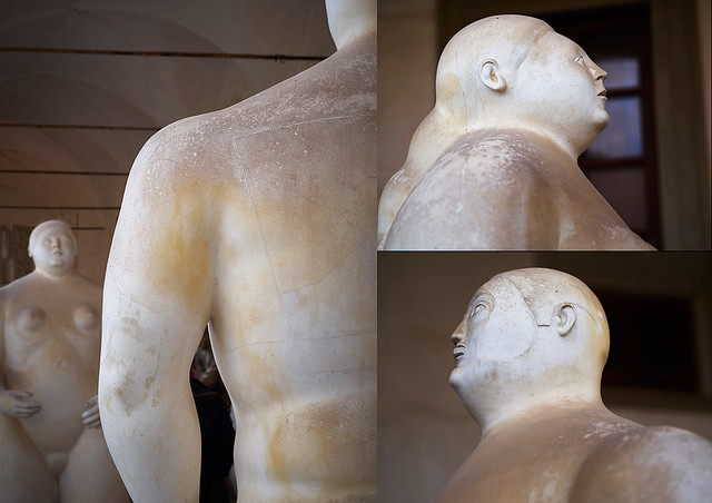
A little while ago, we spent a long weekend in the town of Pietrasanta, in northwestern Tuscany, a little way away from the millionaire’s playground, and capital of bling, Forti die Marmi. Pietrasanta is nothing like that hyper-sanitised enclave, fortunately, but a rather surprisingly well-kept secret outside of the flow of mass tourism. Although it has a rather shady past, these days Pietrasanta is a thriving artistic and cultural community, and home to some well-know names such as Fernando Botero and, until recently, Igor Mitoraj. It was actually through an interview with Botero that we found out about Pietrasanta.

https://farm8.staticflickr.com/7658/16655825524_d4d4178516_z.jpg

Models for Botero’s Adam and Eve, in the Museo dei Bozzetti

Pietrasanta is just down the road from the Carrara marble quarries, which have provided the source material for notable artists and architects for centuries, including of course Michelangelo. And marble is much in evidence in the town.  The old centre is perhaps a little tidier than the average Italian town, but is full of the usual nooks, crannies and idiosyncrasies which make these places so rewarding to wander around, camera in hand.

Here, then, are a few examples.

https://farm8.staticflickr.com/7669/17089867220_93c9143f25_z.jpg
https://farm8.staticflickr.com/7660/16657168963_f3932a427e_z.jpg
https://farm8.staticflickr.com/7721/17089869480_0d4015a003_z.jpg
https://farm8.staticflickr.com/7658/17091198539_b0306bf909_z.jpg
https://farm8.staticflickr.com/7727/17275603232_1c751d4040_z.jpg
https://farm9.staticflickr.com/8700/17069983927_18ea57c362_z.jpg
https://farm8.staticflickr.com/7701/17091193009_aa2670d2cc_z.jpg
https://farm8.staticflickr.com/7715/17275604282_0082e110b5_z.jpg
https://farm9.staticflickr.com/8723/17069977807_dedf32b3af_z.jpg
https://farm9.staticflickr.com/8825/17089874230_a2309bf8f4_z.jpg
https://farm9.staticflickr.com/8796/17277629771_96e4826e20_z.jpg
https://farm8.staticflickr.com/7691/17089634488_8fa3cb7d0d_z.jpg


Posted in Photography on Sunday, April 26, 2015 at 06:36 PM • PermalinkComments ()

Avannaa by Tiina Itkonen

book of the year (so far!)

in Book Reviews , Wednesday, April 22, 2015

This is a book review I’ve spent longer than usual thinking about. I’ve wanted to get it out there, but at the same time not rush it, because the subject really is something quite special. And I’ve been busy with a lot of other stuff so finding time hasn’t been easy.  The subject is Tiina Itkonen’s book, Avannaa, for which I was pleased to be able to contribute to the crowdfunding campaign.

Avannaa

Avannaa is subtitled “Photographs of Greenlandic Landscapes”, but it is much more than that. It is an expression of one person’s discovery and connection with a faraway world that most of us can only dream of. And unlike so much landscape photography, especially that in the polar latitudes, which largely consists of trophy hunting, this is the product of a long term, deep relationship with both the natural and human landscapes. Added to that, Tiina Itkonen as a photographer has a delicate, precise touch which brings alive the subject matter, and communicates her passion for Greenland, without falling into the trap of the over-processed, superficial quick thrill effects which are so commonplace these days. 

These photographs are clearly born from patient observation, of clicking the shutter only when the moment demands it, rather than from rushing around snapping everything in sight and hoping that something can be made of it all later. They have plenty to say, but prefer to say it quietly. The strong visual and thematic coherence add to the sense of depth and meaning.

Titkonene1

Uummannaq II, Greenland 2007 © Tiina Itkonen

You can dwell over the landscapes in Avannaa without them grabbing you by the throat. Every new visit reveals something else, and serves to increase appreciation for the photographer’s talent. This is not the kind of photography which is going to appear on the front page of “Awesome Digital SLR Photography Monthly”, or gain 1000+ faves on 500px, but it could well grace the walls of art photography lovers, which is probably why Itkonen is better known in the art photography world, with serious gallery representation, than in the camera buying world.  Indeed, there is not one word about cameras or technology in either Avannaa or the earlier Inghuit.  Having said that, the technical quality of the photography is flawless. As a large proportion of the photography is in panoramic format, with a ratio of 3:1, and has a very film-like palette, with remarkable detail, one could guess at the use of 6x17 camera. But it really doesn’t matter.

It takes a lot of dedication to complete a body of work such as this. Greenland, although reasonably accessible these days, is still a remote a difficult place to get to grips with. Many people would consider a quick summer flight to Nuuk, or even Kulusuk, as epic enough, but reaching the communities of the north-west coast, and living amongst them not only in summer, but also in winter, and repeating the experience time and again, well this ventures well into the territory of obsession.

Titkonene2

Masaitsiaq 1998 © Tiina Itkonen

In her earlier work, Inughuit, Itknonen focused on the Greenlandic people, mainly through intimate portraits of daily life. In Avannaa the people are still there, but the landscape now takes centre stage. However, you still get the strong feeling that the landscape is shaped and given meaning by the people who live in it.  This is the big difference between the High Arctic and the Antarctic. The Antarctic really is an alien place, survivable only in artificial circumstances.  But the High Arctic, as terrifying as it may seem to a comfortable West European, is and has been home to many, many generations, and these people have given the landscape life through myth, legend, and everyday life. The landscape and it’s inhabitants are closely intertwined, and removing one or the other from any photographic representation removes the magic.

If I had to find something to criticise, it would only be a slight regret that the format isn’t a little bigger, so that the panoramic frames do not have to run across two pages. But the economics of book publishing these days probably push that kind of luxury out of the bounds of reason.

I guess you can tell I like this book. I’m looking forward to Tiina Itkonen’s next works. You can - and should - buy Avannaa here.

A couple of shots of the book, to give a general idea:

Avannaa 001
Avannaa 002
Avannaa 003
Posted in Book Reviews on Wednesday, April 22, 2015 at 08:26 PM • PermalinkComments (3)
Page 42 of 141 pages ‹ First  < 40 41 42 43 44 >  Last ›