photoblogography - Just some stuff about photography

Hell freezes over

coming to my senses?

in Product reviews , Sunday, August 30, 2015

I have spent a huge amount of time and effort over the years, not to mention a little money, trying to avoid using Adobe Lightroom. The various reasons for this include that I don’t much like the GUI (compared to Aperture, RIP), I don’t much like the library (compared to Aperture, RIP), and I’m uncomfortable with the Adobe subscription model. I also have a certain sense of antipathy towards the rather over the top, uncritical, fawning cheerleading which comes from so many on-line self-appointed gurus, all of whom have their book, or video, or workshop to sell, and all of whom have contributed, thanks to killer marketing skills from Adobe, to Lightroom’s supremacy. A successful symbiotic community, but not one which has done much service to the world of digital photography in general.

But is Lightroom itself actually all that bad? Well, no, it isn’t. It’s pretty good actually, but it is neither the Second Coming, nor is it without faults, nor is it as overwhelmingly superior as the shill wolf pack would have you believe. But looking at the combination of requirements that I have personally, I have to admit, finally, that avoiding it is like cutting off my nose to spite my face. So I’ve finally admitted that resistance is not only futile, but counterproductive as well.

Lrgrab

I certainly wasn’t expecting to be looking at this, a few weeks ago.

The quality of the output from the Develop module tends to get widely derided these days on the interwebs, especially compared with CaptureOne. I’m not entirely sure why, but I suspect there is more than a grain of anti-Adobe sentiment behind this. The difference in quality, measured as resolution and definition, between all Raw converters on the market, is generally minimal. To my eyes Iridient Developer has a slight edge, but that may be down to its superlative sharpening tools. Yes, there are differences in colour rendition, but if you drill down a bit to understand why, then generally you can pretty much neutralise them. If utmost, 200% pixel peeping brick wall cat’s whiskers photography is your thing, then probably Lightroom or Adobe Camera Raw is not what you need. But otherwise, the combination of features and sheer completeness of Adobe’s offering is difficult to ignore.

The Lightroom user interface still looks to me like it has overall design philosophy. Different modules, even tools within modules, look like they were designed and integrated by different people with little communication between themselves. Indeed, the different Modules behave more like separate applications linked together through a common launcher than parts of the same application. The essential weakness of the cumbersome modal design is betrayed by the Develop Module leaking into the Library Module by way of the Quick Develop tools. It’s a pity that either stubbornness, not-invented-here syndrome, or, most likely, be-suited MBAs clutching their ROI and P&L spreadsheets is preventing a major UI overhaul. And, think of all the income from the new editions of books, videos, etc!

But on balance the experience is positive. Compared with CaptureOne, the only real advantage that I find there is that the image adjustment tools are more intuitive and faster to use, and certain features such as perspective correction (especially), highlight recovery, and clarity control, are better. On the other hand Lightroom has far better support for camera calibration, and the sharpening tools are better. I prefer CaptureOne’s layer approach to Lightroom’s edit points, and I preferred Aperture’s local edits approach to both of these, but in the end the functionality is much the same.

The killer features in Lightroom are the Library, and, surprisingly, Lightroom Mobile. The Library is almost as good as Aperture’s. It is fast, smooth, and there are plenty of well designed metadata tools. The implementation of Stacks is a half-baked copy of Aperture’s (and really, it is, just look at when it was released in Lightroom), albeit more powerful than CaptureOne’s Versions, and the Smart Collections are weak compare to Aperture’s Smart Albums, but on balance, it is - now - the best on the market. Overall, compared with CaptureOne’s improving, but incomplete and laggy Catalog, Lightoom’s Library is much easier to use. And the other major plus for me, at least, is full support for large Photoshop and TIFF files, which means I can catalogue my film scans together with my Raw files. Aperture let me do this as well - indeed, the fact that Lightroom 1 had serious file size limitations was one major factor leading me to switch - but Lightroom actually is smoother.  The only “orphan” files I have now are Sigma Merrill Raws, but nobody supports those. The workaround of cataloging a proxy JPEG and using that to launch the X3F in Iridient Developer works just as well in Lightroom as in Aperture, or indeed CaptureOne.

I think that the dependence on a physical file structure in the Library is pretty prehistoric, compared to Aperture’s fully virtual organisation, but the geek contingent could never live with the loss of explicit control that the virtual approach required, so we’re stuck in the past.  On a side note, recently I completely restructured my physical file organisation, to try to make it more convenient to PhotoSupreme’s needs.  Aperture didn’t skip a beat: together with MacOS, it noticed that the referenced files had moved, and just adjusted itself. CaptureOne, or Lightroom, would have just given up and died. But thanks to Apple shifting lock stock and barrel in to the luxury personal accessory market, we’ve lost all that innovation.

Ironically, my file structure is actually quite clumsy. This is due to an earlier period when I was using Lightroom 1, for about a year, until moving to Aperture 2.  I had to live with the file organisation imposed by Lightroom. Since this basically has never changed, re-importing into Lightroom CC was not a big deal. I did try the Aperture Importer: it’s not as good as CaptureOne’s by a long way, but not as bad as people say it is - it does actually work, albeit very, very slowly.  However, since all it really does is carry over some metadata, and that can just as easily be accomplished by writing metadata to original files or XMP sidecars, there’s little point in it. Takes forever and a day too, and the workflow is very badly designed.

I wasn’t expecting much from Lightroom Mobile, because it doesn’t do what I thought I wanted, i.e. remote editing and curation of the Library. It also gets a poor press, because it doesn’t do what a lot of people want, i.e. act as a front-end mobile file importer. What it actually does do is give you access to selected parts of your library which you have already created on the desktop, and, via “cloud” synchronisation, it then allows you to review and rate these, and to apply quite a high degree of image manipulation. On my new iPad Air 2, this works very well indeed, and actually, it turns out it is pretty close to what I wanted. Keywording would be nice to have, but what it does give me is enough to keep me constructively engaged during daily train commutes. Also, Lightroom Mobile supports importing and synchronisation of photos taken with iDevices. I haven’t tried that yet, but it is interesting. However, it does seem to conflict with a lot that Mylio provides. Mylio does do things that Lightroom Mobile does not, for example importing new files in the field and synchronising them with home and backup destinations, but several key things that it does do, and Lightroom does not, for example key wording, it does rather weakly.  I’m not really sure yet if Mylio is really needed in a Lightroom-centric workflow.

Finally, a CC subscription to Lightroom also brings Photoshop CC 2015, which has some useful additions for working with film scans, not the least being the Camera Raw plugin. I’d heard vaguely about this, but I didn’t really realise how useful it could be to be able to use ACR adjustments on a layer for film scans. Sure, there are other ways of doing everything in Photoshop, but the ACR toolset is specifically designed for photography, and makes everything much faster. And the fact that it swallows a 350Mb 16 bit XPan scan without a murmur is pretty impressive.

So, over the last months, I have invested a lot of time successively in PhotoSupreme, CaptureOne, and Mylio, and at this point pretty much discarded all of them in favour of Lightroom (maybe not Mylio, I may still have a use for that, but development seems to have slowed). It’s completely against current trends to switch FROM CaptureOne TO Lightroom, which, given my track record and general disposition, is probably as good a reason for doing it than any. Switching to Lightroom and writing a nice review about Jeff Schewe in the same month ? I must be going soft in the head.


Posted in Product reviews on Sunday, August 30, 2015 at 08:26 PM • PermalinkComments (6)

Photoshop Workflow 2 by Ming Thein

good in parts

in Product reviews , Thursday, August 27, 2015

Ming Thein runs one of the most outstanding photography blogs on the web today. His combination of posting frequency, quality of content, quantity and depth of content, lucid writing, and tasteful presentation free of third party advertising is probably unique. On top of this, he engages fully with his readers in the comments sections, and last, but very much not least, is a talented photographer with a killer instinct for composition, and a commitment bordering on obsession with precision and technical quality. Why, I wonder, does he pour so much energy into this? I assume that the underlying driver is to build his brand, both as a professional photographer, but also as an educator, a purveyor of workshops and training materials. Since I am a compulsive, if intermittent, consumer of such materials, I decided to take up a special offer a few months ago to buy his “Photoshop Workflow 2” video. Since I haven’t seen any independent reviews of his videos, I decided to throw my hat into the ring.

Photoshop workflow part 1 mingthein com m4v

you get quite familiar with this view…

When Ming publishes a review, he tells things as he sees them, fairly, but without pulling punches, and from his clearly stated subjective point of view. Witness his review of the new wonder box Sony A7RII, which I found pretty refreshing. So I’m going to take the same approach to “Photoshop Workflow 2”. The basic questions I’m looking to answer are “were the videos useful to me”, “would I recommend them to a beginner”, and “would I recommend them in general”. The answers are, “not really”, “no”, and “it depends”.

The video is split into 2 parts, and covers Ming’s full end to end workflow, from import through to print-ready output. The subject matter here is not a tutorial on Adobe Camera Raw and Photoshop, as such, but rather a description of the specific process Ming uses to streamline his image processing and to produce output in his adopted style. So if you’re interested in finding out, in detail, how he uses these tools, then you might be interested in these videos. If you’re looking for a more wide-ranging, open-ended discussion, then probably not.

The workflow uses Adobe Bridge, Adobe Camera Raw and Photoshop, nothing else. The video starts off with a lengthy preamble about choosing and setting up equipment. There’s not much to quibble about here, even if I would have expected a professional photographer to adopt a more suitable display than Apple’s shiny Thunderbolt Display, but one section had me spluttering in my coffee. Ming recommends carrying out the critical step of monitor calibration by eye, using Apple’s software calibration utility. At best this can only lead to a good subjective calibration. Maybe Ming has superhuman eyesight and colour discrimination to go with his astronomical IQ, but generally it will lead to a medium to poor subjective calibration. In a closed, end to end flow where your output is going nowhere else than a single printer, this might work. But otherwise it’s a recipe for disaster and lot of wasted paper. Decent hardware calibrators are neither expensive nor hard to use. It amazes me that Ming disdains to use one, especially given his geeky side. To add insult to injury, the sequence showing the software calibration in use is a waste of time, as for some reason the screen capture does not show any activity in calibration tool screens: the viewer cannot see what the narrator is describing.

The workflow itself is split in a set of steps: ingest the images, rate them iteratively in Bridge, bring the picks into Camera Raw, sort out the white balance and any colour issues, and adjust the exposure as high as possible without clipping. Then export to Photoshop. In Photoshop, switch to LAB mode and adjust the exposure globally to taste using one or more tone curves. Then adjust exposure locally using the dodge and burn tools. And sharpen appropriately. That’s basically it. What I find surprising is first, on the input, total disinterest in keywording or any kind of asset management. I guess when you’ve got a brain the size of a planet you don’t need any help remembering where your photos are. Or where they’re from. The second thing is pretty much completely eschewing layers in Photoshop, largely sacrificed on the altar of LAB mode editing. Well, it’s his workflow, but I have to say he’s out on a limb on that point!

I’m not going to comment further on the content. It is exactly as promised, no more, no less. The rest of this review is about the video itself. As mentioned before, it is split into 2 parts, running over 130 and 100 minutes respectively. I’ll say this immediately, that is far, far too long. For the first 8 minutes all we see is a static Photoshop screen with the title, and Ming talking over it. Obviously, a tutorial needs an introduction, but really it also needs a few hooks up front to get the viewer interested. A short talking head sequence might have been a nice touch. Ming’s delivery tends to be rather flat and hesitant, and although not too bad, really cannot comfortably carry a 4.5 hour monologue! “Ums”, repetitions, sudden switch of context, and various mannerisms quickly get annoying, and should be edited. Also, his Mac keeps interrupting him demanding to do software updates. Annoying, yes, but for such a production, he really should have stopped, disabled updates, and started again. This, and other things, gives the impression of a one-take capture, with no post editing whatsoever. Presumably he did take a comfort break every now and then.

Anyway, this then leads into what was the most interesting part for me, Curation. This is the process of reviewing a collection of images and deciding which ones to take forward. Actually, id argue that Curation also requires a clear objective, like a book, an exhibition, or a portfolio. Here, I’d argue that he’s culling, a pre-requisite to curation. His methodology and especially thoughts about the image are interesting, but, again, it’s way too drawn out. He does not need 136 photos to make the point. They finally get wittled down to 19 at 45 minutes in. This is fast, but not when you’re presenting it on video. It’s a bit like cookery shows - sure, the roast took 2 hours to cook, but we didn’t get a 2 hour shot of an oven door. Next up comes the colour management sequence mentioned earlier. Skip this. Finally, at 1:24, the section on workflow starts. It is interesting, but again, it drags a bit. The referring back to an earlier version of the video is also irritating - unless it comes as part of the package, it should not be assumed that the viewer is familiar with it. Also, key concepts, such as dodging and burning, seem to get rather light treatment. Nevertheless, Ming’s method of dealing with exposure is very educative. What is, in my view, extremely poor, is that in his first, lengthy Photoshop workflow, when extolling the virtues of LAB mode, it turns out he was in RGB mode all the time. Anybody can make a mistake, but apart from any discussion of the fact that even he could not tell the difference, surely the professional thing to do would be to go back and reshoot the sequence. There then follows a sequence talking through the processing of different images, which is quite engaging. Finally, there is a useful, short, discussion of Camera Raw as a filter on a TIFF image, which is an area of Photoshop I had never explored. Wrapping up is a section on Fuji X-Trans files. Doubtless this is interesting to Fuji owners, but for me, and I assume other non-Fuji owners, it’s 20 minutes of padding.

And here we get to the point I’ve avoided so far: why so long, and why the padding? Well, I suspect that in part it is to justify the rather extravagant pricing: Photoshop Workflow 2 costs $80, standalone (various discounted bundles are offered), including access to source files to work on.

Arguably $80 is reasonable, given the content. But for this price, I’d expect better narrative, some evidence of post-editing, tidying up or re-shooting messy segments, and more weight on detail rather than repetition. In fact, the final 4 minute wrap up pretty much gives you an adequate overview! The X-trans section should be a separate, possibly free, download. Another product in the same ballpark, Michael Reichmann and Jeff Schewe’s epic “Camera to Print & Screen”, which offers 59 easily digestible segments totalling over 12 hours, with a vast scope, costs $60, and is frankly a lot more entertaining.

I would like to emphasise that this is a review of a product, not of it’s author. Ming Thein is a fine photographer, and a great, positive contributor to the photography internet. He holds himself to very high standards in his writing and his photography, but at least in this case, for video he doesn’t quite reach the mark. This view, of course, is coloured by the high relative pricing of his videos. Ignoring that small point, then there is little to criticise.

So, coming back to my questions: “was the video useful to me”: not really, but I did find his method of working with exposure interesting, albeit because I’ve been roughly doing something similar myself. But to be honest I would say I was reminded of a few key points, but I didn’t discover much new; “would I recommend it to a beginner”: no - it’s way too expensive and way too long to hold attention - and “would I recommend them in general”: well, if you want to make photos that look like Ming Thein’s yes. Otherwise, probably not.

I don’t regret paying for this video, and others I got as part of a bundle, because in any case I consider it in part supporting Ming in maintaining his excellent web site. But I do think he should take a step back, and see if he could improve his production standards to find a better way to deliver his valuable knowledge and artistry.


Posted in Product reviews on Thursday, August 27, 2015 at 08:33 PM • PermalinkComments ()

Ferragosto

the sargasso of the soul

in Photography in Ticino , Sunday, August 23, 2015

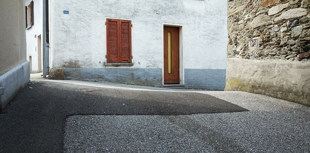
Ferragosto is an Italian and public holiday celebrated on 15 August, coinciding with the major Catholic feast of the Assumption of Mary. These days it commonly marks the end of a standard two week work close down and summer vacation period, during which Italian cities are deserted, and nobody, but nobody, answers the phone. Even the carabinieri have gone to the beach. Unlike Northern Europeans, in general Italians seek out crowds, and actually seem to enjoy being packed in like sardines on the beaches of Rimini and Viareggio, and saying that you’re not going anywhere at “Ferragosto” is to be marked out as a weirdo.

drm_gr_20150810_0601

Since the Canton Ticino is at least culturally an extension of Northern Italy, and since over 50,000 Italians cross the border every day to work here (Ticino has a population of about 330,000), Ferragosto strikes Ticino as well.

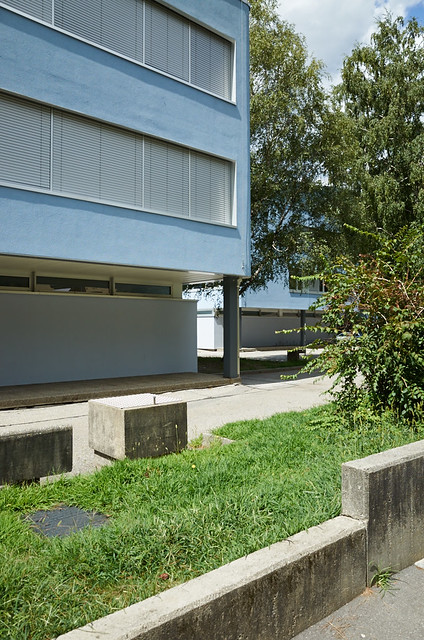
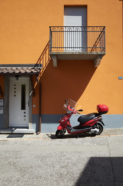
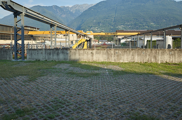
Apart from the tourists, and the few people like me still working, the trains are empty, and the streets emptier still. The wind-down starts as the the schools and universities close at the beginning of July, accelerates towards August, and then peaks during the Ferragosto. The heat and the lack of activity lead to strange, subdued atmosphere, like an urban Sargasso Sea.

I wrote a little about this last year, with a short set of photos.  Here’s a few more.

drm_gr_20150813_0614
drm_gr_20150817_0625
drm_gr_20150813_0611
drm_gr_20150817_0626
drm_gr_20150813_0617
drm_2015_15-08-20__R000632


After the 15th of August, people start drifting back. You might, just might, be able to reach a plumber or an electrician, but it’s still unlikely. Then it all accelerates. In a few short days the 50,000 people are once again crossing the border to jam up an infrastructure which was never designed to support them, the trains are full, the streets are busy. Ferragosto and the dog days of August are a receding dream.

drm_2015_15-08-21__R000635
Posted in Photography in Ticino on Sunday, August 23, 2015 at 07:14 PM • PermalinkComments ()

The Digital Print, by Jeff Schewe

mmm, such delicious crow

in Book Reviews , Thursday, August 20, 2015

I’m firmly of the belief that a photograph isn’t finished until it is printed. And yet I make very few prints. The reasons for this include a lack of time, a lack of space to hang them on the walls, a lack of people to show them to - nobody I know is interested - and not forgetting pure unadulterated sloth. And then, when I do decided to settle down and do some printing, stuff always goes wrong. Either the printer comes up with one of it’s various ruses to frustrate me, or I forget to set something up correctly, or the colour profiles have mysteriously corrupted themselves. And then when it does work technically, the print seems to lack a certain something. A couple of days ago, I was trying to print a photo taken back in June in Norway, and on paper it just looked flat and lifeless.

Drm 2015 06 04 P6042591 1

Flat & lifeless in Norway

It was mainly to address the last point that, pretty much on a whim, I decided to buy the eBook version of Jeff Schewe’s “The Digital Print”. A successful and award-winning commercial advertising photographer, Jeff Schewe has become a well-known and larger than life figure in the world of digital imaging. He’s a very strong advocate of all things Adobe, having been closely associated with the company since very early versions of Photoshop. While earning a lot of well-deserved respect he has also cultivated an abrasive online personality especially on the forums of the Luminous Landscape. To say he doesn’t take fools gladly - or indeed anybody expressing a divergent opinion - would be as much of an understatement as to say he quite likes Lightroom. Having followed his curt, rude dismissals of all and sundry over the years, I’d decided I couldn’t stand him. Ironically, a quick glance at pretty much any personnel report on me over the past 300 years will say pretty much exactly the same thing. And that’s in person, not online. Anyway, I refused to buy his two books “The Digital Negative” and “The Digital Print” because (a) I didn’t like “forum Schewe”, and (b) I was anti-Lightroom. Well, that was a serious case of cutting off my nose to spite my face.

As it turns out, “The Digital Print” is probably the best book on digital photography I’ve ever read. It has immediately made a significant improvement to the quality of the prints which I’m able to make. Rather than just provide a dry set of instructions, it has the knack of encouraging the reader to think about how to make a good print, of what it actually means to represent a digital image on paper, and then concisely and clearly provides the technical information you need. It focuses squarely on Adobe Photoshop and Adobe Lightroom, and mainly on Epson printers, although Canon gets a look in. I have an Epson printer and I use Photoshop to print, but generally I wouldn’t touch Lightroom with a bargepole. Apple (may they rot in corporate hell) forced me to abandon Aperture, and I now use Capture One, with round trip to Iridient Developer for top picks. But the presentation of Lightroom Print Module in “The Digital Negative” is the most persuasive argument I’ve ever seen to switch. Comparing a sharp ORF file with all sharpening turned off in Camera Raw and Capture One shows noticeably more detail in Capture One. But frankly it’s unlikely to be significant in a print. Still, another migration is too painful to contemplate, and in fact a large part of the content of the book is applicable to most imaging software.

“The Digital Negative” is written in a very accessible and concise style. There is humour (sorry, “humor”), but it’s never forced, like in so many of these books. And there is no padding, although the depth of the section on Colour Theory might seem a touch excessive. Really, I think most photographers just want to know how to setup colour management and get good printer profiles. The nuts and bolts under the hood are all very well, but frankly, about as relevant as a Photoshop binary dump to most people. But the rest, covering not only preparing and printing the file, but also selecting paper, displaying and storing prints is captivating. The very detailed section on managing Epson printer settings is worth the price on its own. I’ve found out some secrets about my Epson 3800 which I have eluded me over than five or six level six years that I’ve owned it. The end result is a big smile on my face and a lot of fun making prints.

So as you can tell, if you’re at all serious about printing digital images (and that includes scanned film, by the way), I thoroughly recommend this book and herewith will consume copious amounts of crow. I should probably buy Jeff Schewe a drink or five.


p.s. - Jeff, “tirer” in French also means “to print”. A photographic print is “un tirage”. I guess 27 million people have already told you this.


Posted in Book Reviews on Thursday, August 20, 2015 at 08:34 PM • PermalinkComments (2)

Norway

let’s get started

in Photography , Tuesday, August 11, 2015

The last 6 months have been pretty turbulent on the personal front, and although it remains a constant presence, photography, and especially dedicated photography time, has taken a major step backwards. I think I can count the number of shots I’ve taken on a tripod this year on the fingers of both hands… well, maybe I’d have to include a foot or two. So, although I wasn’t treating my trip to Norway in June as photographic in any shape or form, so far it has turned out to be pretty much the main source of new images for me this year.

Drm 2015 06 09 P6093085

This is one of those very few photos which I gave more than a few seconds though to. Even though, it is basically a roadside grab shot. And actually this particular photo isn’t going to make it into the final selection I’m working on, so it’s getting a consolation prize of being featured here.

It’s also quite unusual these days for me to make a straightforward landscape photo, which I guess this is, even if it’s pretty dull.

Norway is a country I’m discovering very slowly, through short chunks here and there. But it’s a pretty fabulous place, even if at times so similar to Switzerland that I wonder if I’m being a bit perverse. After all, why travel 2500km to explore a landscape that’s so reminiscent of the one on my doorstep? Well, Norway is at least less expensive than Switzerland (no, really, it is!).

I’m planning to add a Norway gallery pretty soon, and there are 7 rolls of XPan frames to consider too. So I guess it’s going to be a bit of a theme over the coming weeks and months.

Posted in Photography on Tuesday, August 11, 2015 at 09:38 PM • PermalinkComments ()
Page 39 of 141 pages ‹ First  < 37 38 39 40 41 >  Last ›