Some Guy bites back
large pinch of salt absolutely mandatory
in General Rants , Tuesday, October 04, 2016
This stuff I wrote the other day was picked up by Andrew Molitor on his blog "Photos and Stuff" (hmm, sounds familiar), and put forward as an example of what happens when a photographer lacks a firm goal. He’s put it in a benign enough way - God help me if I should get on his wrong side - but I think maybe he’s hung his coat on the wrong nail. I don’t lack a firm goal - the problem is that I have far, far too many goals.
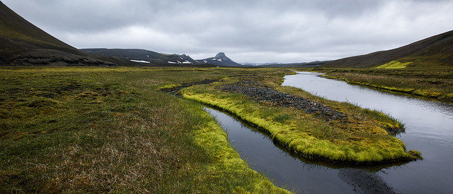
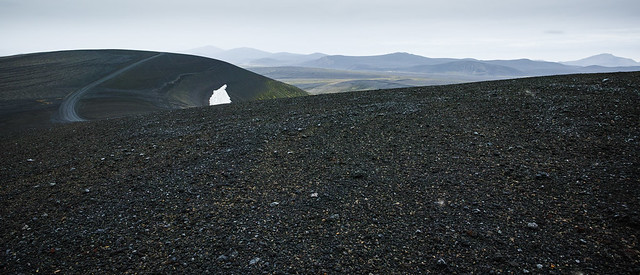
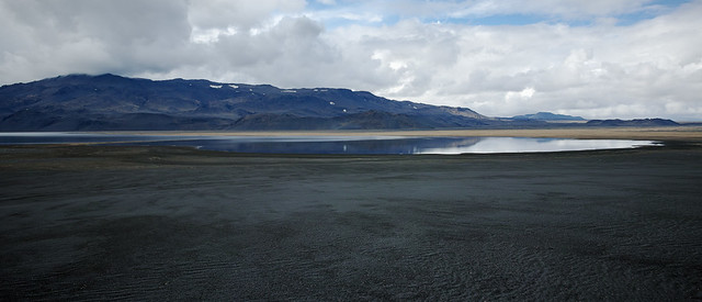
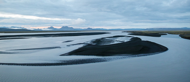
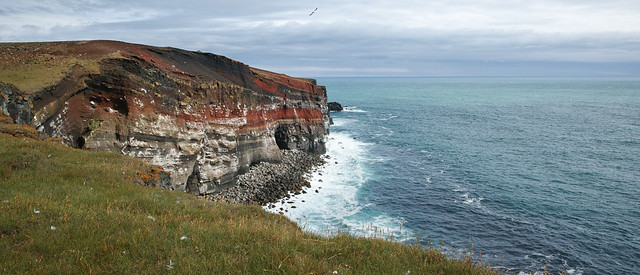
I could say taking my Iceland photography as the focus is not the best idea. To be honest, for me photography is just an excuse to spend time in Iceland. But since recently I have actually evolved a framework that I might be able to drape some Icelandic photography over, let’s leave that aside. Generally, the problem I was rambling on about the other week is not that I don’t know what I want to express.The problem lies in the detail of how to express it. And by extension, coming up against seemingly diametrically opposed advice on how to do so.
There is something slightly odd about advocating someone to study photo books (you should see my bookshelves) read about Real Photography (ditto, and a pretty broad selection) but at the same time advising them to steer clear of anything that smacks of technique, especially, God forbid, post-processing. Technique doesn’t make you a good photographer, but lack of technique - applicable technique, that is - can prevent a good photographer from emerging.
Certainly it is all too easy to go overboard on technique - the web is overflowing with examples of dangerous idiot savants who’ll sell you their useless advice - but that does not invalidate technique in itself. It would be like saying that a writer has no need of vocabulary or grammar. And that is a useful analogy: I often feel like I’ve got a whole bunch of stories to tell, pictorially, but I don’t quite have the technique to tell them. Let’s not fall into the trap of taking that too literally - of course there is a storytelling aspect to photography involving the sequencing of and relationships between photos. But there is also a storytelling aspect to single images, and the language to tell that story has verbs like dodging and burning and nouns like micro-contrast and tone. It’s hardly a new observation. So just because I may be having some trouble reconciling apparently contradictory advice on how to apply the language of post-processing doesn’t mean I haven’t got a clue about what I’m trying to express.
There’s another trap easily sprung - Andrew picks up on the not uncommon advice to flip a picture to study the balance. It comes naturally to view camera photographers who see the world upside down on the ground glass. The trap Andrew stumbled into is this: he exclaims “Really, who gives a shit about balance? I don't. Balance is a thing, but it's not an unalloyed good thing any more than blue is a good thing. It's just a property of the picture”. Well, yeah. But, er, who said anything about it being anything else ? The point is the trick frees you up to consider the balance. It doesn’t say, anywhere, that the balance has to be “right”. It just IS. Balance can be harmonious, and serene, or it can be tense and uneasy. If you “don’t give a shit about balance” then honestly I wonder if you give much of a shit about photography, finally. But I’m pretty sure Andrew assumed balance, in this context, means nice pretty blue skies with unicorns jumping over perfect rainbows. His reaction to my mention of this idea, by setting up and demolishing a straw man, somewhat tainted the rest of his argument. Actually I think he’d rather enjoy reading David Ward’s philosophical treatise on landscape photography, “Landscape Within”.
I suspect anything hinting at Landscape Photography is a bit of a red rag to Andrew. Landscape has become the stamp collecting or transporting of photography. It’s what socially inept people in smelly anoraks do, which lets them conflate their longing for shiny toys with wanting to impress the girls by being creative (we’re pretty much all boys). Well, anyway, that’s a view which Andrew sometimes gives me the impression he may subscribe to. He’s hardly the only one, but this idea that Landscape Photography is just a crutch for DPReview or 500px denizens and not something real Real Photographers do is pretty prevalent. Hell, it’s not far from the truth. But it’s a generalisation, and generalisations cloud vision.
To quote another bit “So what was it like, David? (and not just David, all you folks in the cheap seats should follow along) Take some time. Get out a notebook. Write. Think. What was it like to be in Iceland?” - well, actually, I’ve done that. Quite a lot. It’s scattered all over this blog, and it’s starting to coalesce.
(note, all this is in good humour. Andrew Molitor seems like the kind of guy I'd be happy to buy a drink for). Read his blog - he's definitely wrong about one thing - I'm not an "an occasional reader here", actually I read pretty much every word he writes.


