photoblogography - Just some stuff about photography

La Magliasina

going with the flow

in Photography in Ticino , Thursday, March 14, 2019

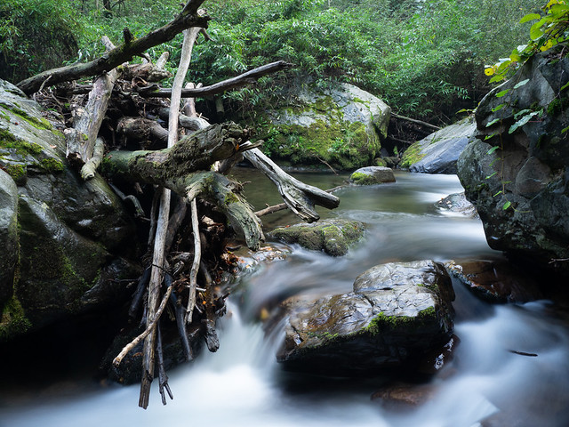
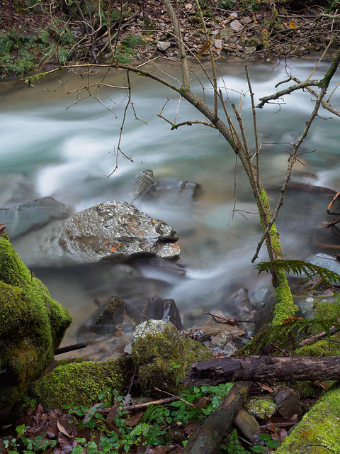
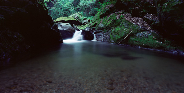
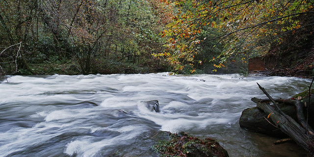
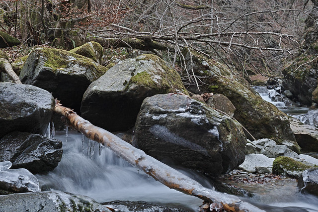
The Magliasina is a short, scrappy, torrential river which emerges on the slopes of Monte Gradiccioli in the Malcantone region of Ticino, and 15km later drains into Lake Lugano. At its mouth, it marks the boundary between the villages of Caslano, and of Magliaso, where I live, and which gave the name to the river.

Drm 20181010 EM1S5962

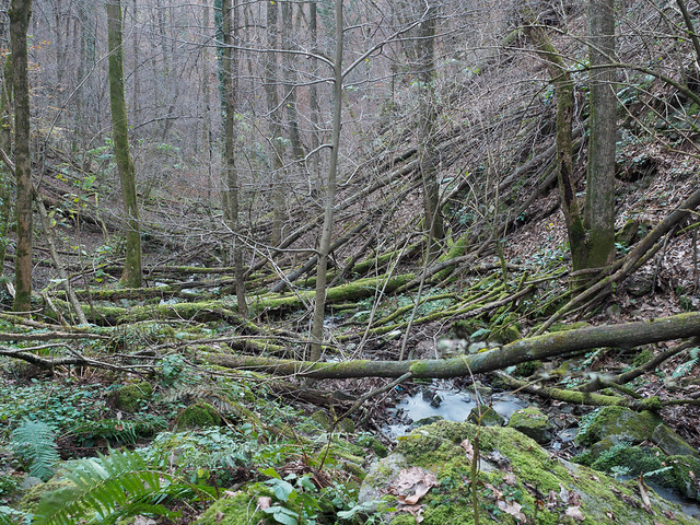
For most of its length it is hidden from sight at the foot of a deserted, steep sided narrow valley. There are a few crossing points where bridges have been built to allow paths to join the two sides of the valley, but mainly the river is heard, not seen.  I’ve been exploring it bit by bit for quite some time. I’ve largely moved on from the more easily accessible spots and, based on large scale topographic maps tried to work out where there might be interesting hideaways. Although such spots might sometimes be approached by following deserted, disappearing paths, reaching them almost always involves some serious off-piste traversing.

Drm 20181114 EM540018

Sometimes I strike gold, sometimes not, but more than once I’ve ended up with more of a scramble on my hands than I bargained for. In a few cases I’ve been forced to question my sanity. In some parts the valley side is very steep, and the soil is unstable. It also tends to be covered in vicious undergrowth in summer, and treacherous rotting tree trunks and branches all year round.  If photos were graded by the physical difficulty in taking them, I’d have quite a portfolio by now.

Throttle

In the lower reaches the valley is much broader, but even more strangled by undergrowth. Now and again I come across signs that in earlier times, the area was actually inhabited, partly farmed, and the river was a focal point. Today few people seem to realise it even exists.  Oh, there are rock pools here and there which are clearly the treasured secrets of teenagers looking for a summer hideaway.  And there are a few easily accessed and popular areas such as the Maglio del Malcantone, but largely the river keeps well away from view.

Overflow

It’s become a bit of an obsession, but unlike my other obsessions, it is within walking distance of my front door. So far I’m continuing to make new discoveries, and there are more to be found. For example, the ruins of a 100 year old hydroelectric plant lurk somewhere in the woods. I think I know where, but it’s a stretch I haven’t explored yet. And I haven’t started on the high upstream section.

Drm 20181216 SDQH0032

Probably it isn’t all that sensible to go off exploring like this on my own, but nobody seems interested. Every now and again I am reminded that while Switzerland is a very safe place from a society point of view, nature here can be pretty bloody dangerous. I should probably invest in a rope. And a loud whistle.

Drm 20181128 EM580028

You can see more, if you want, in my Magliasina album on Flickr.

Posted in Photography in Ticino on Thursday, March 14, 2019 at 08:09 PM • PermalinkComments ()

Glacier, by Ragnar Axelsson

ice age

in Book Reviews , Wednesday, January 30, 2019

“Glacier” is the title of what must be the magnum opus of Icelandic photographer Ragnar Axelsson, also known as Rax. Previously his published photography has been more orientated towards environmental portraiture and reportage, through acclaimed books such as “Faces of the North” and “Last Days of the Arctic”, but “Glacier” is pure landscape. It isn’t picture postcard landscape though - far from it. Glacier is a vast collection of aerial photography of Iceland’s ice fields.

IMG 5457

For the greater part the photography discards any sense of scale and proportion, and presents a near abstract, otherworldly view. Photographing in black and white further removes any easy connection to reality, and emphasises even further the quite unbelievable forms shaped by the forces on the ice. The net effect is captivating. Far from being a set of exercises in graphic composition, the emotional impact is remarkable, encompassing everything from fascination to - in the case of some of the volcano shots - terror.

In much of his previous work, Rax did not seem to place an undue emphasis on technical quality, at least not to the extent of discarding photos for purely technical reasons, but here, the precision and clarity is impressive, and indeed important. The fact that as far as I know most were taken from a pretty unstable light aircraft makes them all the more impressive.

IMG 5458

That it is aerial photography may put some off, but this is emphatically not some “Iceland viewed from the sky” kitsch. It is more like a distant relative of Edward Burtynsky’s work, and equally affecting.

Obviously I highly recommend losing yourself in “Glacier” for a few hours. It is one of the best photobooks I have ever seen, and I’ve seen a lot. But I am going to leave off with a minor rant:

Clearly there is an environmental message as well as an aesthetic dimension underlying “Glacier”. I have absolutely no problem with that. But then, why deliver the book wrapped up in a pointless plastic wrapper, with a plastic “Glacier” sticker attached to it, both of which need to be ripped off and thrown away ? Yes, it protects the integrity of the (gorgeous) design concept, but in doing so it totally undermines the message. I am so, so fed up of the torrents of plastic running through this and every household every day. I appreciate it isn’t easy to find a solution, but if it was easy, we wouldn’t have such a major problem. Did the idea of recyclable paper outer wrapper occur to the book designer, I wonder ?


Posted in Book Reviews on Wednesday, January 30, 2019 at 05:21 PM • PermalinkComments ()

Interesting Times

Fame ...AND fortune!

in Photography , Thursday, January 10, 2019

Welcome to 2019. I spent the last couple of weeks off the grid - no forums, no Twitter, no Brexit, no Trump. It was wonderful.  On my return I found quite a few surprises, for example the palace revolution at the veteran Luminous Landscape website - see Andrew Molitor’s take on that. Other than some very helpful experts populating the technical forums, the Luminous Landscape hasn’t been very relevant to me for quite some time, but in it’s heyday it was a big influence on me. I followed the site since the very early days, pre-digital boom, and I would be lying if I didn’t acknowledge Michael Reichmann as a major influence on both my photography and my approach.  Some may find that an uncool admission, but it could have been a lot worse.

But the next big surprise was an email from Olympus Europe, telling me that my already forgotten submission to their “snow” competition had actually won.  And netted me a €500 voucher to spend on Olympus gear. Well, I don’t really know what I’m going to do with the voucher, but the praise is very welcome!

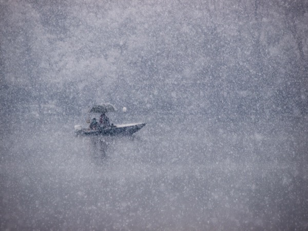
I’m also feeling just a little vindicated, because the photograph in question - which I actually took way back in 2006, is reasonably typical of my general approach, and not a blatant attempt to win a competition with some 500px super saturated horror.  To be honest I had no expectation whatsoever of winning.  The technical quality is terrible and the photo was shot using a measly 10 Megapixel Olympus E-3 camera.  Here it is…

Drm 090106 144452

I can only thank the judge, Lukasz Bozycki, for his astounding good taste 😊

Literally ten minutes after the email from Olympus Europe, I got a totally separate email from the publishers of the UK-based Olympus magazine asking to use a photo of mine in an upcoming special issue. Fame AND fortune! The day job must be starting to feel nervous.

Happy New Year.


Posted in Photography on Thursday, January 10, 2019 at 07:46 PM • PermalinkComments (2)

Software

displacement activity I

in Post-processing , Tuesday, December 11, 2018

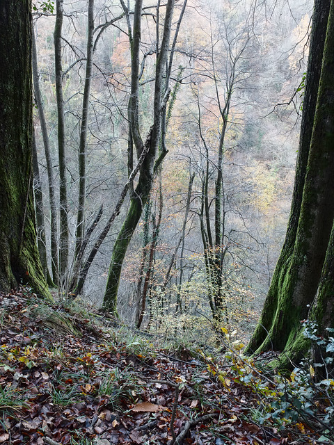
I’ve recently been going through some kind of phase where I’m reassessing a lot of my work. Initially this was on an aesthetic level, but somewhat inevitably technical considerations started to intervene. First of all, I have been trying to get a little more disciplined in my picture making. Although I like to think that I’m pretty much on top of the basics of using a camera, I have tended to be a little indisciplined in how I apply this knowledge. This then leads to, for example, photos with too much, or too little depth of field, because I was too lazy to think about optimising aperture. It all came about when I started to make prints of some of the recent series of woodland photos I’ve been making. In turn this led me to making a number of “test” prints (to be perfectly honest, I probably don’t make any other kind). And so I noticed that the colour in these prints was actually a bit weird, and so _then_ I just had to re-profile the paper, which more or less fixed the issue, but used up all my supplies. And left me wondering how my previous carefully created profile had “gone bad”. And off we go again.
Untangle II

“Untangle I” - the photo that led me to re-evaluate my printing

Or not - prompted by an article I saw recently, I wondered if maybe it might be a good idea to revisit ImagePrint by Colorbyte Software. I used to use ImagePrint with my Epson 2100 printer, but when this died, and some 8 years ago I splurged on an A2 Epson 3800, I would have had to upgrade my ImagePrint license, and I couldn’t afford it. So I bought a Pantone ColorMunki Photo kit instead, which allowed me to profile any printer paper I wanted. Of course this was not the only option: many paper manufacturer profiles are actually more than close enough, and if they’re not, various service providers can create custom profiles for a given paper and specific printer. But of course I wanted to do it all my own way, and now I think about it, I’ve gone through at least 3 printer profiling setups over the last 15 years or so, none cheap.  And in fact even with dedicated software and hardware, colour science, which this is an application of, is seriously hard and time consuming, apart from being a money drain.

ImagePrint on the other hand does absolutely everything for you. It includes a custom print driver which brings a number of tangible benefits, from more accurate colour to saving paper, and a huge library of expert print colour profiles tuned not only to printer/paper combinations, but also to different lighting conditions. The basic point of ImagePrint is that it offers 100% reliable, plug & play highest quality printing. So you can just forget about all the technical complexities and just enjoy the creative part. This to me is quite enough to justify the fairly high price, but on top of that there are myriad additional features which offer significant advantages in various printing scenarios.  So I renewed my license for the latest version, “ImagePrint Black”, and ever since I’ve been printing a lot more, with no test prints required.

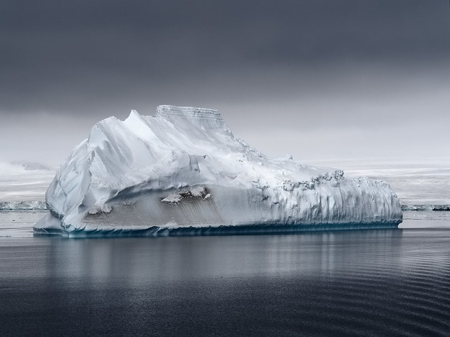
That solved my output problems. Next up was the input. I had been working on a set of photos recently for my 2018 calendar, and revisiting these I noticed that one of them was not quite right. This was a photo of an iceberg, which look fairly spectacular, but after I printed it (see above) I realised it was all a bit too, well, blue. So once again a trip down the rabbit hole of Raw conversion software beckoned. I decided to download a trial of the latest version of Capture One, v11 (now they’re on v12), and opened a few iceberg photos. One of them, not the one that had initially sent me into a spin, really shocked me: Capture One appeared to be showing textures completely missing in the Lightroom interpretation, and better fine detail as well. I cross-checked in Exposure X3, and in Iridient Developer, and the variation across these gave me the clue I needed to narrow the gap - it was simply a case of reducing the exposure, which in Lightroom seems to have a complex relationship with brightness. The much more involved Capture One default processing had, in this case, given better results.  As for the fine detail, well, there, at least with Olympus ORF files, the current iteration of Lightroom cannot match Capture One, or indeed the new Exposure X4. Both extract more real detail, although frankly only us pixel peepers would notice in almost all cases. But this comes with a price with Capture One, as any kind of noise reduction coupled with sharpening gives a horrible plasticky effect in recent ORF files. This is nothing new - I noticed it with v8 and it was just that made me decide to give up fighting and submit to Lightroom for once and for all.
Drm 20161203 PC030310 IridientEdit 3

“float” - the photo that used to be far too blue

However, Capture One has another major card up its sleeve, at least for me: the luminance curve. In Lightroom pretty much any change to contrast, by direct slider or by curve, has a major effect on saturation as well. Apparently this is by design, and it is stubbornly maintained, but personally I hate it. You can compensate by reducing saturation and/or vibrance, but first, this is imprecise, and second, why the hell should one need to? This naturally led me to the realisation that I should just be more disciplined with applying a previous strategy: do the Raw conversion in Iridient Developer, which is far less heavy handed, has not only a luminance curve, but also a chroma curve, and delivers the best detail and sharpness of all, then do the rest in Lightroom. Iridient even includes a Lightroom plug-in to facilitate all of this.

So, after this bit of re-evaluation, I have ended up with a software end to end process (I’m not going to call it a “workflow”, this is fun, not work) which drags the absolute best of my pitiful 16 Mpix sensor camera, and starts to approach the delicacy I’m always aiming for in colour and colour transitions.  Having got those variables out of the way, I can now concentrate on choosing the correct f-stop.

Posted in Post-processing on Tuesday, December 11, 2018 at 09:20 PM • PermalinkComments (1)

Moving on

moving on up?

in Photography , Friday, November 30, 2018

Nearly 8 years ago, I finally gave up on any aspiration to finding an “interesting” job, and settled instead for a stable job which allowed me to continue living where I finally found a place I could and wanted to settle in. And so like many others I surrendered to the gaping maw of Banking IT. It could be worse - a lot worse - but it wasn’t really something I wanted to do when I grew up.

A distinct downside was that it required me to commute a significant distance. A second downside was an office is one of the most dreary, soul-destroying settings you could imagine (well, ok, it’s not Slough), albeit set in the middle of a fairly spectacular pre-alpine valley. To get out of the office I got into the habit of taking a walk at lunchtime, and eventually I started to take a camera with me.  To start off with, I just did “tests” - this, I think, is the first example I published - but eventually I started to see some photographic potential in the area.

For a while I was in a “satellite” office which had a number of advantages, first that being 10 minutes closer to the train station, it cut down my commute just a smidgeon, but the second was that it was also quite close to a path leading up a hill, where I discovered all sorts of wonders. Well, relative to staring at a corporate Windows PC, they were wonders.

Therails

Some photos which might have made it into my idea of a project called “The Rails”

In particular I discovered an abandoned funicular railway, which had been used many years ago in the construction of a hydroelectric plant pipeline, now itself removed and replaced.  The upper part, it turned out, was still very occasionally used to ferry materials up the hillside, but the lower part was completely abandoned, and in some places overgrown or buried. The hillside is also steep and covered in dense undergrowth, but over many lunchtime visits - some a little more extended than usual - I gradually pieced together and documented various parts.  This formed a project, “The Rails”, which, finally, only existed in my mind a few edits on my iPad, but it kept my brain working.

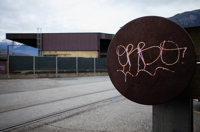
Later, I moved back to the main office. This was much less conveniently located for interesting lunchtime walks, but my route from and to the station did lead me through a fairly dilapidated, partially disused light industrial zone, when led to some interesting compositions. Indeed, there must be some buildings along that route I’ve photographed about 50 times if not more. In different seasons, different weather, different light, with digital cameras, film cameras, different lenses. Any of my colleagues who may have noticed what I was doing must have though I was slightly nuts… apart from the fact they already had plenty of reasons to think that.

But now it has come to an end. This, below, is the last photo from the last day of that walk to the office. There was no conscious intent in my mind to create any kind of symbolism, but it seems that I did do so.

Drm 20181123 R0000038

Up against the buffers: last day in G.

And from today I’m working in the same job but from a new location, which is only 30 minutes away, instead of 90, and while still not the most inspiring location, should give quite a lot of opportunities to explore. And it will give me 2 hours of my life back everyday, so maybe I’ll have a little more time to actual pursue and complete photographic projects. Or perhaps I’ll simply stick to type, and dither even more.

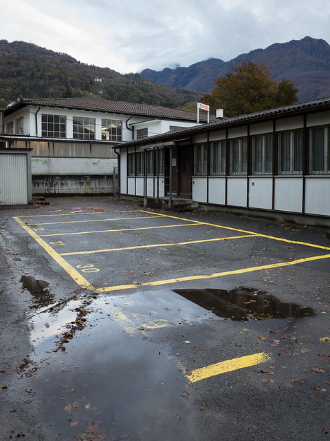
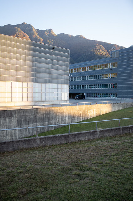
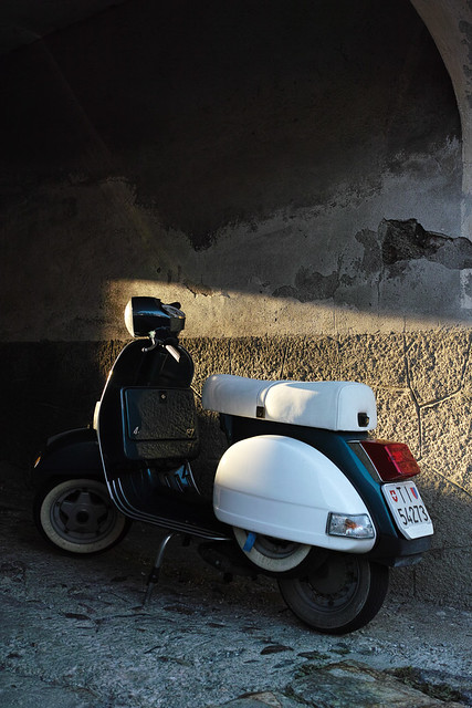
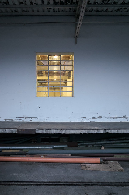
The following is a small selection of photos taken over the past 8 years while walking to or from work, or wandering around a lunchtime.  I’ve got hundreds of them…

Drm 2014 12 17 R0000228
Drm E P5 20160301 P3014050
Drm gr 20150303 0518
Drm 2014 07 10 P7100027
Drm E M5MarkII 20171019 EM590002
Drm 2014 08 04 P8040147
Drm 2014 11 07 R0000006
Drm 20181022 R0000009
Drm dp2m 20131127 1207
Drm 2015 01 19 R0000344


Not to be continued…

Posted in Photography on Friday, November 30, 2018 at 07:58 PM • PermalinkComments ()
Page 18 of 141 pages ‹ First  < 16 17 18 19 20 >  Last ›