photoblogography - Just some stuff about photography

Iceland, by Josef Hoflehner

A book review

in Book Reviews , Friday, August 12, 2011

For the third and final in my recent mini series of Iceland photo book reviews, I’m looking at one that seems to have achieved some kind of contemporary classic status: “Iceland”, by Josef Hoflehner.

Iceland cover

One thing really needs to be adressed up front. Anybody who decides to specialise in square format, monochrome, long exposure landscape shots is going to get compared with Michael Kenna, and that’s a scary prospect. So let’s leave that aside, for now.

I’d been dithering about buying this book for ages. Looking at Josef Hoflehner’s website though, I was never that blown away by the photos. But it seemed that my collection really would be incomplete without it, so finally I ordered it direct from the author. One thing I really have to comment on is that the packaging was amazing. So much bubble wrap that it would probably have survived a drop from several hundred feet. But unfortunately this caught the beady eyes of the Swiss Customs, who charged me the 2.6% import duty they normally waive - and a handling charge over half the cost of the book. Oh well. Anyway, after half an hour or so of unwrapping, I got the book open, and was immediately blown away by the print quality. It really is gorgeous, and makes the photos spring to life. So good you feel like you should wear cotton gloves to read it.

So, excellent first impressions. Josef Hoflehner’s style is clearly minimalist. There are a number of photos of poles sticking out of the sea, with or without bird perching on top. Seascapes tend to dominate, these being something of a primary material for long exposures. The locations will, by and large, be pretty familiar to anybody who has spent a few days or so in Iceland. And this is where things start to go a bit wrong, for me. It’s that I necessarily need to see new locations, but if I’m going to see the same locations that the world+dog snaps, then I’d like to see a personal interpretation, something that’s going to catch my attention. And, sorry, but using the Michael Kenna preset, in a fairly heavy handed way, doesn’t qualify.

I’m aware that this sounds very harsh. I’m also aware that Hoflehner is highly regarded by people who know what they’re talking about - after all, he was the IPA’s Nature Photographer of the Year 2007. But I find this collection strangely unengaging. It’s pretty telling that I’ve got 3 or 4 photos which are almost identical to his, apart from the 4:3 frame and the colour. And I know just how obvious they were. The “rocks in the sea”, and the telegraph poles in the sea (within urban Reykjavik, by the way), just don’t do much for me, in particular in the context of a book which is supposed to be about Iceland. Of course, it is entirely possible to put a very different twist on “about Iceland”. It doesn’t have to be pretty landscapes. It doesn’t have to be landscapes at all. In fact a book of photos of overweight people with badly fitting clothes stuffing hot dogs could easily be “about Iceland”. But for that to work, you’ve got to be consistent. And long exposures of rocks in the sea which could be anywhere in the world, and if anything resonate with a more Far Eastern visual ethos, don’t fit in comfortably.

It’s ironic that in the narrative that serves as an introduction, he describes a very different vision, albeit in the somewhat clichéd let’s-get-romantically-stuck-in-a-snowstorm pseudo-explorer style which seems to appeal to the Germanic contingent. But I searched in vain for any real photographic counterpoint to that tale.

There are some good photographs in this collection - there are even a couple of great ones (one of which is on the cover). But there’s also a lot of repetition, some dodgy compositions, and a fair of amount of humdrum which cranking up the contrast to 11 doesn’t rescue.  Josef Hoflehner is clearly a very good photographer, but I don’t think that “Iceland” is his best work.

Well, that’s my opinion. For what it’s worth.  You can make up your own mind by buying “Iceland” direct from the photographer, or from Beyond Words.

Posted in Book Reviews on Friday, August 12, 2011 at 04:11 PM • PermalinkComments ()

Near or far ?

or somewhere in between ?

in Photography , Thursday, August 11, 2011

A recent blog post I read, and which early-onset Alzheimer’s is preventing me from linking to (Blogheimer’s, maybe ?), led me to realise that for quite a while I’ve been breaking one of the Cardinal Rules of landscape photography - one that I certainly used to fully subscribe to, but which I’ve been flouting for quite a while:

THOU SHALT STRIVE FOR SHARP FOCUS FROM THE NEAREST FIGMENT TO THE FURTHEST FIRMAMENT

Or something like that.  But I have sinned, and have been guilty of letting the background sort itself out.  This is a conscious move to some extent. My reasoning was we expect far off objects to be less distinct, and shoving everything into one plane of focus doesn’t seem all that important, in particular given the tradeoffs.  Of course, it’s not a point one could argue with Ansell Adams (well, obviously, but you know what I mean).  But I bet it would get me into serious trouble in the average British Camera Club.

Here’s a prime piece of evidence, freshly created this morning:

Lavertezzo, Ticino

The foreground is pretty much in focus, by my usual standards, but the middle and background rocks are distinctly soft. And the bridge, well it’s practically blurred.

Of course, there are some practical reasons for this.  With the Olympus 4:3 sensor, diffraction sets in noticeably at f/11, and any smaller aperture than that is going to be a compromise. And although, on the other hand, the depth of field at a given aperture is roughly twice that of a 35mm size sensor, it’s not quite enough to compensate, even at wide angles like here.  Sometimes I use this characteristic to my advantage. Sometimes it becomes a bit of a handicap.  I don’t really know if I’ve become more aware of the diffraction issue, and am over-compensating, or if if I actually like the look… when it works, that is. Sometimes it doesn’t.

Is full field sharp-as-a-proverbial-pin-ness overrated, or I am I denial ? Do I need .... a new camera ???

Posted in Photography on Thursday, August 11, 2011 at 06:29 PM • PermalinkComments (1)

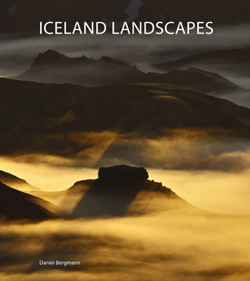
Iceland Landscapes by Daníel Bergmann

Book Review

in Book Reviews , Wednesday, July 27, 2011

“The North begins and ends with Iceland” - Marco Paoluzzo

There are a lot of photography books on Iceland and Icelandic landscapes in particular. They’re split, pretty much, into several categories: books by Icelandic photographers that are never seen outside of Iceland, but are ubiquitous in their homeland. “Lost in Iceland” by Sigurgeir Sigurjonsson is a good example. Then we have books by foreign photographers, which are never seen in Iceland, but in some cases are quite ubiquitous outside of the country. Interestingly black & white Icelandic landscape photography books, are, as far as I know, a uniquely foreign category.

And then we have Iceland Landscapes by Daníel Bergmann.

Db IL cover

Daníel is without a shadow of a doubt Icelandic, but thanks to time he spent outside of the country, he’s had something of the experience of discovering Iceland as a foreigner, and this gives him something of a mixed perspective. He is able to see the country at a remove, while at the same time knowing it extremely well, with the result that he’s able to bring something new to a rather over-crowded field.

Iceland Landscapes is, I think, his 5th published book, but it is the first that really focuses on the landscape. It’s beautifully printed and presented, and includes a foreword by British photographer David Ward. This is very appropriate, because Daníel’s approach is well in tune with Ward’s “Landscape Within” ethos, as well as his discrete but strong spiritual undertone.

One thing that stands out for me is his response to and treatment of light. He prefers the subtle approach, and often goes for quite muted light, and avoids the sometimes ghastly “Velvia tones” so characteristic of a sector of the landscape community, as well as the heavy-handed contrast treatments so beloved by the Flickr crowd.

In general he tends to avoid the more over-photographed locations in Iceland. In particular I’m think of the coastal area to the west of Vik, which has really been done to death - although he has included a couple of beautiful scenes from there. But the most successful shots tend to be from well off the beaten track, perhaps not so much because they’re unknown, but perhaps more because they communicate a stronger connection to the land.

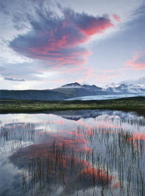
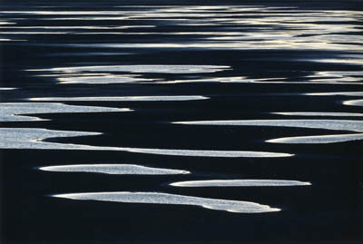
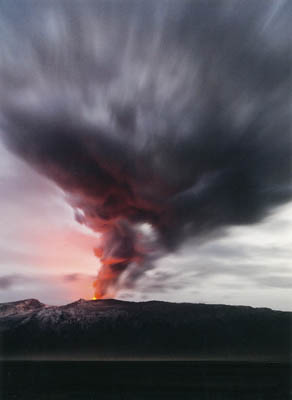
There are many outstanding photos, but here’s a small selection of my current favourites (which I hope doesn’t break “Fair Use” copyright rules!).

Db skaftafell

Skaftafell © Daníel Bergmann


Db leirur 400

Leirur © Daníel Bergmann


eyjafjallajökull

Eyjafjallajökull © Daníel Bergmann

“Iceland Landscapes” is at completely the other end the spectrum to “Terra Borealis” by Marco Paoluzzo, which I reviewed last week. But they’ve one special thing in common: they avoid the hard sell, the dramatic-but-cheap shot, but instead slowly draw you in to the worlds they create.

I think it’s obvious that I highly recommend “Iceland Landscapes”. You can get your own copy directly from Daníel Bergmann, or apparently it’s available in Icelandic bookstores and tourist shops.

The North, as well as a lot of other things, does indeed begin and end in Iceland. For me it’s been too long…

Disclaimer: In fairness I should mention that I’m happy to count Daníel Bergmann as a good friend who I’ve spent too little time with. But I’d be as positive about this collection of photographs even if my worst enemy had published it.

Posted in Book Reviews on Wednesday, July 27, 2011 at 10:17 PM • PermalinkComments ()

Dimage Scan MultiPro Micro-banding

The “thin red line” problem, and a solution

in Scanning , Saturday, July 23, 2011

After 10 years or so of pretty constant use, I’m beginning to get the hang of my Minolta MultiPro film scanner. Having very belatedly discovered Scanhancer inventor Erik de Goederen’s tip for making a single-sided glass film holder, I’m also getting something close to dust-free scans. So naturally, now was the time for the Minolta to blow a gasket.

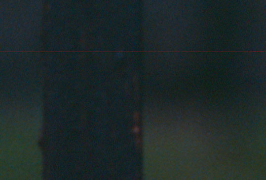
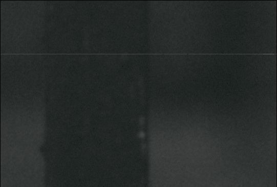
Well, fortunately it seems to be a fairly minor gasket, and in fact I may be lucky to have only been hit by it now, because it has a name in the MultiPro community: micro-banding. Somebody even built a Photoshop plug-in (Windows only) to fix it, way back. Actually I think it is more of a stuck pixel, or whatever passes for that, as the effect is of a single-pixel wide red line right across the scan. It is strange that it’s always red though.

Multipro red line red channel

the red line, aka “micro banding”


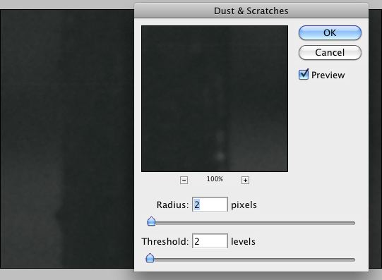
The fix is actually pretty simple, so you don’t need a plug-in. Before you do any other editing - and especially rotating - simply zoom in at 100% and select a thin rectangle, say 5 pixels high, all the way across the image, with the red line centered. Then select the red channel only. Then apply the Dust & Scratch filter with settings Radius 2, Threshold 2 or thereabouts.

Multipro red line red channel

red channel only


Multipro red line red channel

Dust & Scratch filter settings


It doesn’t completely go away, but you’re never going to see it at anything less than serious pixel-peeping level, and certainly not on a print.

I don’t know why it hit my scanner now. Could be old age. Could be dust, although I’ve opened it up for the first time ever, and it is remarkably clean inside. Could be because I’ve been fiddling around with fluid mounts. I don’t know, I just hope it doesn’t spread, because there’s essentially nothing available to replace it.


Posted in Scanning on Saturday, July 23, 2011 at 08:02 PM • PermalinkComments (3)

Admin Notes

A couple of updates

in General Rants , Friday, July 22, 2011

Just a quick note about some changes and fixes I’ve recently made here.  First of all, I finally noticed that the links in my RSS feeds were broken. That means that my faithful subscribers (yes, all 4 of you) couldn’t click through to the articles on the site. Brilliant, no ? Anyway, it’s fixed now. Sorry.

Second, you’ll probably notice I’ve added little bubbles showing how many comments there are on the articles listed on the home page. I haven’t bothered with handling the case that there are more than 99 comments. That will be a nice problem to have.

Finally, I am going to try to get around to making commenting easier, especially for frequent visitors (that’s, er, Tim. And maybe RB, sometimes).

Have a wonderful weekend
David

Posted in General Rants on Friday, July 22, 2011 at 06:14 PM • PermalinkComments ()
Page 89 of 141 pages ‹ First  < 87 88 89 90 91 >  Last ›